How Swiss grid systems helped me redesign a digital publication for Italian pharmacists
Quick summary In 2019 I built Farmacia Virtuale. In 2026, Alfonso's brief was one line: use fewer images. That single constraint decided the whole redesign. With no photos to lean on, the grid, the type, and the colour had to carry the authority instead. Here is how structure alone gave a pharmacy publication its editorial identity back.
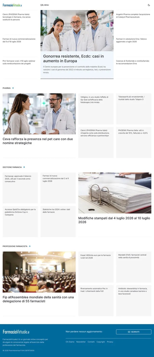
The site had no editorial identity. That was the real problem.
I designed the original Farmacia Virtuale site back in 2019.
At the time, it stood apart since most pharmacy blogs ran on generic WordPress templates, and this one didn't.
But I opened it again in 2026, and the problems were obvious.
The structure was clunky. The layouts were predictable. The reading experience never felt like the authority the publication had earned.
In a market where any publication can look competent and interchangeable, looking competent is not enough. Sameness was the real liability.
Most digital publications make the same mistake. They borrow a theme, and the theme decides who they are. It rarely reflects the brand, rarely matches how people read, and rarely carries the authority the work deserves.
Alfonso runs Farmacia Virtuale, and he wanted more from it. His brief was short: focus on readability, make content easier to find, use fewer images, and turn the site into a leading publication for Italian pharmacists.
To get there, I needed two things — a clearer structure and a real identity. One line in that brief decided how I would build both.
One line in the brief decided everything
Alfonso's brief took away the easiest tool in editorial design: use fewer images.
Most sites lean on photography to do the heavy lifting. A big image tells you what matters. A photo grid sets the rhythm. Pictures carry the mood, the energy, the sense that someone is in charge.
Take the images away, and all of that has to come from somewhere else.
With no photographic crutch, the design had to build authority from structure alone.
That is the whole story of this redesign. Every choice that follows — the navigation, the grid, the typeface, the colour — is a consequence of that one move.
So, I stopped thinking about pictures and started thinking about what would carry the weight instead: the structure, the grid, the type, the colour. That is where Swiss design came in.
Before I opened Figma, I went to Geneva
The brief pointed one way: Swiss design.
Its whole philosophy — clarity, legibility, and stripping away anything that doesn't help the reader — was exactly what a site with fewer images needed.
So, before I touched a single layout, I went back to the people who did this best. I wanted to understand how designers like Josef Müller-Brockmann and Karl Gerstner built authority out of structure, type, and restraint.
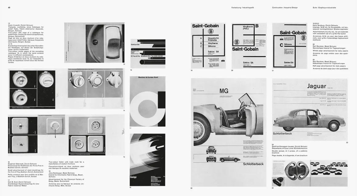
I studied Müller-Brockmann's Grid Systems in Graphic Design and Gerstner's Designing Programmes to get deep into the principles. Brockmann shaped most of my choices — the grid, and the way I worked with type.
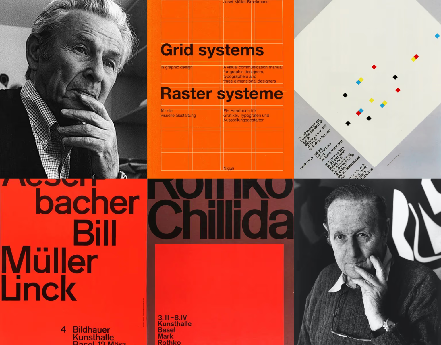
The reading settled one thing before I opened any software: this redesign had to stand on proven principles.
The first job was making the whole publication visible
The 2019 site buried its content. The architecture followed the site's own logic and ignored how pharmacists actually look for things. Key topics hid behind a dropdown, and you had to already know the site to use it.
With no images to pull the eye toward what mattered, I couldn't afford a structure that hid things. The reader had to see the full range of the publication at a glance.
To fix that, I started with the site's three audiences. I worked with Alfonso to map what they actually needed.
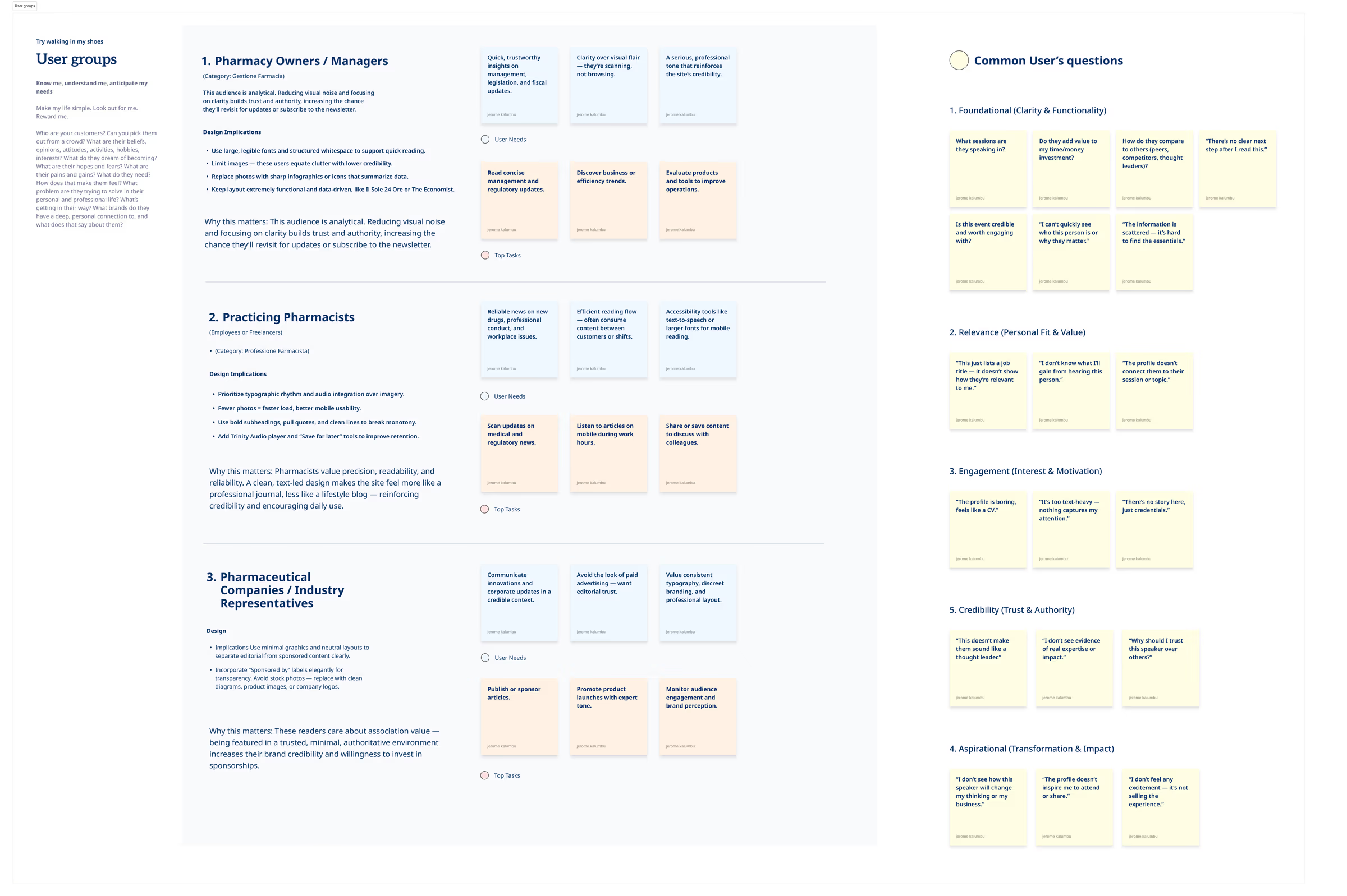
Then I rebuilt the navigation around those real tasks. Primary categories and actions moved into a mega menu, so the full depth of the site shows up front. Secondary pages — contact, about, privacy — moved to the footer, out of the way.
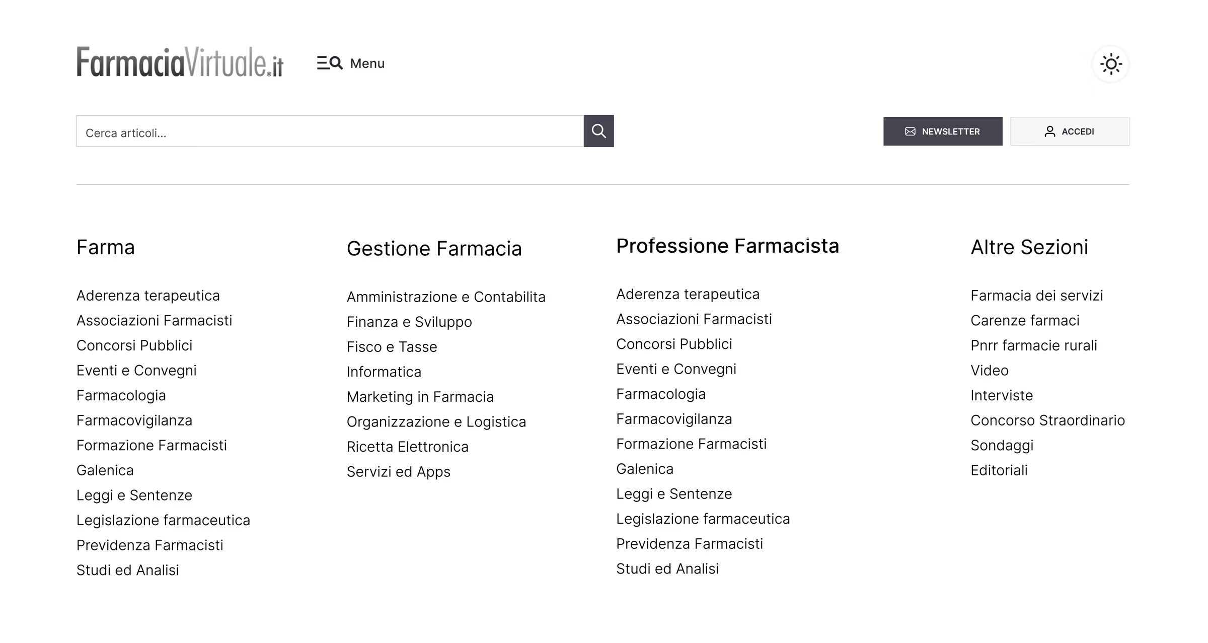
Navigation became the first editorial statement of the redesign. Before a layout is seen, before a word is read, the structure already tells the reader one thing: this publication knows exactly what it is.
With no images to lead the eye, the grid had to lead it
On most sites, images guide the eye — where to start, what matters, where to rest. Without them, that job fell to the grid.
So, the grid had to set the hierarchy, the rhythm, and the emphasis on its own.
To address that, I built the main pages on a four-column modular grid. A modular grid divides the page into a repeating set of blocks, so every element sits in a deliberate place and the whole page reads as ordered.
Then I broke the symmetry on purpose. An even grid can feel static, so I composed the blocks asymmetrically to create tension and pull the eye through the page. Asymmetry gave the layout rhythm and personality without giving up clarity.
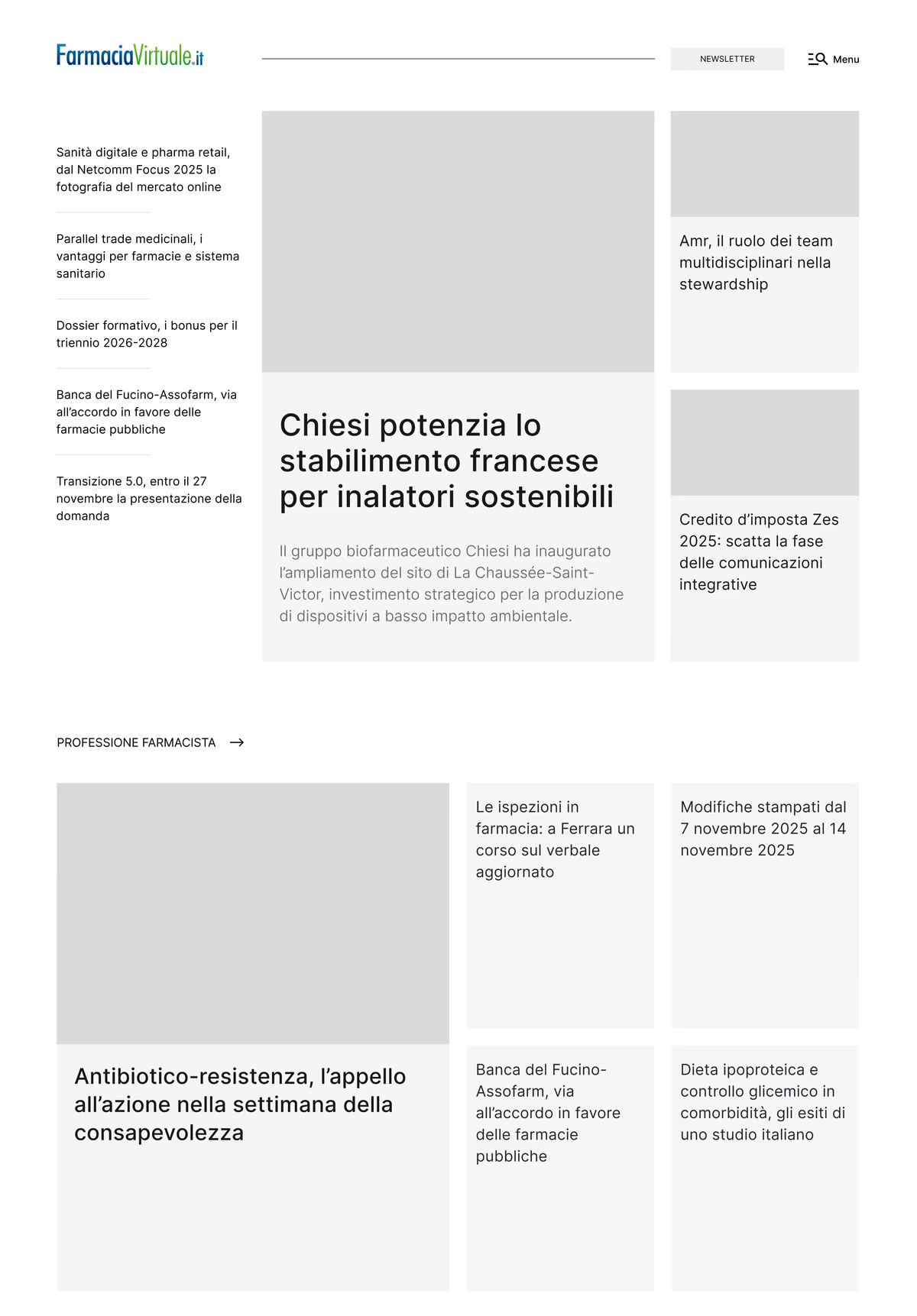
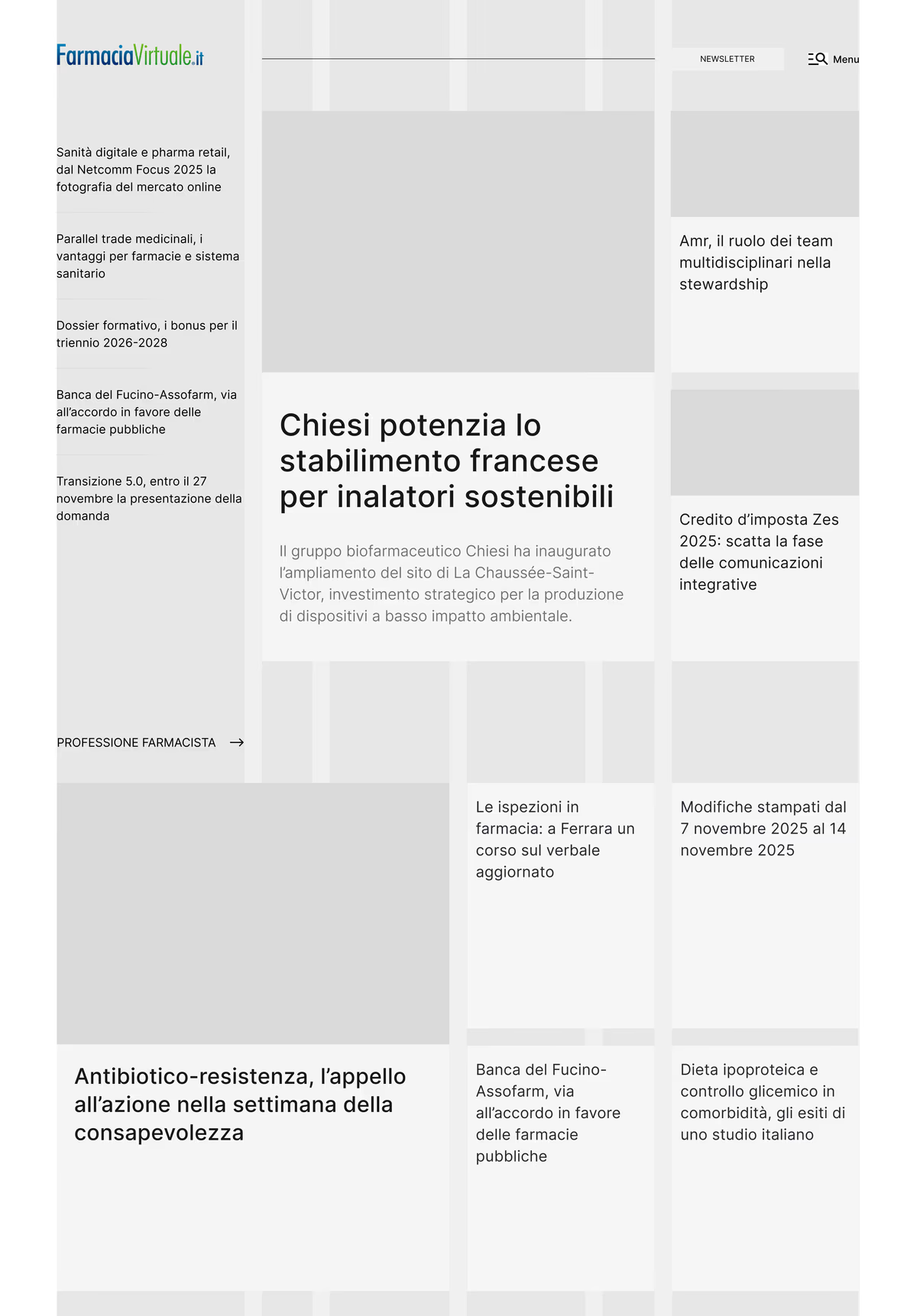
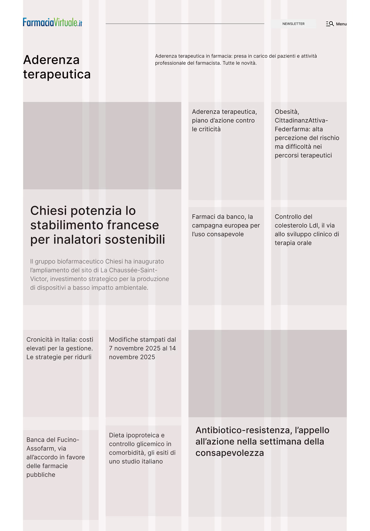
To add energy, I let larger blocks act as anchors. A lead article takes a bigger module with one supporting image, pulling the reader in, while smaller blocks carry the stream of stories around it.
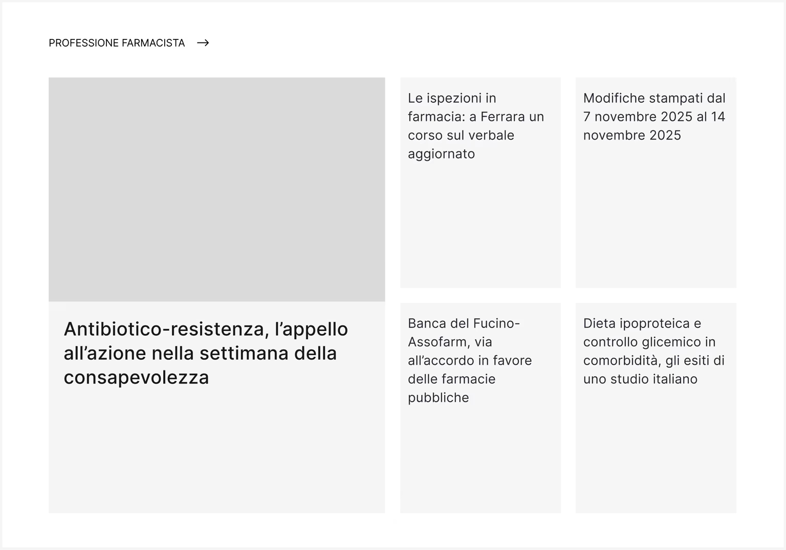
Generous space separates each section, and that space does real work. It gives the publication a calm, curated feel — a distinctly Swiss character on every page, without a single extra picture.
When type carries the message, it has to be the right type
Strip out the images, and type is left holding almost the entire message.
The old site wasn't ready for that. It used Merriweather for headings and Open Sans for body, and the pair struggled at size, especially on phones. Long reading felt like work.
So, I replaced both with a single typeface: Inter.
I chose Inter because it shares its roots with Helvetica and the Swiss tradition the whole redesign leans on. Its tall x-height and open shapes stay clear in a big headline and in a long paragraph alike.
One typeface doing both jobs also keeps the reading calm. Nothing competes; the words just carry.
Then I set the sizes on a Minor Third scale — a fixed ratio of 1.2 between each step. That ratio gives controlled, even jumps from body text to subhead to headline, so the hierarchy feels consistent on every screen.
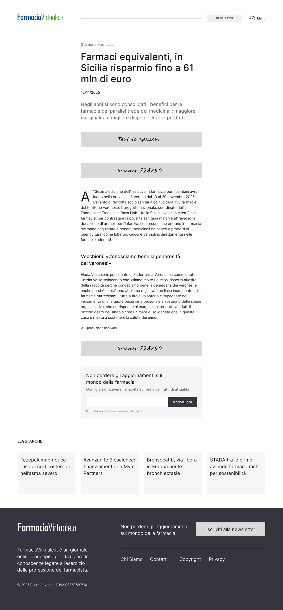
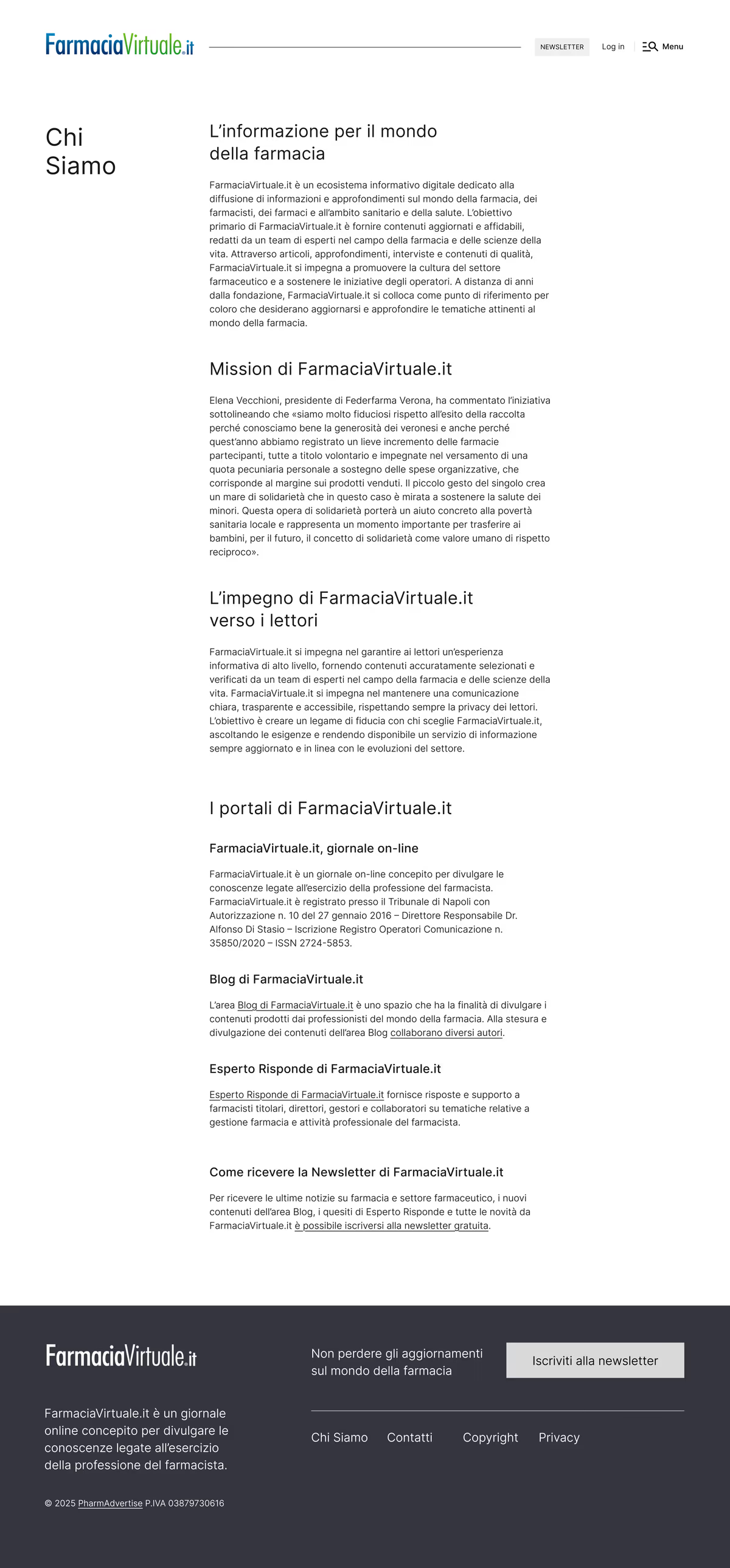
On a page with no decorative image, the type carries everything — the structure, the voice, and the authority, all at once.
Colour stopped being decoration and became a signal
With images gone, colour couldn't just be mood. It had to mean something.
I used it to say three things clearly: what kind of publication this is, which content matters most, and where to take action.
To keep the reading calm and focused, I held the palette to colours that feel serious and rigorous. Black and greys build the typographic structure. Soft blues separate one section from the next in light mode.
One vibrant blue does the pointing. It marks links, buttons, featured content, and key areas like the footer. Because blue is Farmacia Virtuale's signature colour, I kept it restrained, so it still means something when it appears.
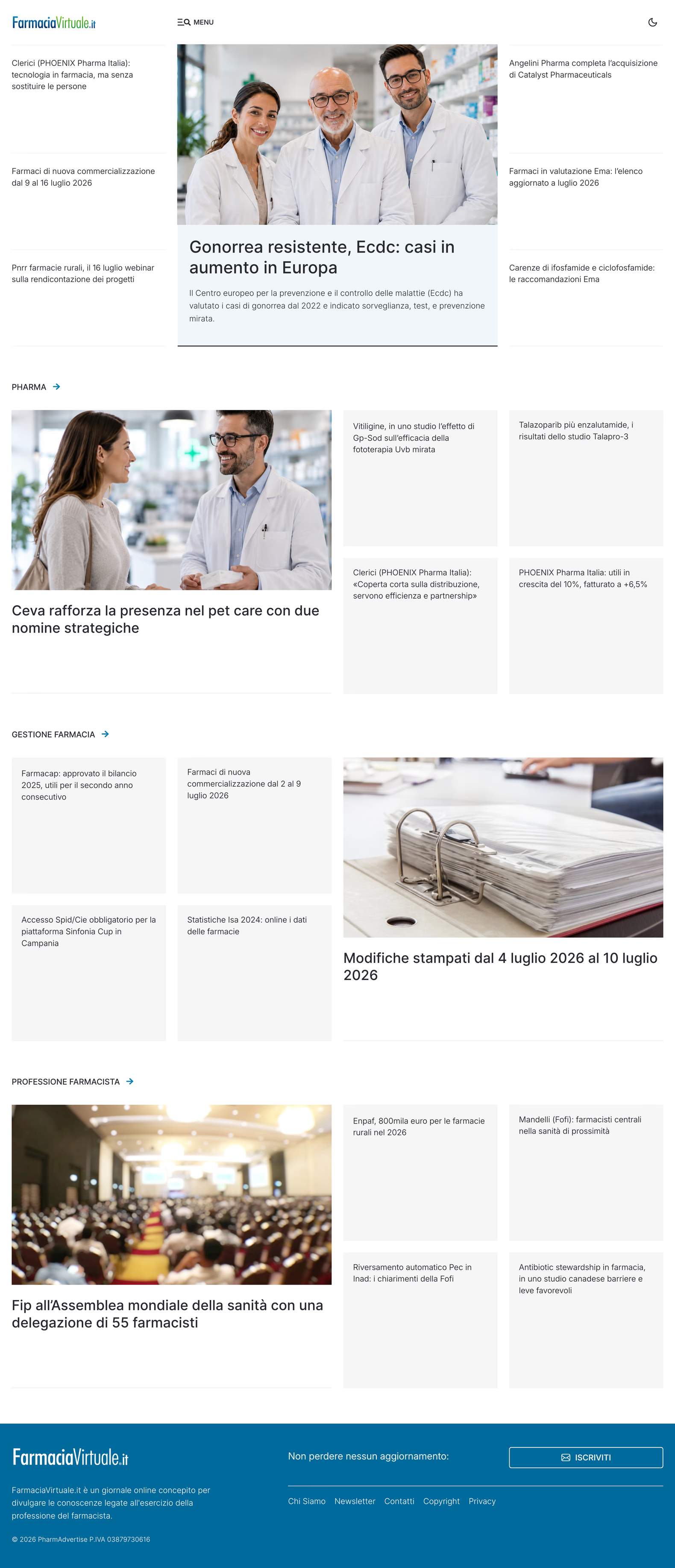
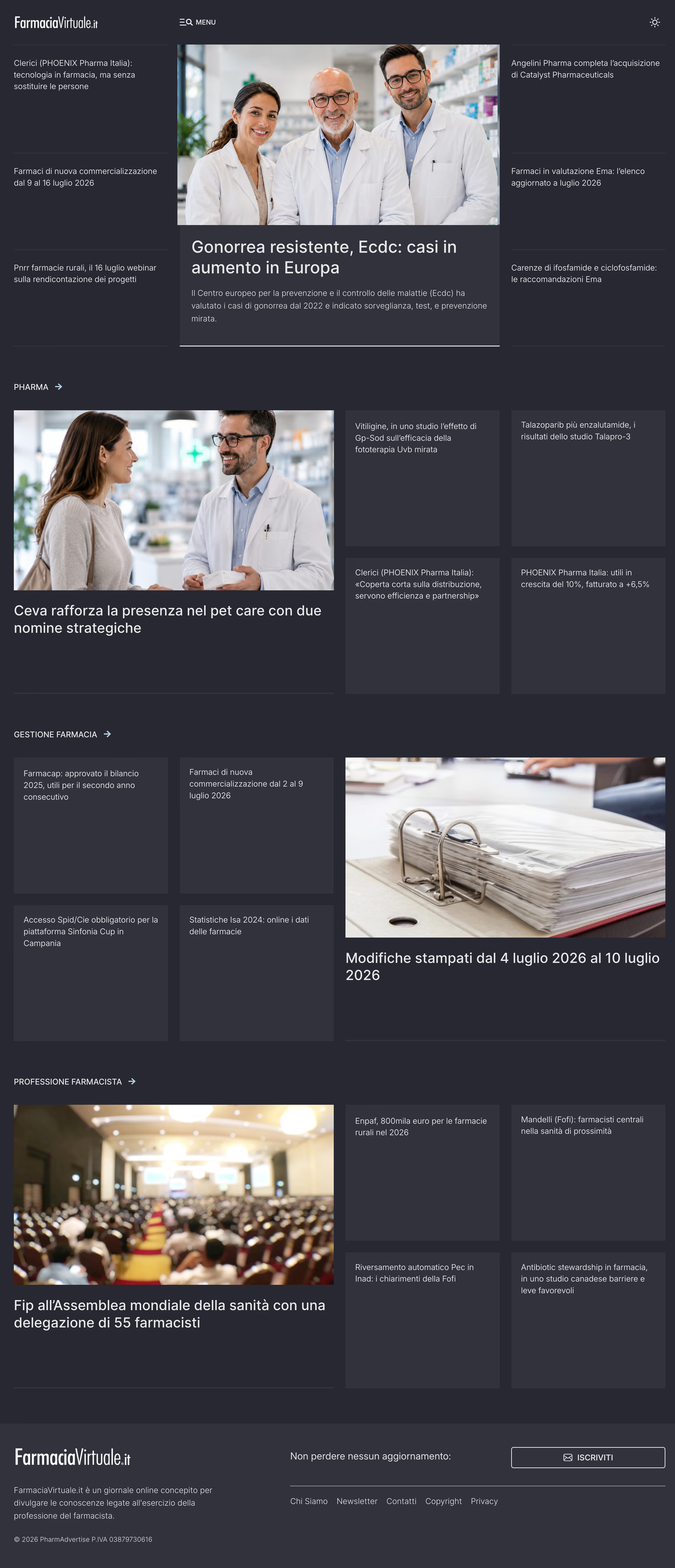
Then I built a dark theme on the same logic, reversed. White type and lighter elements hold the same hierarchy against dark surfaces, so a pharmacist reading late at night gets the same calm, the same signals, the same order.
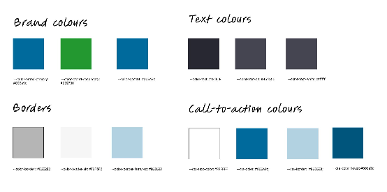
Colour never leads here. It confirms what the grid and the type have already said. That restraint is the point.
Farmacia Virtuale now looks like what it truly is
The content that was buried is easy to find. The grid makes the hierarchy visible on every page. The type stays comfortable on every screen.
And it all holds up without leaning on photography.
Most of all, the site now feels like a serious publication with a clear point of view — one that signals authority before a pharmacist has read a single article.
“I found myself in front of a prepared, reliable, serious, precise UI/UX designer, capable of interpreting our needs and putting them into practice.”
Alfonso Di StasioDirector, Farmacia Virtuale
One line in a brief did all of this. “Use fewer images” wasn't a limit to work around. It was the design decision. It told me where the authority had to come from, and everything else followed.
A constraint is a brief in disguise. Take away the easy tool, and you're forced to find the honest one.
That's what art direction does.
Want to go deeper on this? Read my book “Don’t start with visuals”.