How I used storytelling to elevate the brand experience of Omnia Safety
Quick summary This article is part of a deep-dive case study showing how I redesigned Omnia Safety’s website by clarifying the messaging, applying storytelling techniques, and using creative direction to elevate the user experience.
For the past six months, I redesigned the website for Omnia Safety, a consultancy that helps companies comply with safety regulations. The goal was simple: make their message clear and their brand memorable.
Why change was needed
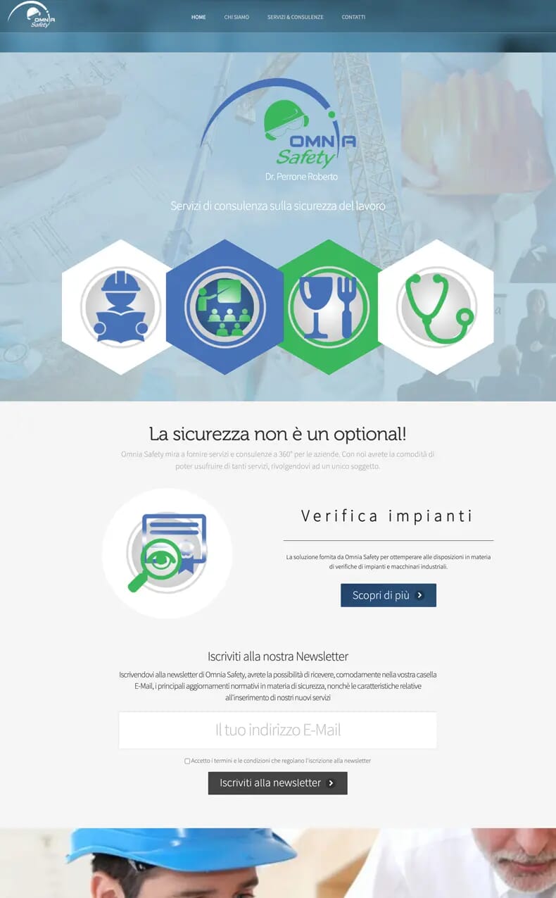
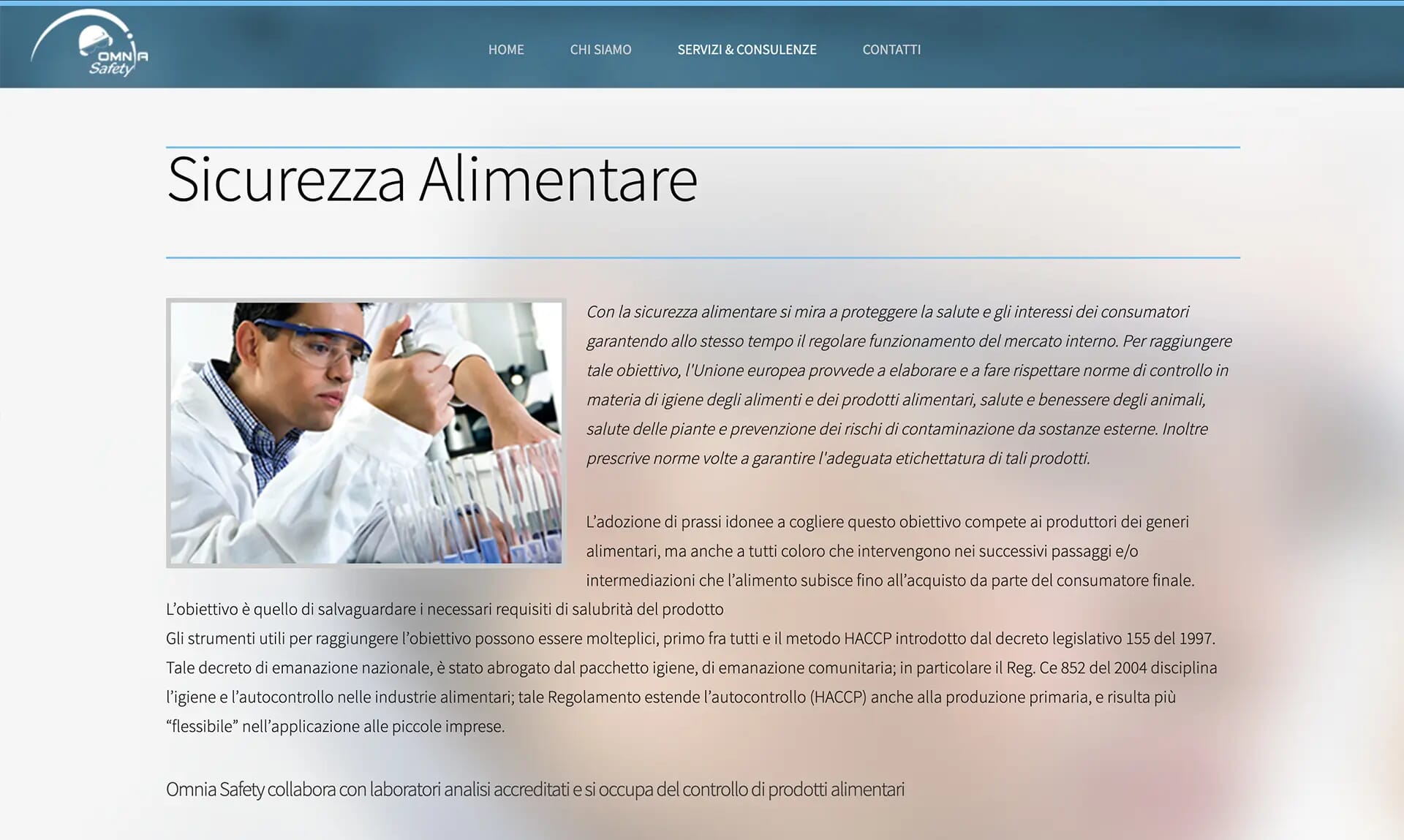
The old site was like many corporate websites—confusing, impersonal, and difficult to trust. Through storytelling and creative direction, I turned it into a site that’s easier to understand, visually distinctive, and more engaging for potential clients.
To solve this, I used storytelling and creative direction to create a website with clear communication, a stronger identity, and a user experience that builds confidence.
In this case study, you’ll see how a simple narrative, clear structure, and thoughtful visuals can turn a confusing website into one that connects with users, earns trust, and drives business growth. It’s an approach you can easily apply to your own projects.
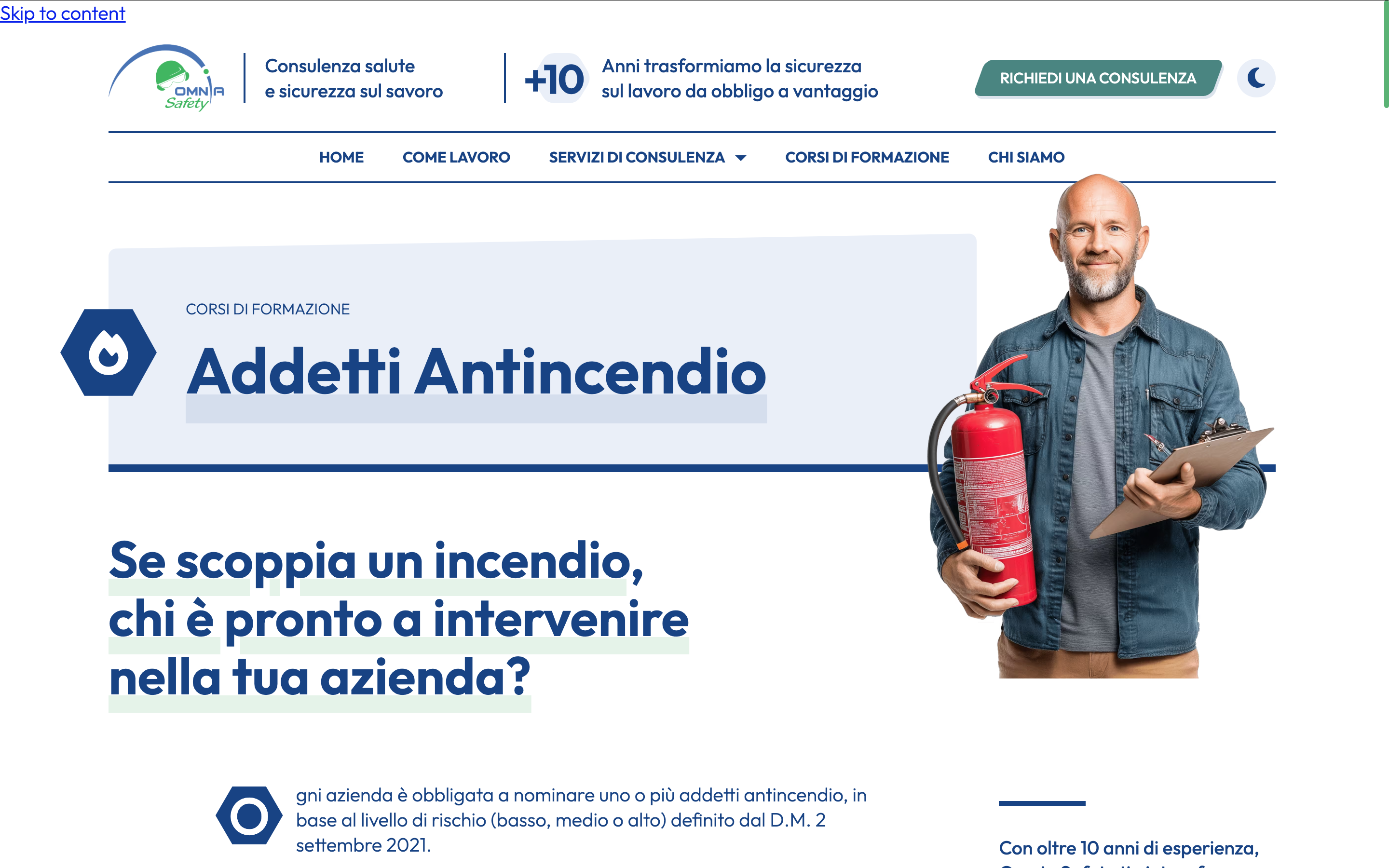
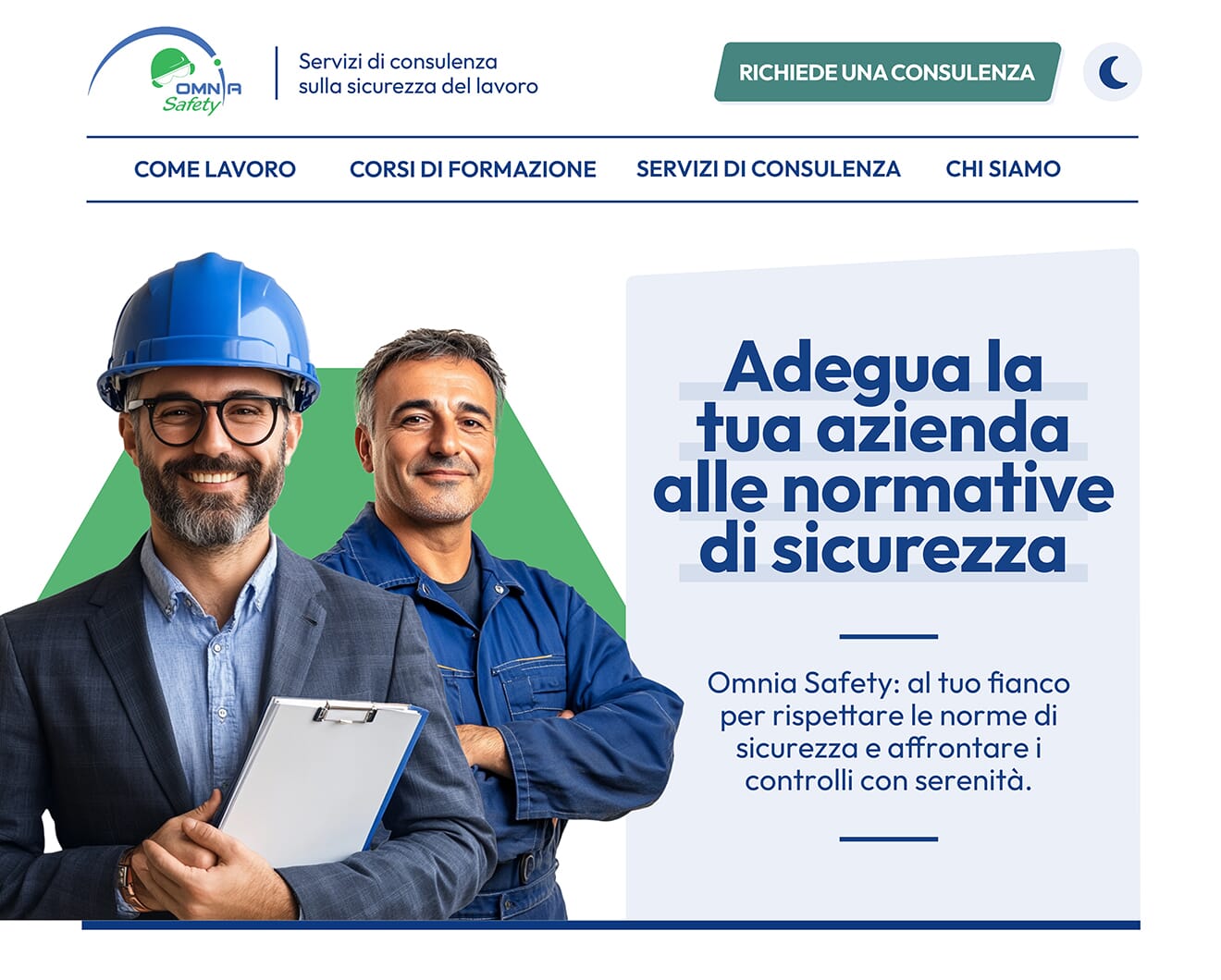
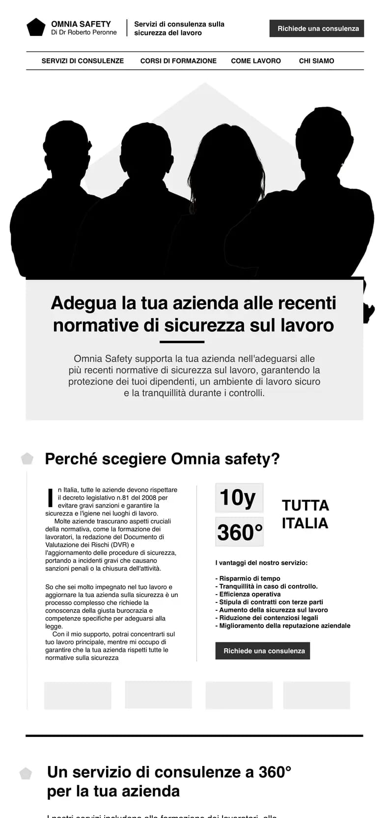
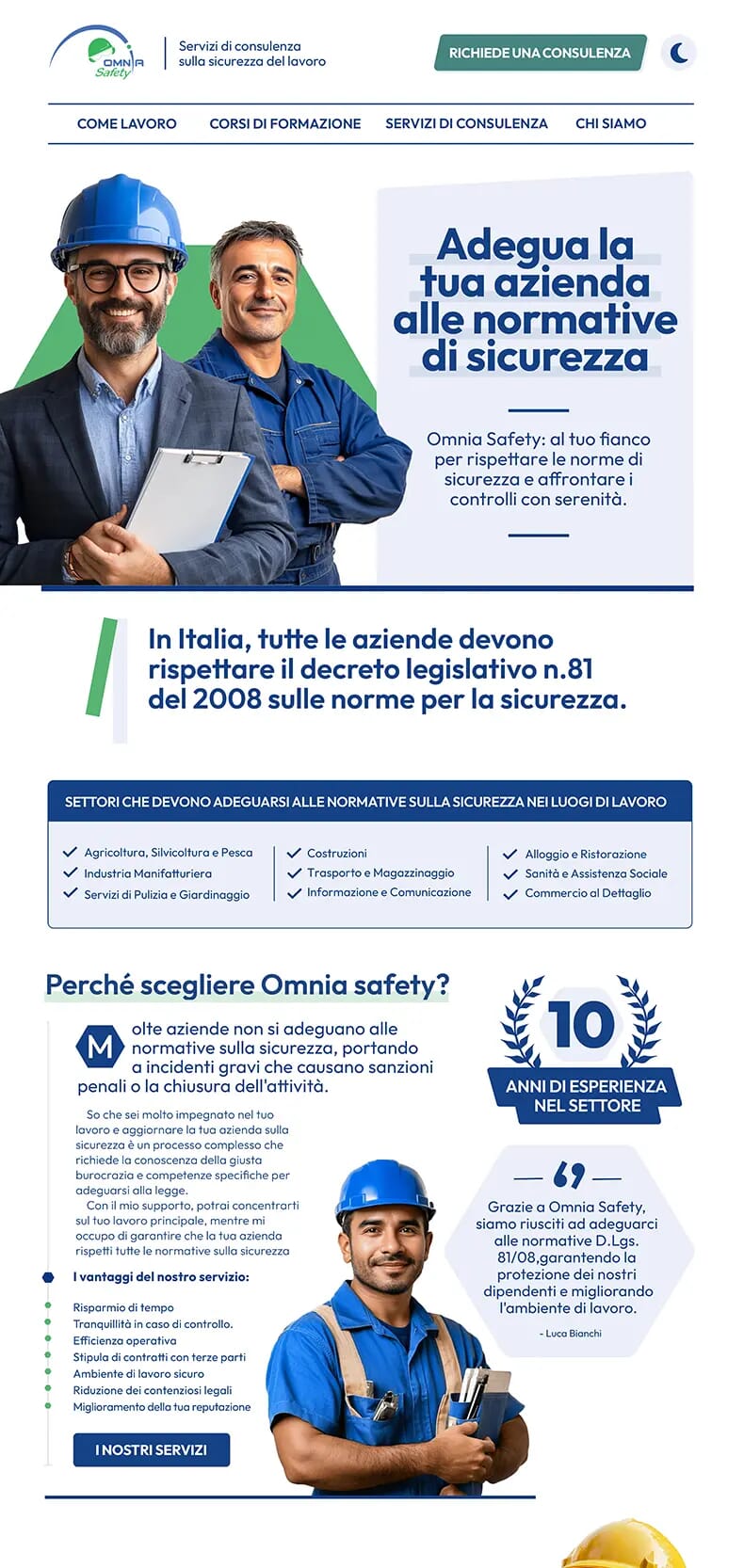
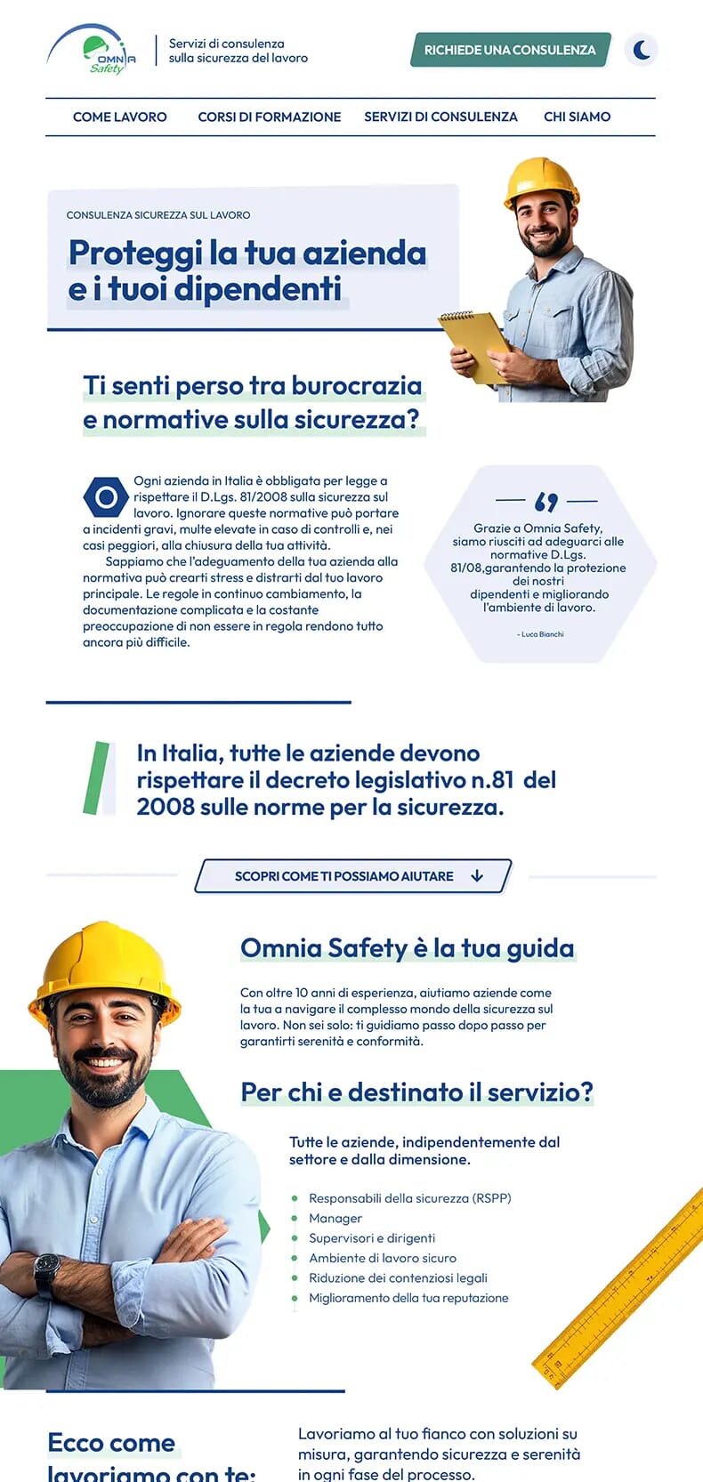
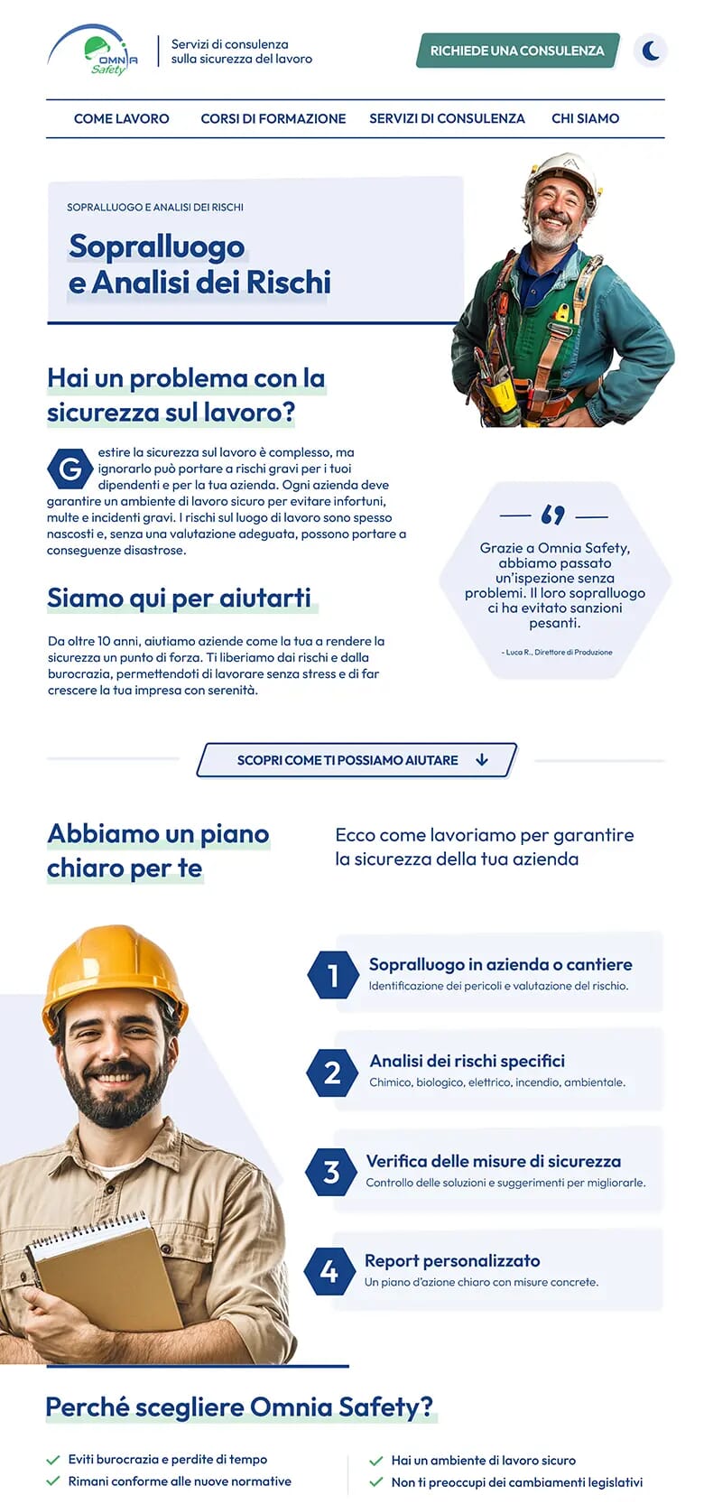
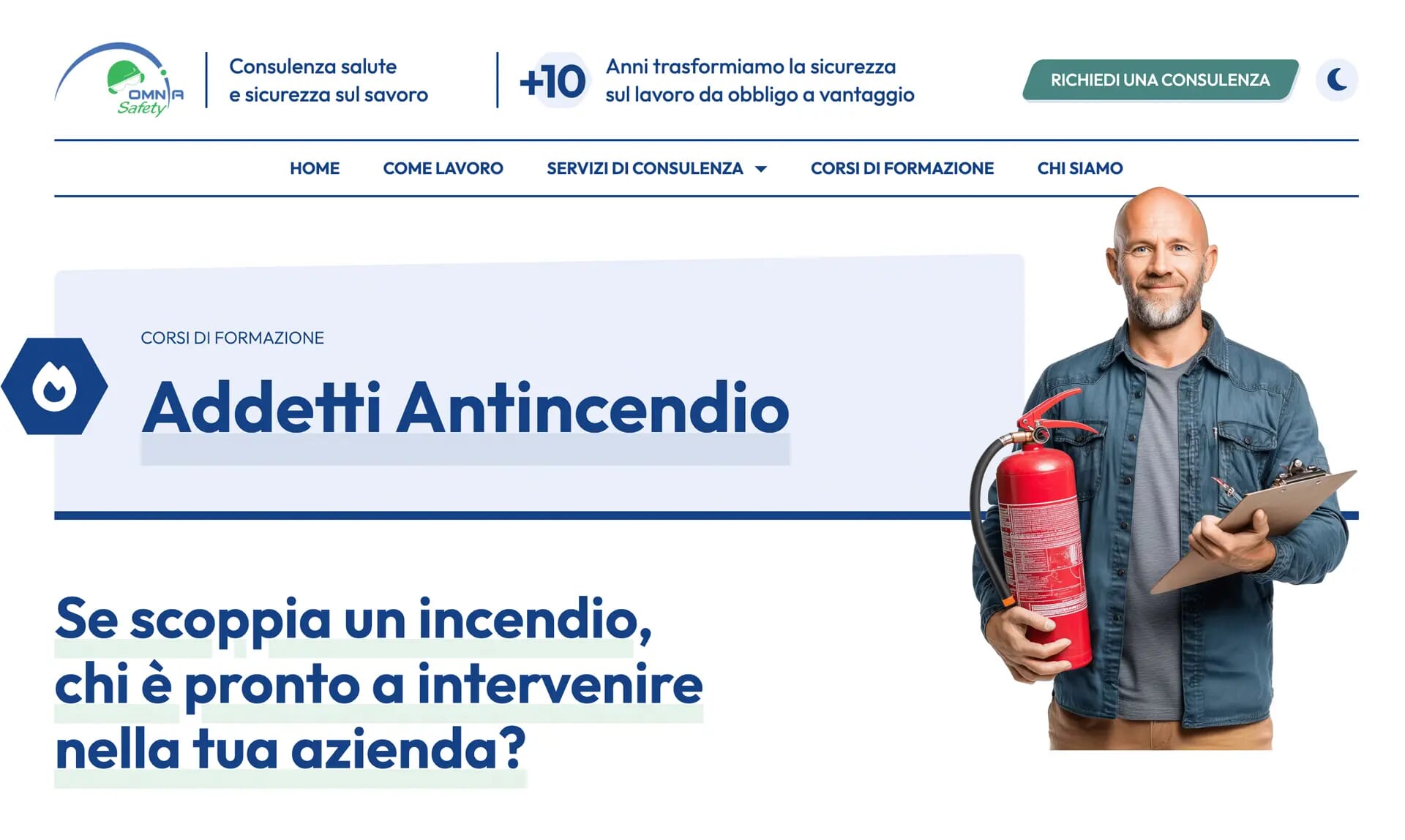
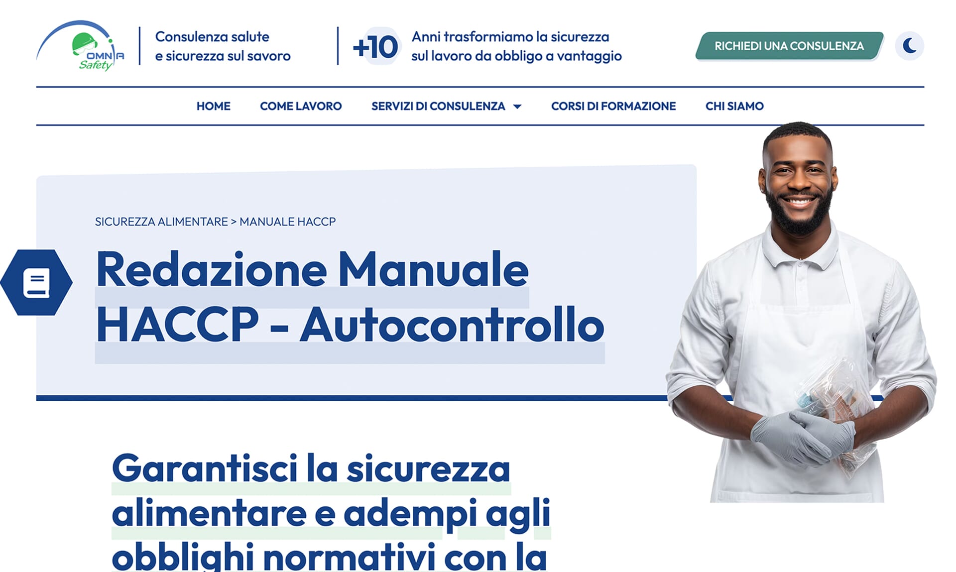
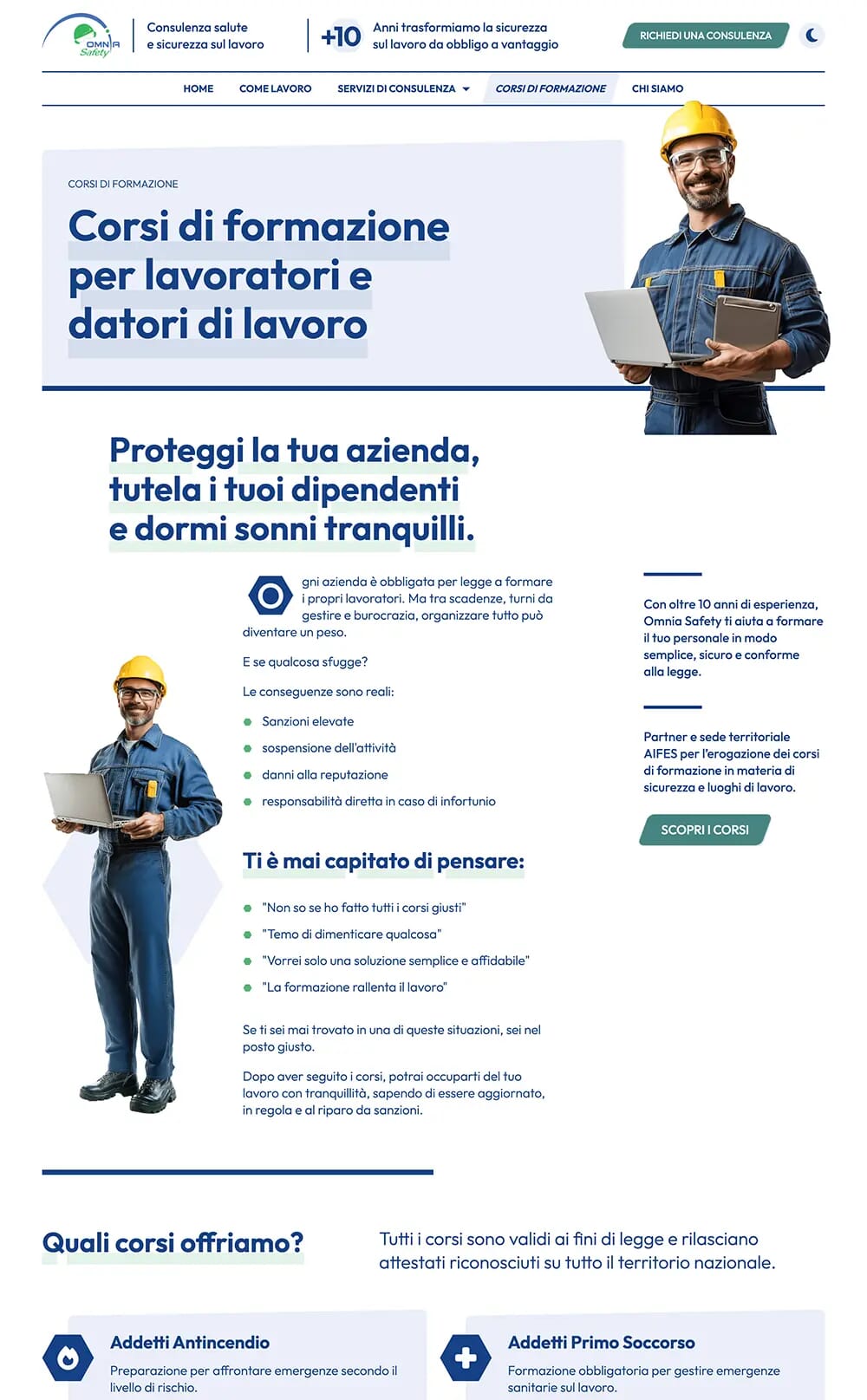
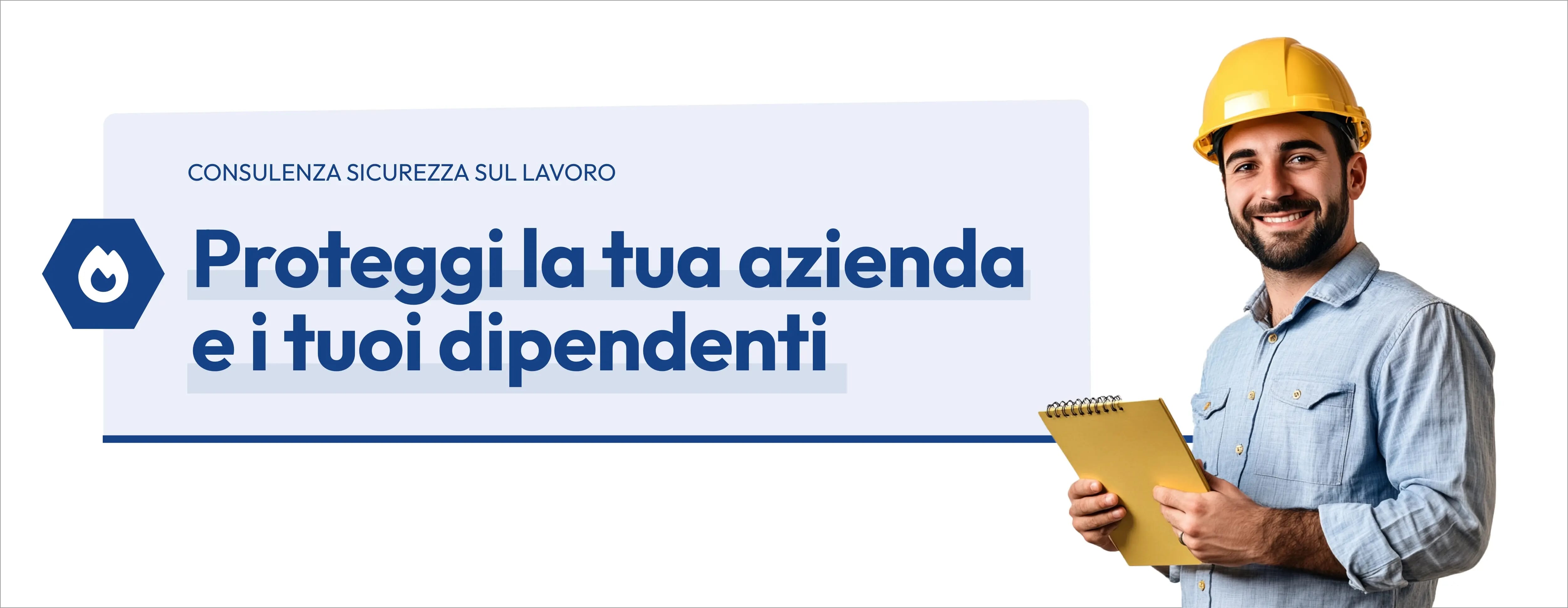
This is how the new website I redesigned looks!
Shaping the story around user Needs
When visitors landed on Omnia Safety’s website, many felt anxious — worried about inspections, fines, or compliance issues. They came looking for clarity and reassurance.
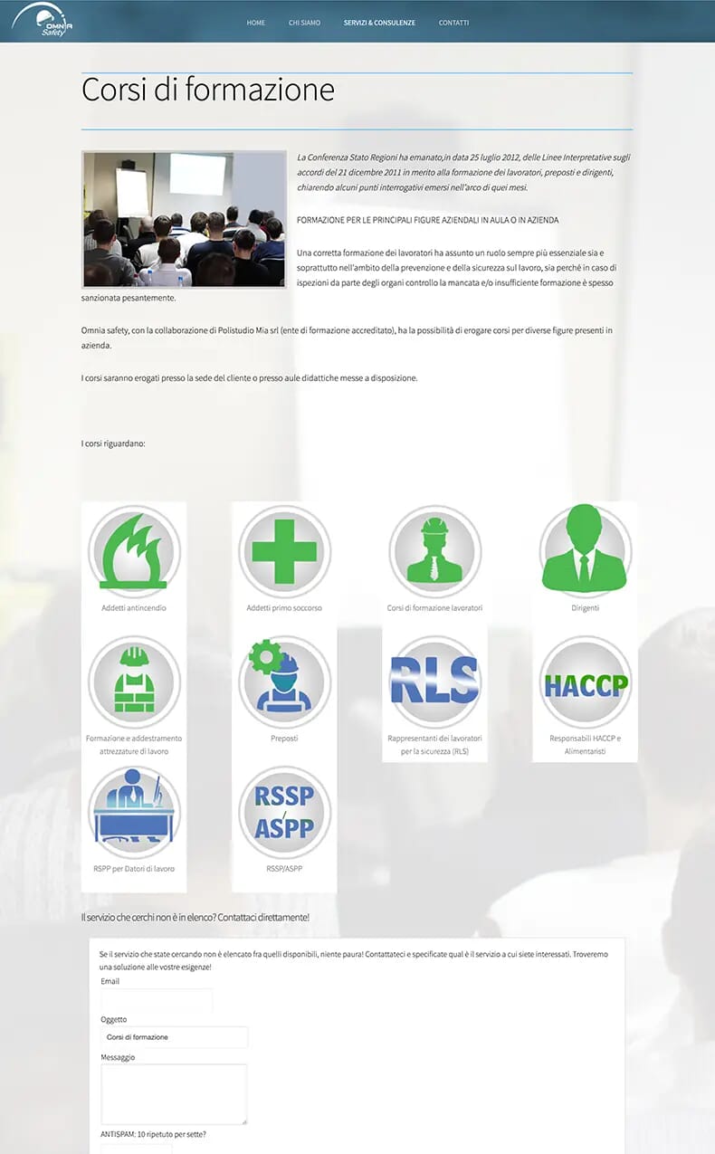
Instead, they found long pages written in formal language that felt cold and distant. The copy was full of jargon, hard to scan, and easy to abandon.
When people have to work too hard to understand what you do, they leave — and that’s exactly what was happening.
Reframing the Story Around the User
I used Donald Miller’s StoryBrand (SB7) framework to rewrite every page around the user’s story. The goal was simple: help people quickly see how Omnia Safety can help their company stay safe, compliant, and protected from costly penalties.
In this new narrative, Omnia Safety isn’t the hero — the user is. The company plays the role of a trusted guide, offering the expertise and direction needed to overcome challenges and move forward with confidence.
Answering Users’ Questions and Objections
Each page and content block was written from the user’s point of view, answering their most important questions, objections, and concerns — all to help them complete their top tasks without friction.
People decide on average in five to eight seconds whether to stay or leave a page. For them to stay, it's crucial that our core messages address their questions and alleviate their doubts.
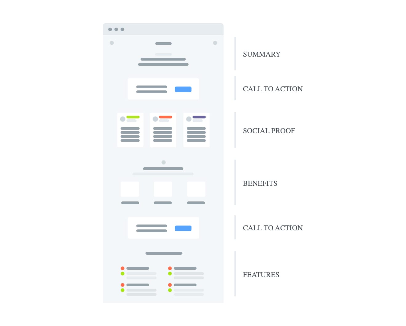
To support this, I applied Paul Boag’s content-block approach, mapping each page into modular sections that respond directly to user needs and guide them toward action.
By humanising the message and improving the structure, each page now feels both emotional and practical. Users can see themselves in the story, understand the value quickly, and feel confident reaching out for help.
Complex information was transformed into a clear, trustworthy story that naturally leads users to book a consultancy with confidence.
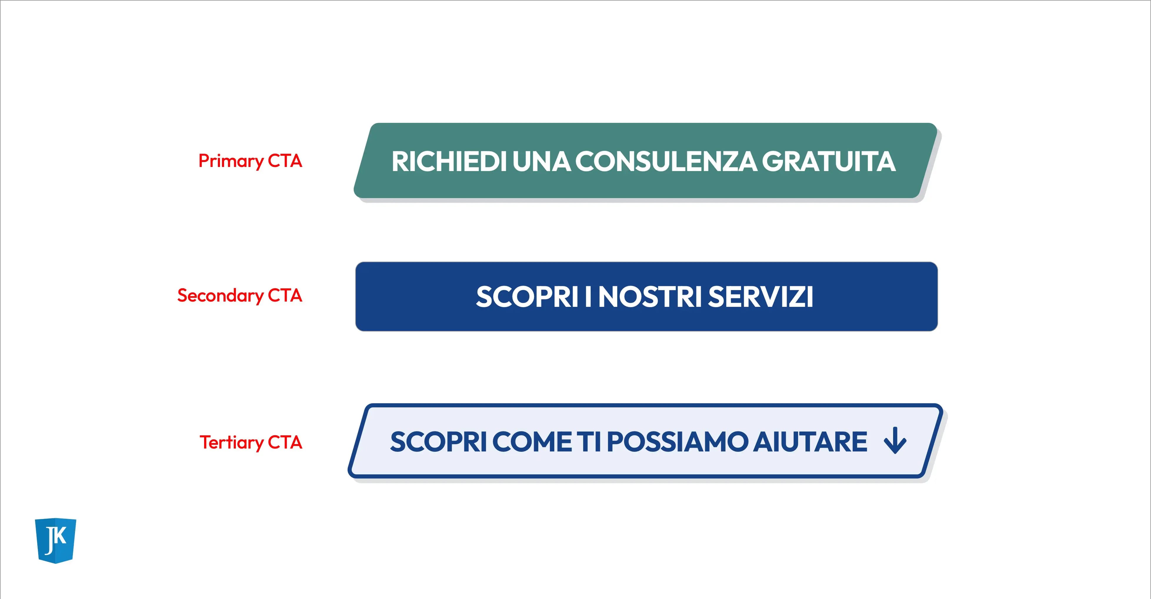
Guiding users toward the right action
While rewriting the content, I also refined the call-to-action hierarchy. Each page now includes a clear primary action — “Richiedi una consulenza” — driving the main business goal.
For users who need more time, I added secondary buttons like “Scopri di più.” These lower-commitment choices let visitors explore the offer further while naturally guiding them toward conversion.
Turning layouts into living narratives
The old site looked cluttered and outdated — important details were lost among dense blocks of content, making it difficult for users to scan, focus, or find what they needed.
To fix that, I built every page to bring rhythm, movement, and clarity to the story through distinctive grids. Each layout now guides users naturally, making the content feel alive, balanced, and easy to follow.
Here’s how I approached the design of my layouts through creative direction:
Sketching the story
I always begin with pen and paper. Quick sketches help me explore ideas freely and find the most natural way to structure the story. It’s a fast, intuitive step that keeps creativity flowing without technical limits.
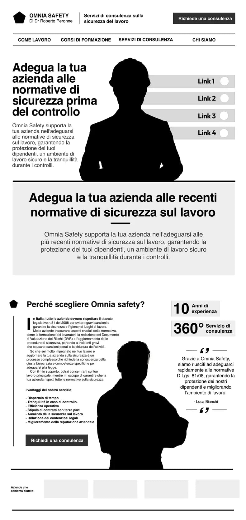
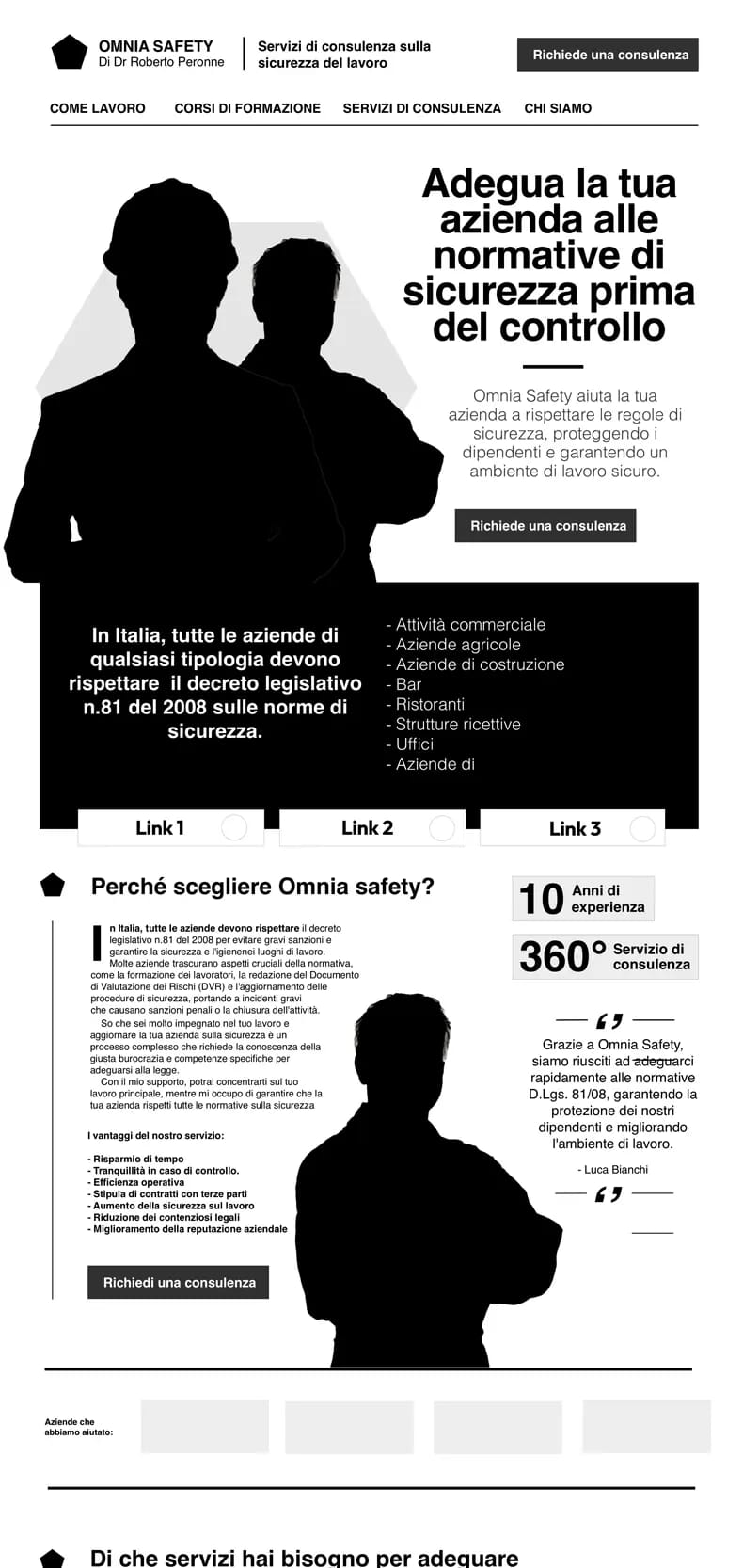
Defining Structure
Once the concept feels right, I move to black-and-white wireframes. This stage is about testing structures, pacing, and visual rhythm. Without the distraction of colour, I can focus on how the eye moves, where to pause, and what should stand out. I explore multiple variations until one clearly tells the story and feels ready to grow.
When the structure felt right, I began exploring how to bring the story to life through colour, typography, and imagery.
Adding emotion and energy
With the foundation in place, I added emotion through colour, typography, and imagery to bring personality and clarity — turning each interface into a meaningful user experience. Like rhythm in music, every element plays its part: grids create balance, hierarchy directs focus, and a touch of asymmetry adds movement and energy that keep users engaged.
The art-directed approach made the design distinctive, intuitive, and memorable. Each layout now guides users naturally, blending clarity with personality and helping them navigate the content with confidence.
With the structure and emotion in place, I focused on how visual storytelling could add warmth and relatability.
Bringing stories to life
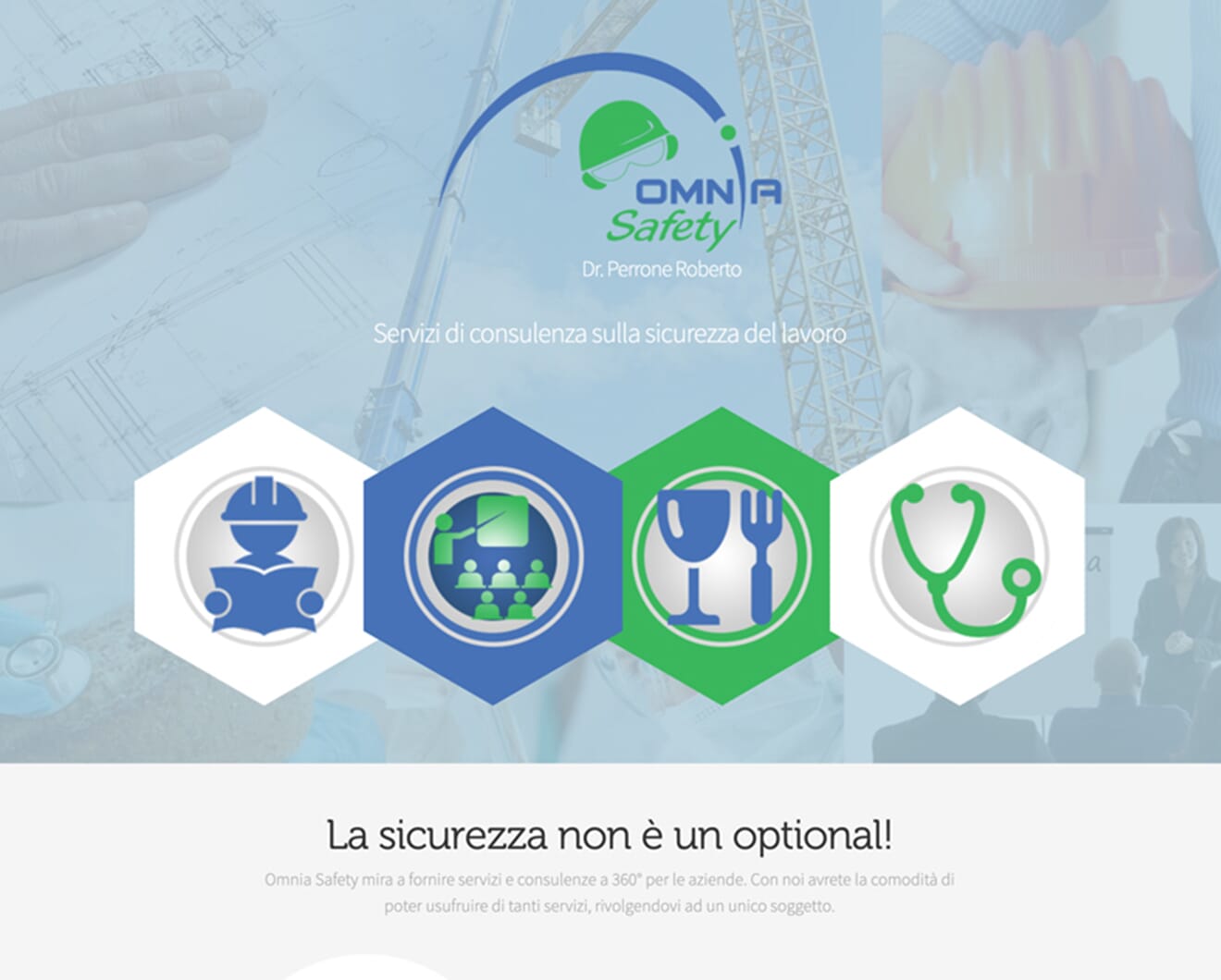
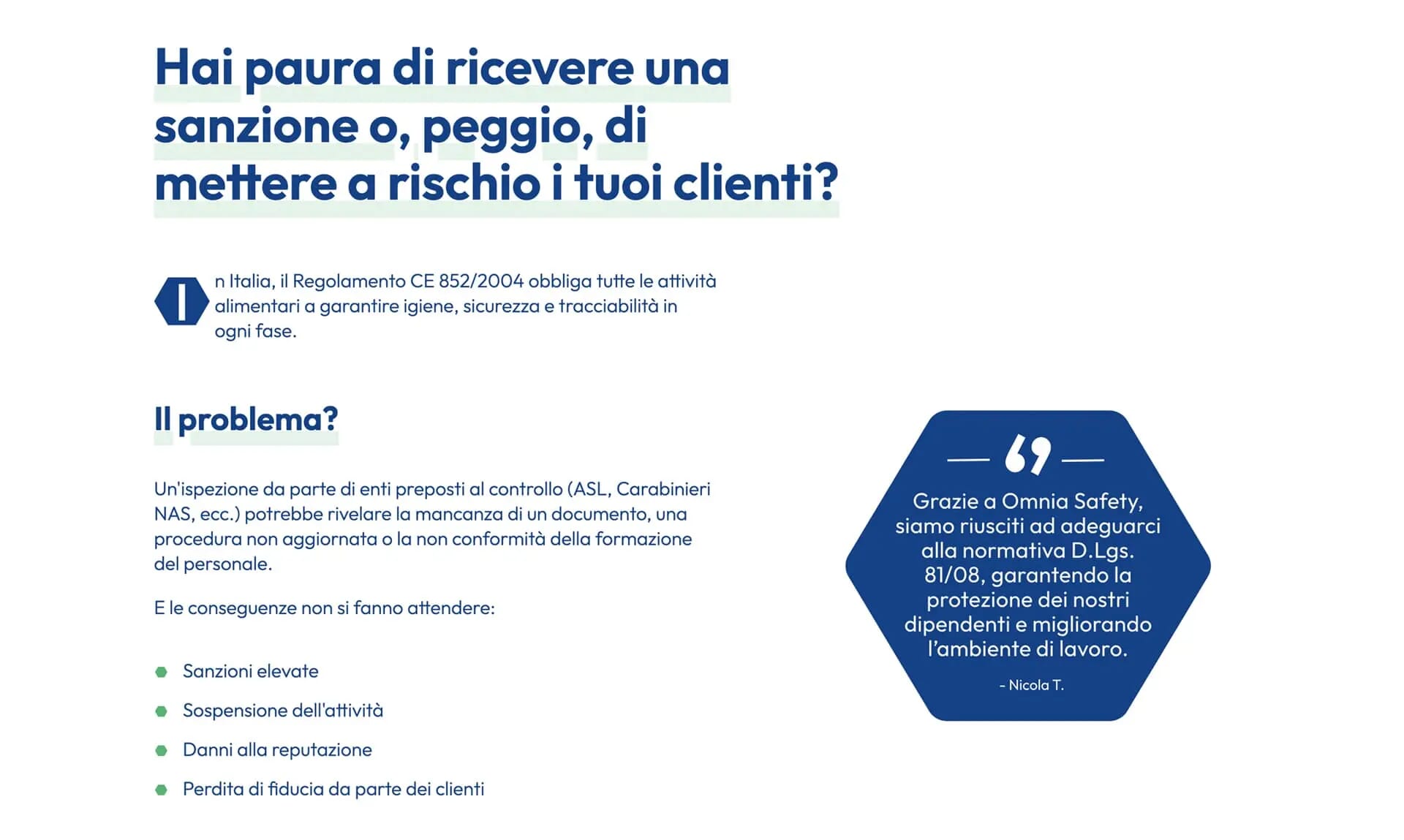
Because we are biologically programmed to focus on faces, I introduced lead characters for each page to enhance the storytelling. Each character represents a specific role, designed to capture attention, direct the eye to key messages, and highlight call-to-action buttons.
When you mix pictures with stories on a website, it gives personality to the site. This helps users feel connected and excited to explore the different content available.
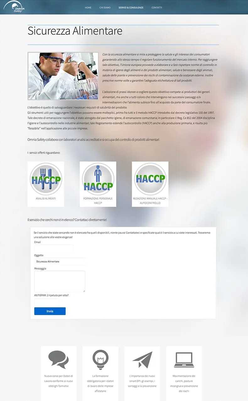
Guiding understanding through icons
Icons play a key role in shaping clarity and storytelling. On the site, I used them to visually define consultancy and training services, helping users quickly identify these sections.
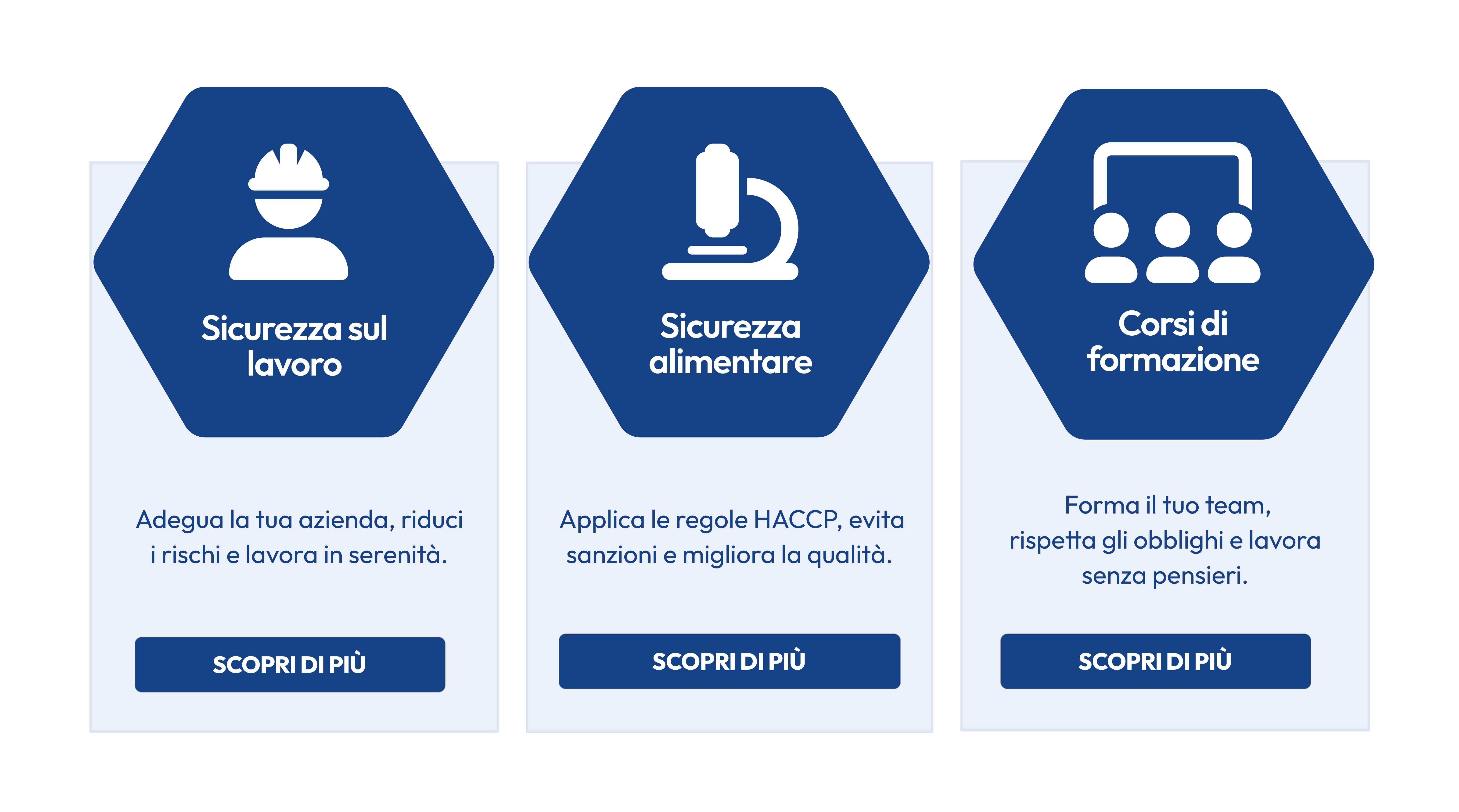
I built a consistent icon library aligned with Omnia Safety’s visual identity. Each service has its own recognisable symbol, turning complex information into clear and intuitive messages.
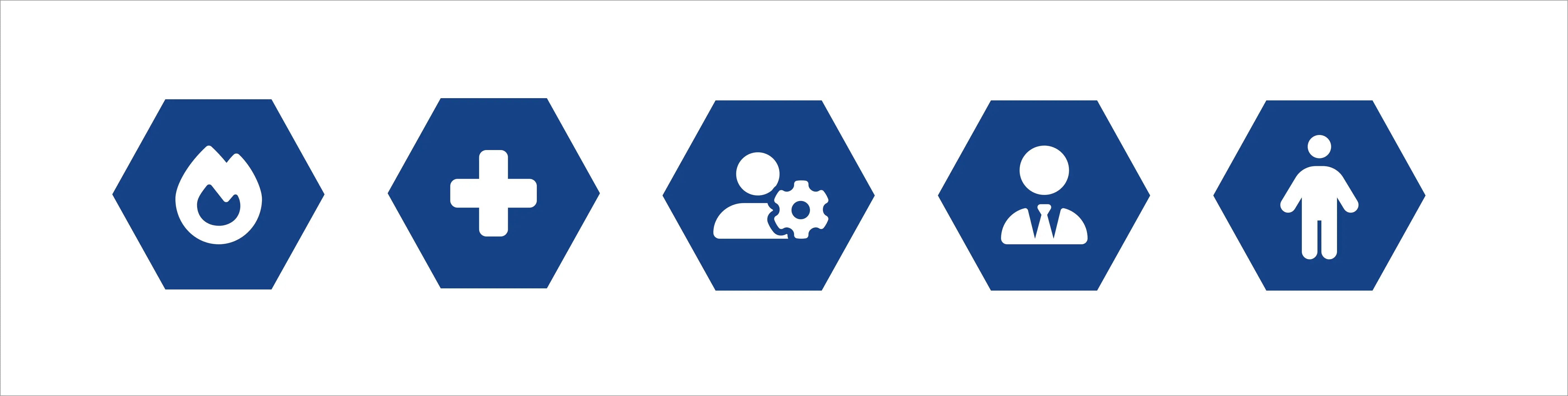
Combined with imagery and layout, icons add personality and accessibility. The brand voice becomes both authoritative and warm—ensuring the content is understood and remembered.
Shaping mood and consistency
The earlier palette felt cold and flat. To add personality and energy, I expanded the original colours with fresh tints and shades. The new spectrum of blues and greens, balanced with neutral greys and bright accents, created consistency across text, surfaces, backgrounds, links, and calls-to-action.
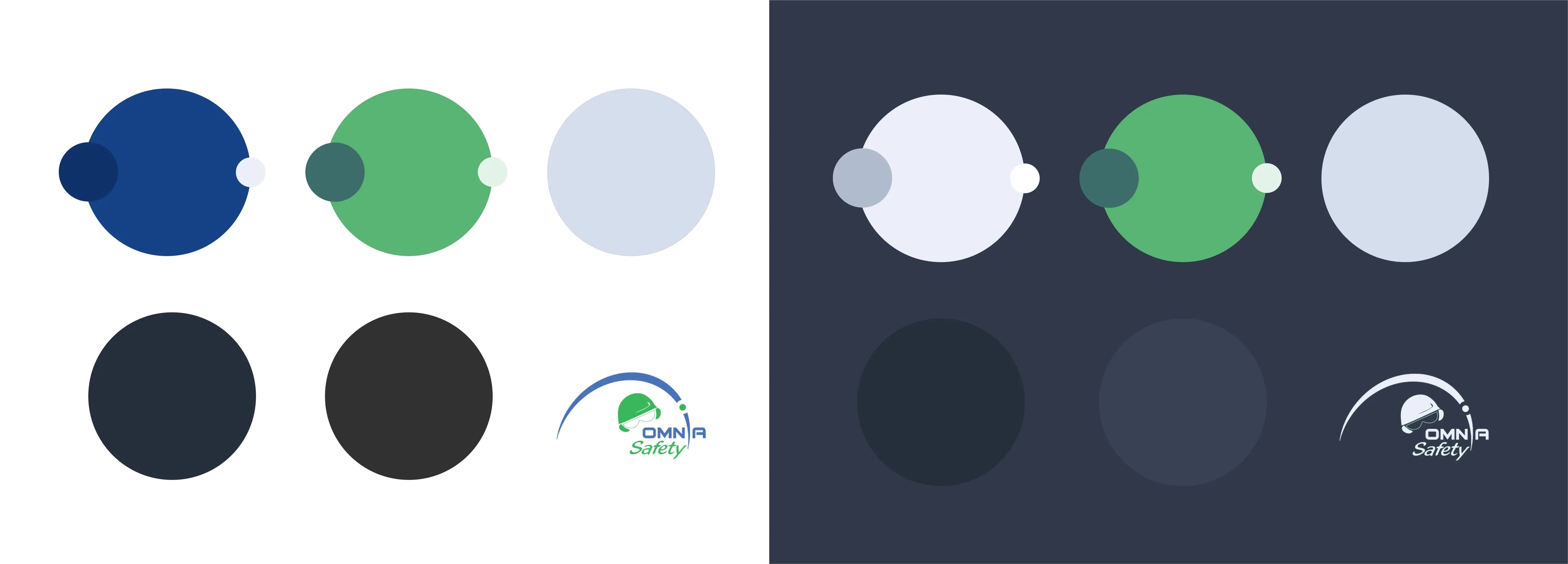
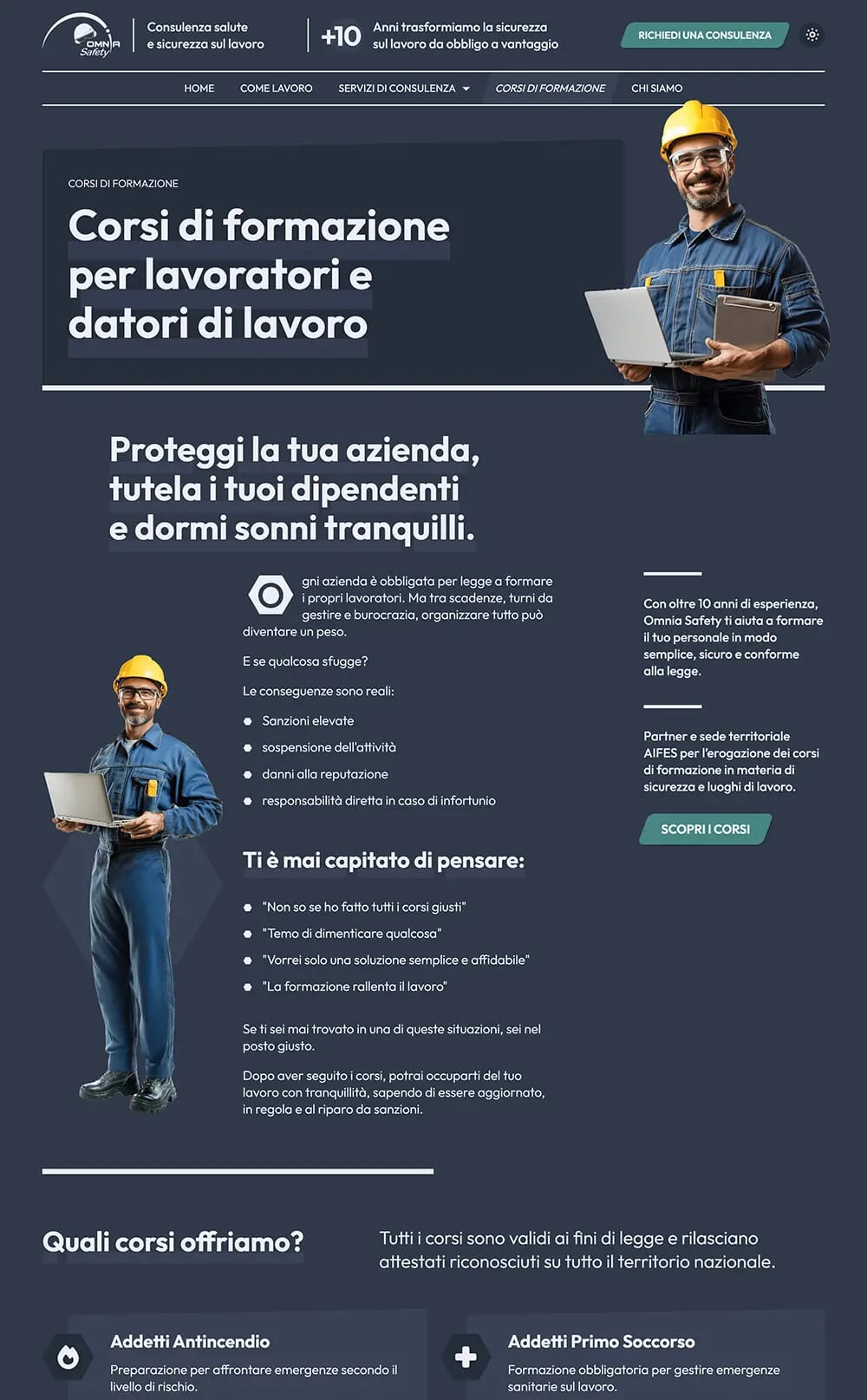
To enhance user experience and accessibility, I implemented both light and dark themes, giving users a choice of interface.
The light theme evokes clarity and trust with crisp blues, soft greys, and green tones. The dark theme uses deeper shades of blue and grey to create focus and atmosphere. Together, they define a unified brand identity across contexts.
By creating an improved palette and two complementary themes, the design now supports storytelling, improves usability, and makes the brand more memorable.
Giving the brand a voice
The previous site had a weak hierarchy with low contrast and shallow scaling, which made scanning difficult.
I introduced a larger visual scale to create stronger contrasts between headings, paragraphs, and lists, using size and weight to emphasise key messages and capture the user's attention. This improved readability, strengthened narrative flow, and gave the design more character.
I selected Outfit for its range of weights and modern character. Its generous x-height improves paragraph readability while keeping headlines sharp and noticeable.
To add more personality, I designed custom headline styling. Underlined headlines act as graphic devices, emphasising key sections without overwhelming the content.
The result is a typographic system that significantly improves usability while elevating the narrative experience.
Conclusion
The redesign transformed Omnia Safety’s website into a clear, human experience built around user needs. Using the SB7 framework, I shaped the story so every page speaks directly to what matters most — helping users understand, trust, and act.
By treating the interface like a well-directed story — with structure, rhythm, and emotion — the site now feels alive and purposeful. It guides users naturally, balances clarity with character, and turns complex information into a confident, engaging journey.
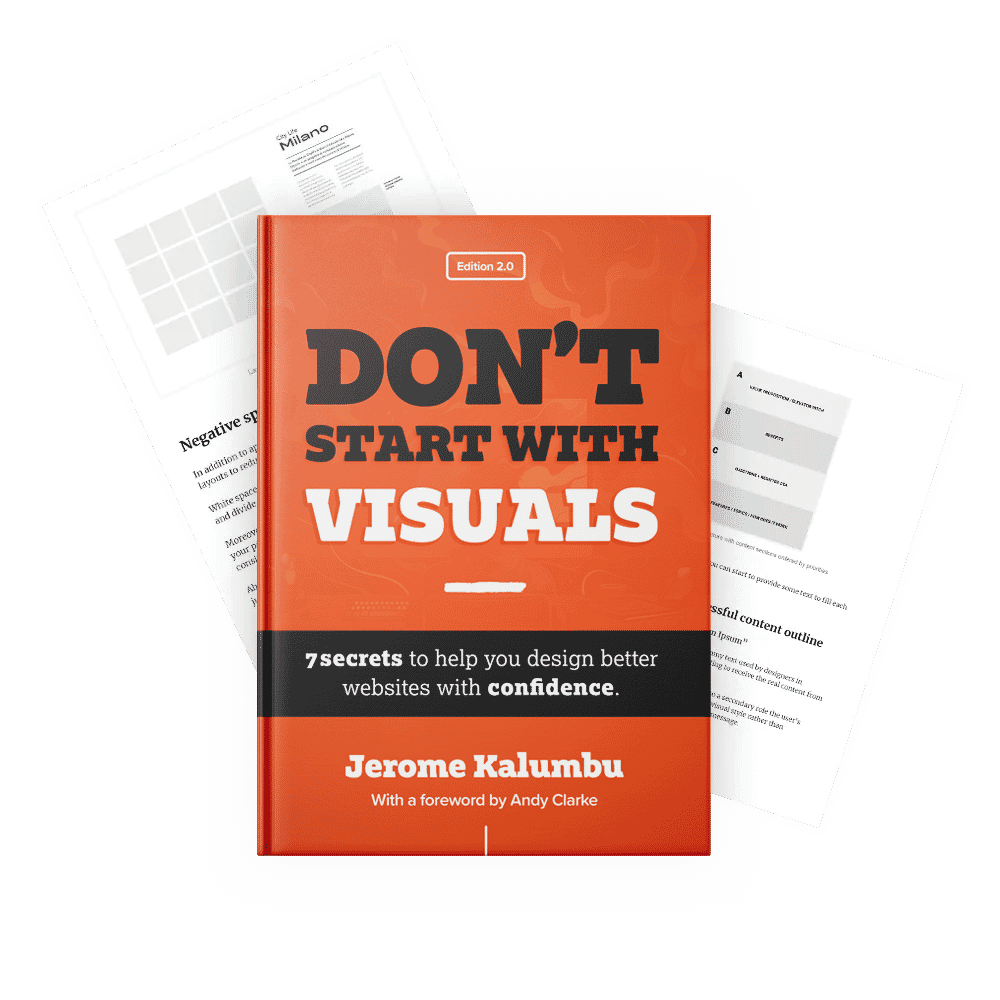
If you want to learn more about this topic, read my book “DON’T START WITH VISUALS”.