Comunicare in Farmacia website redesign
Mission:
The mission of this project was to redesign the website for the brand Comunicare in Farmacia, a platform to provide consultancy and online courses services for pharmacists.
The Challenge
The challenge of this project was to redesign the website including provide a new creative direction in order to:
- Improve the brand awareness;
- Increase engagement;
- Improve customer satisfaction and the overall user experience;
- Increase the number of newsletter subscriptions.
Outcome
By delivering a redesigned site, the company has gained:
- Awareness;
- Credibility;
- An increase of daily site visitors +43%;
- A site accessible, engaging and easy to use.
- (Reading time: 5min)
Team
In this project, I collaborated with the client Alfonso Di Stasio (Founder of Comunicare in Farmacia).
Discovery phase
Business Goals
I started the project by getting to the root of the problem to solve and understand the business goals by asking the client critical questions.
After this first exercise, I understood that my designs needed to help the client with the following:
- Sell more consultancy service;
- Increase newsletter subscriptions;
- Improve brand awareness
User research
Once we clarified the business goals, the next step of my process was to do some light research to understand the user profile and needs.
This step consisted of asking the client questions and surveying users to understand their needs better.
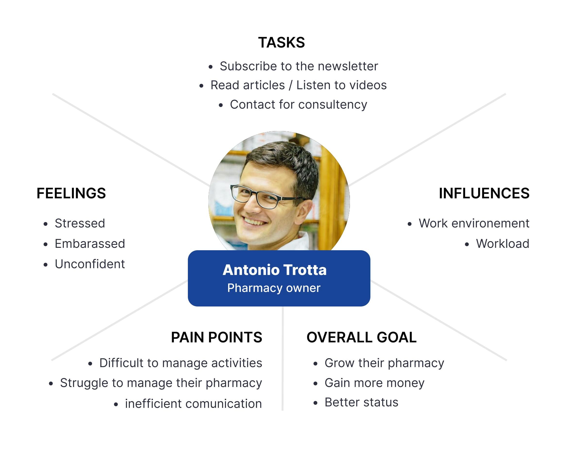
From the information we got, I created an empathy map to create a clear picture of the user and keep in mind what they want to achieve.
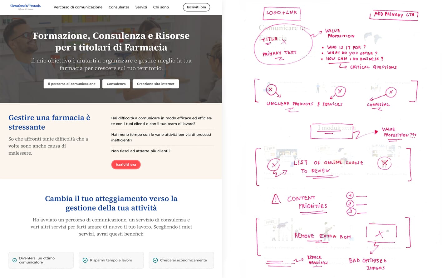
Website UX Audit
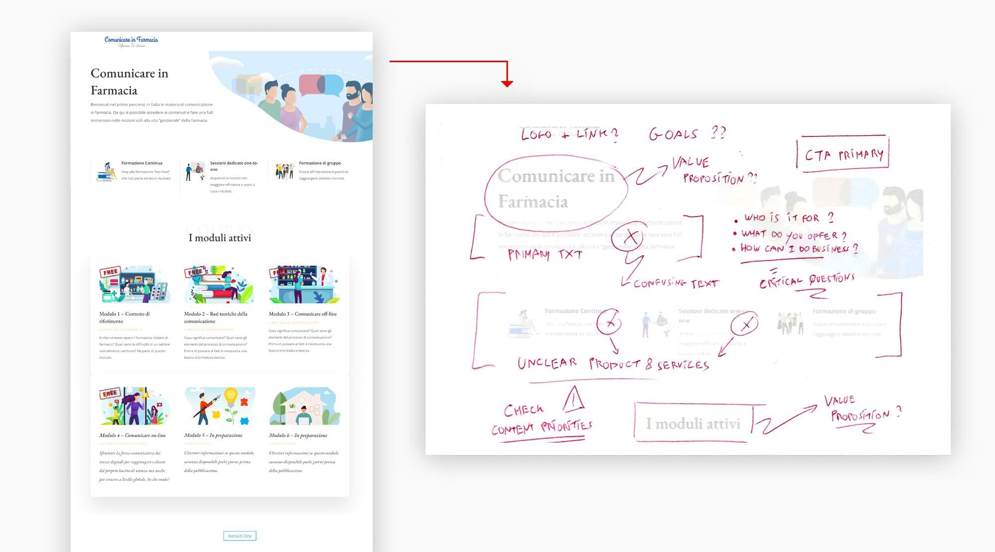
Before redesigning any website, I like to review every page, including interactions, flows, visual design and brand messages, to understand how these elements could be improved in order to deliver a better user experience.
In this project, we identified several issues that undoubtedly made the business lose sales:
- Unclear value proposition;
- Lack of engagement on the content;
- Absence of brand message;
- Bad typesetting;
- Cluttered pages;
- Confusing pages structures.
Now that we have undertaken several exercises to understand the project goals, context, audience and how the current website performs, I applied different solutions to redesign a better website for users and the business.
Brand clarification and attributes
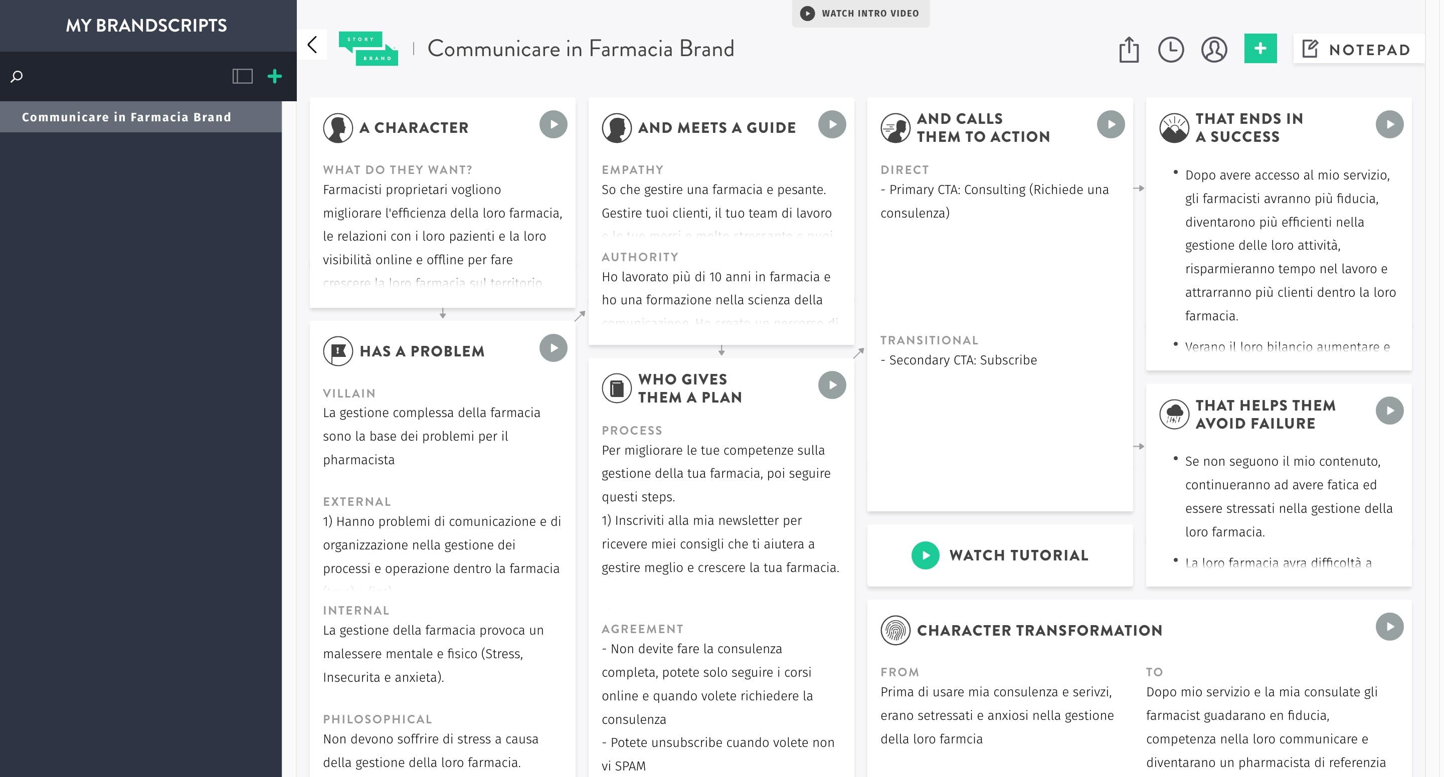
One of the biggest issues of the website was a lack of clarity about the content and the business value proposition.
I used the StoryBrand Framework to clarify the brand and generate key messages to use as a solid foundation in my designs.
To stay in line with the brand, I also defined four brand attributes with the client to determine the tone of voice and design atmosphere of the new website to stay in line with the brand.
- Authority;
- Professional;
- Trustworthy;
- High-quality.
2. Structure Sitemap + Content + Linear Aproach
Sitemap
Now that the brand is clarified, the next step of my process is to define the website's structure based on user needs and business goals.
Creating a sitemap was essential for me to get an idea about the kind of content I should consider adding under each page.
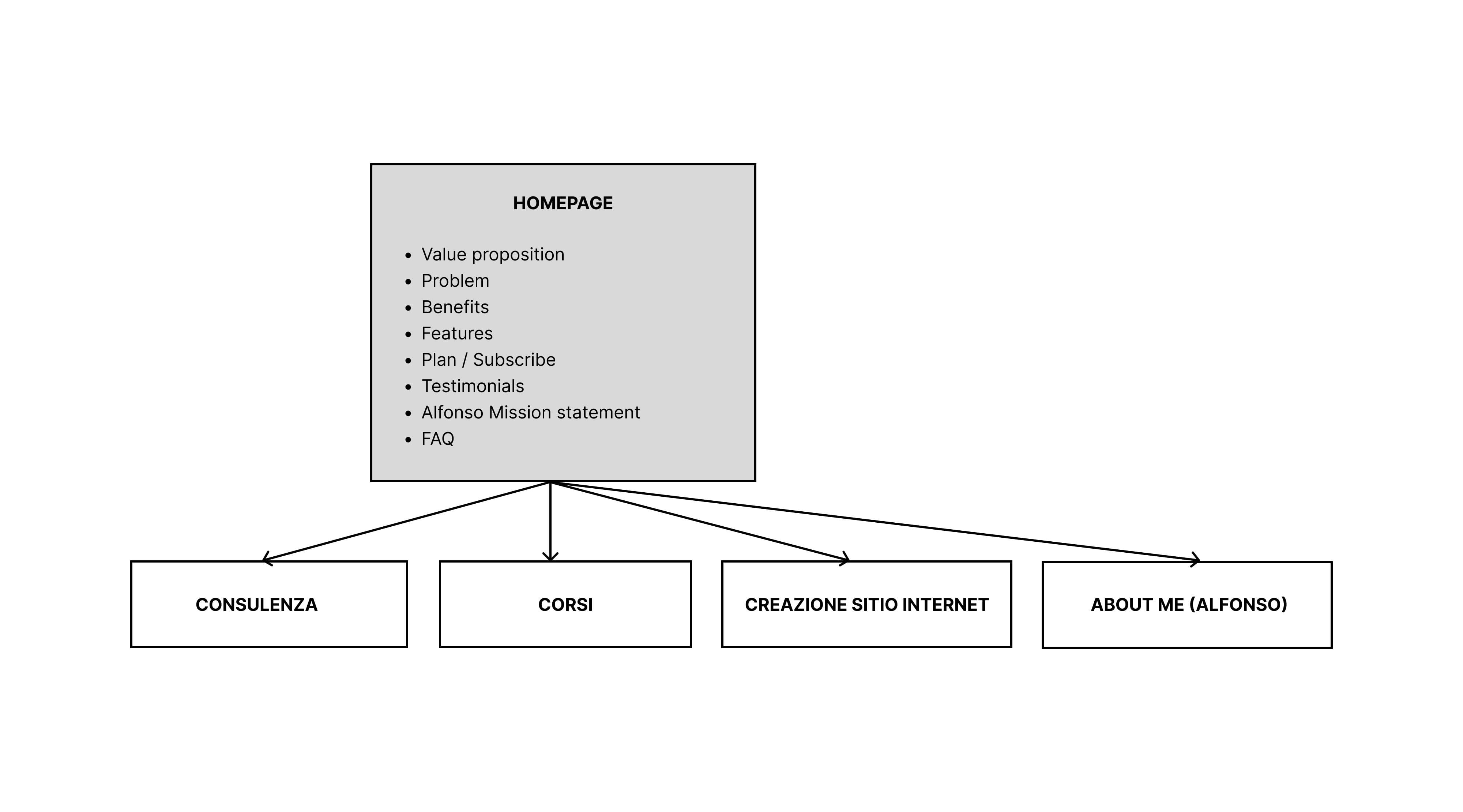
Content priorities with linear-approach
Once the sitemap was established, I worked on defining the content priorities of the content with the client in order to determine the correct order to avoid confusing users and keep our communication focused.
Content
Since content is an essential part of UX, It’s the foundation of my creative process.
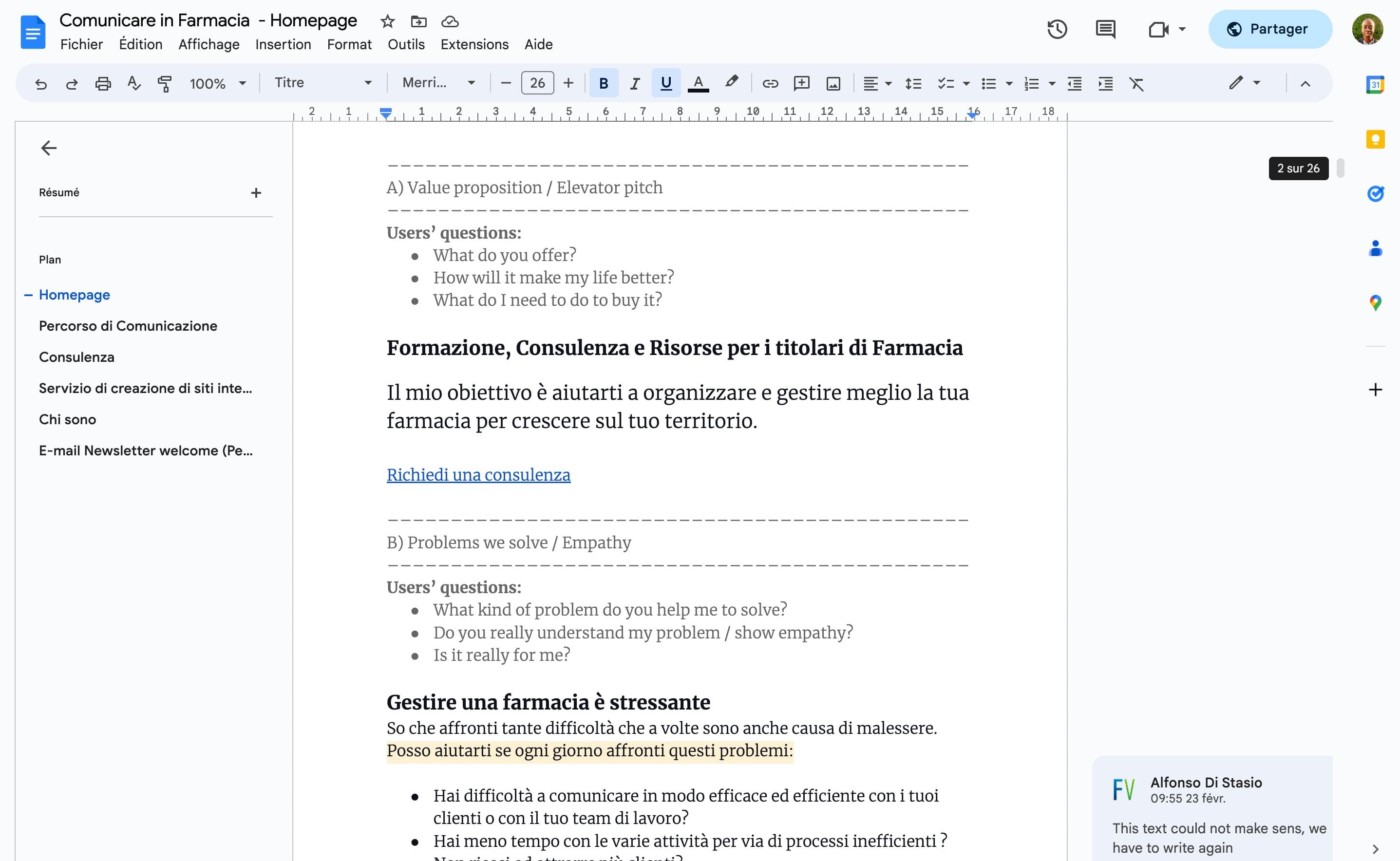
On every project I work on, I review and optimize the content with the client to ensure that it answers the users burning questions and business goals.
In this project, I created a content draft for each page based on the following:
- A list of user’s questions;
- The key messages from the StoryBrand framework;
- Content Priorities from Linear Approach.
Once the content draft was established, the client corrected it according to his needs.
Wireframes
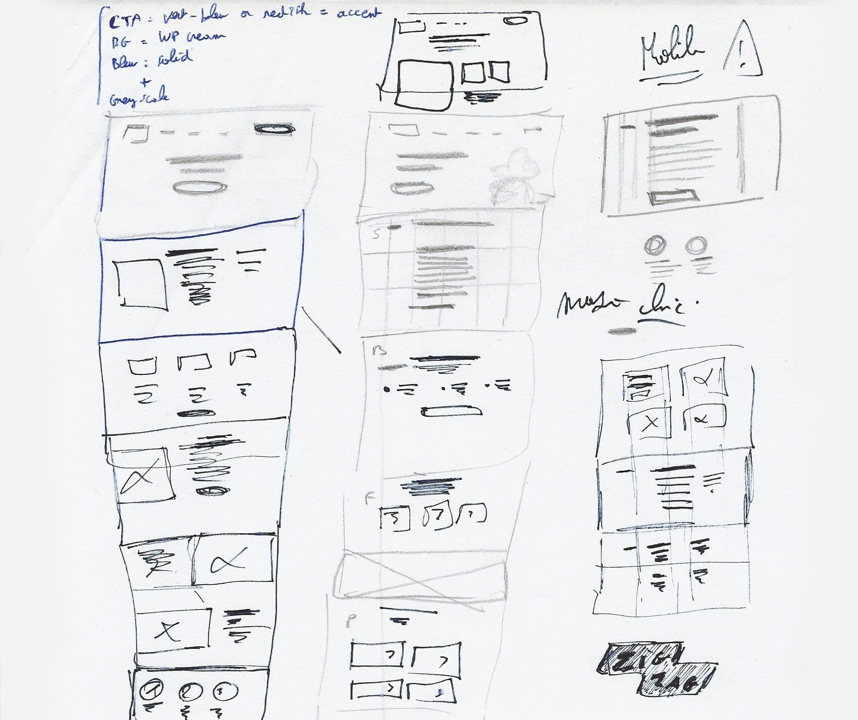
Before defining the design direction, I like to create quick low-fi sketches to get an overview of the pages' structures, including individual elements on each page. This is important for me to understand how we could organize the information on the pages.
Depending on the size of the project, I decide whether or not to move those sketches to mid-fidelity wireframes that I can test and iterate.
Since this project was small and with a low budget, I moved directly to the visual direction in order to get everything to the prototyping stage as soon as possible.
Creative direction
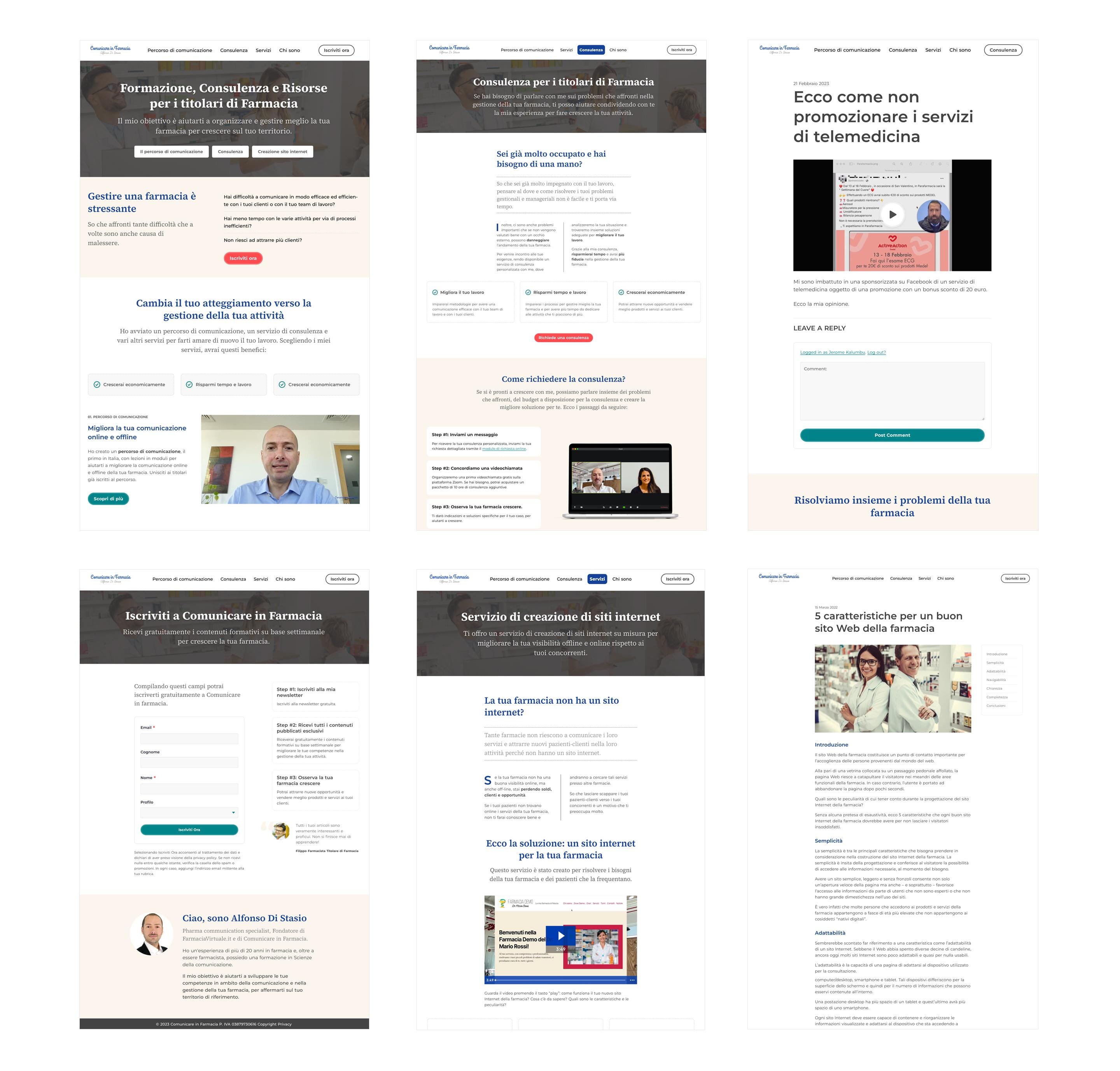
In my process, working on the visual direction consists in creating a few initial mockups on Figma to define the design direction I would like to follow in order to create the design of the website.
I usually consider three main aspects that will create the foundation styles of my designs:
- Typography;
- Grids;
- Colors.
Typography
Typography also represents a large part of my creative process since it’s a critical element of the user experience.
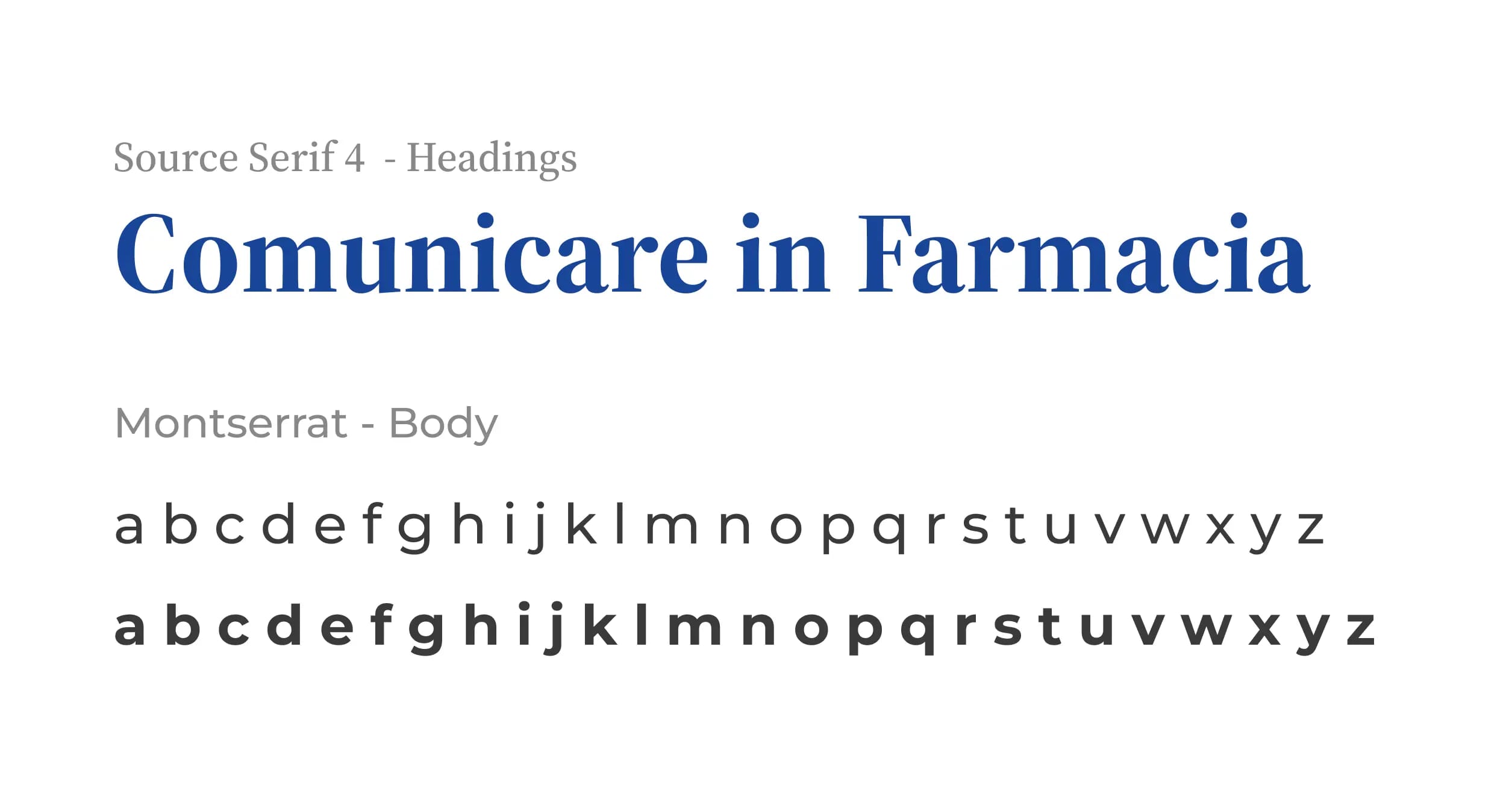
For this project, I combined the typeface Montserrat for the body copy since it offers a pleasant reading experience thanks to its generous shapes and x-height.
For headings, I chose the serif typeface Source Serif Pro 4 since it offers great contrast and feels educational and authoritative when combined with Montserrat.
The test I conducted helped me and the team understand that the prototype failed to communicate effectively several key information to the users. Below are the problems I identified during the test.
Grids
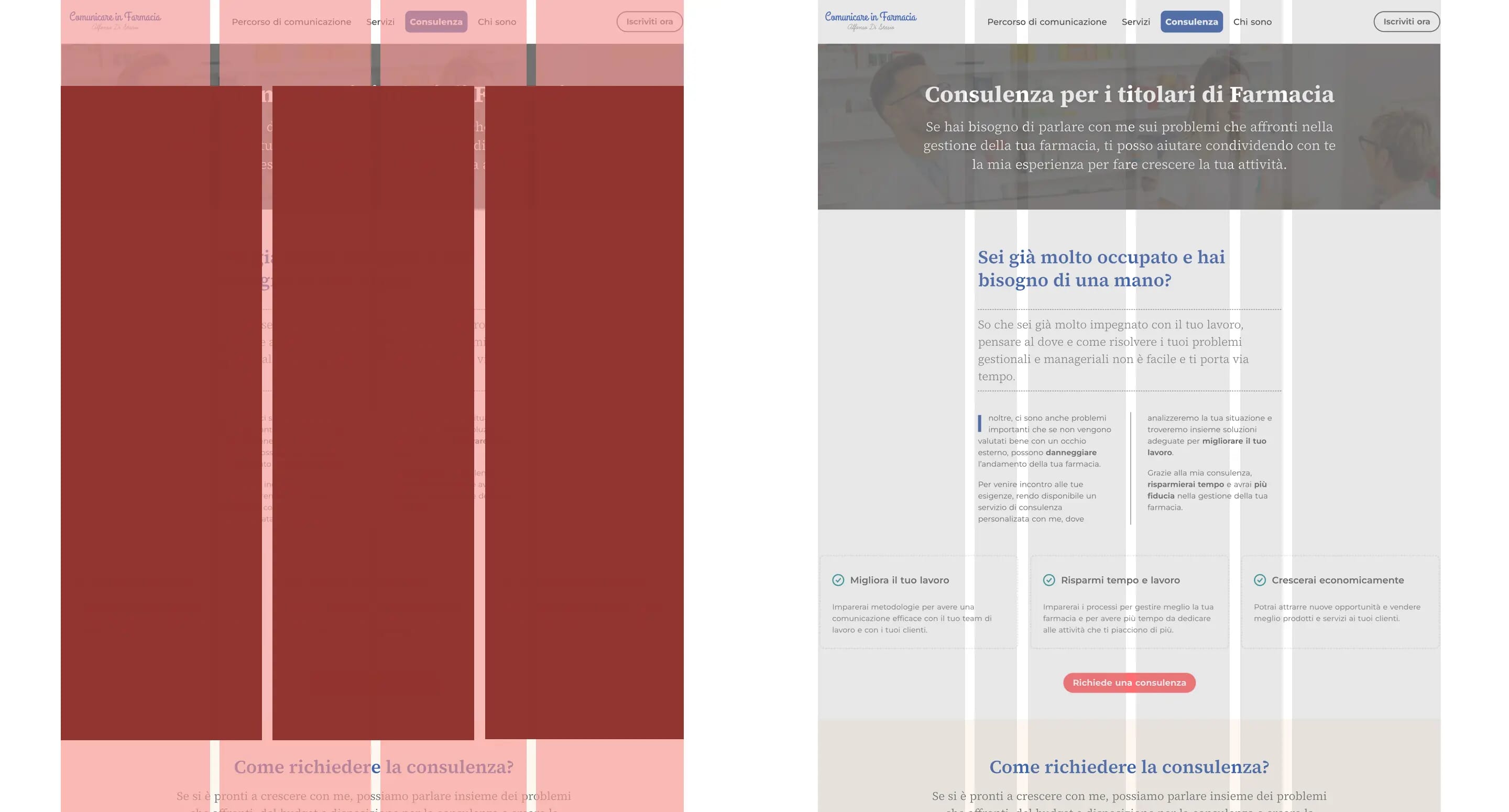
Choosing the right grid to build my layouts is an essential part of my creative process. Since content is the foundation of any website, choosing a suitable grid is an opportunity for me to organize the content and tell the story in the most efficient manner to the user.
Colors
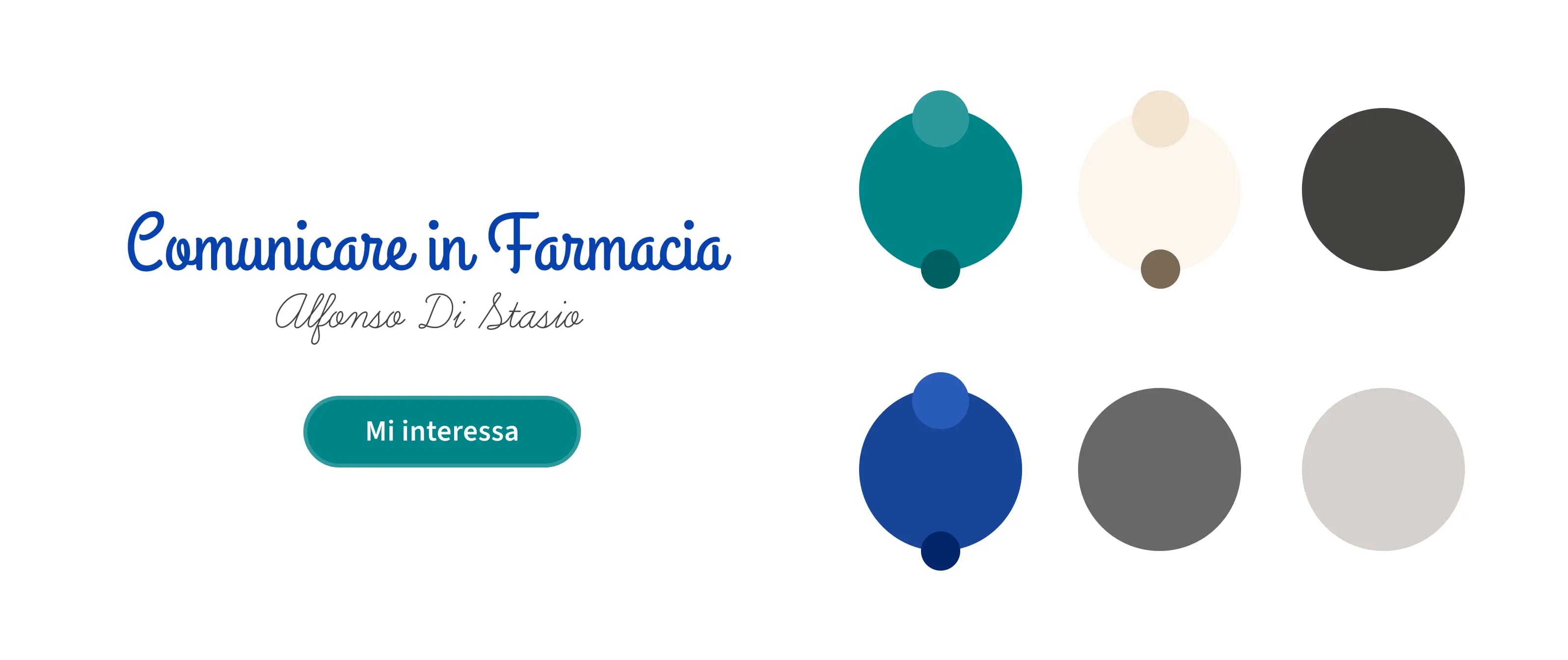
Choosing the appropriate colour palette for my project is essential to use consistent colours with the brand for design elements such as links, text and background sections.
Later in my process, these colours can easily be translated into reusable custom CSS properties variables when I implement the design on a prototype with HTML and CSS.
Front-end development & prototyping
Part of the strategy was to redefine the brand values, in order to create a visual language aligned with Les As Frenchies (See table below). I assisted the client in defining the appropriate attributes of the brand:
As HTML and CSS are deliverables for almost everything I design, it’s a crucial step of my process to generate new ideas, experiment with my design in a browser and see how design, layout, and typography come together.
Designing in a browser also gives me a better understand of how fast (or slow) a website will be for an end-user before implementing the final design.
Since this website was initially set up on WordPress, I needed to implement my prototype, including markup and styles, into a child theme to implement the final design.
Conclusion
In conclusion, working on the redesign of Comunicare in Farmacia with Alfonso Di Stasio was an excellent working experience because my work has helped the business improve its brand awareness and reach its goals.
Since I spend most of my time designing digital products, when I have the chance to work on a project, where I have the flexibility to express my creativity and the opportunity to experiment and learn, I don't hesitate to help.
I hope you enjoyed reading about my process.