An enhanced user-experience for the Onrec website
Mission:
The mission of this project consisted in redesigning the website of Onrec, a company specialized in the recruitment industry.
The Challenge
The challenge of this project was to improve the user-experience of Onrec website to help the company increase their sales and render their site more efficient.
We redesigned the website in order to:
- Create awareness;
- Increase revenue;
- Increase efficiency;
- Reduce bounce rate.
Outcome
After my consultancy, the company has now a redesigned website aligned with its brand strategy and has consequently gained:
- An increase of daily site visitors +30%;
- A site accessible, clear and easy to use;
- A site with a look and feel aligned with the brand attributes.
- (Reading time: 6min)
Team
In this project I collaborated with Isidro Garcia Garrido (Web Developer), David Hurst (Founder of Onrec - Stakeholder) and Stuart Gentle (Publisher).
1. Discovery phase
Goals and target audience
To resolve the problem, we started by defining the business goals and the target audience of Onrec:
Business goals:
- Improve the brand awareness;
- Increase revenue from news and directory profiles;
- Increase engagement;
- Increase newsletter sign-ups.
Target audience:
- HR Directors;
- Personnel Managers;
- Job Boards;
- Recruiters;
- Individuals.
After defining the goals we run a quick site audit in order to diagnose the problems.
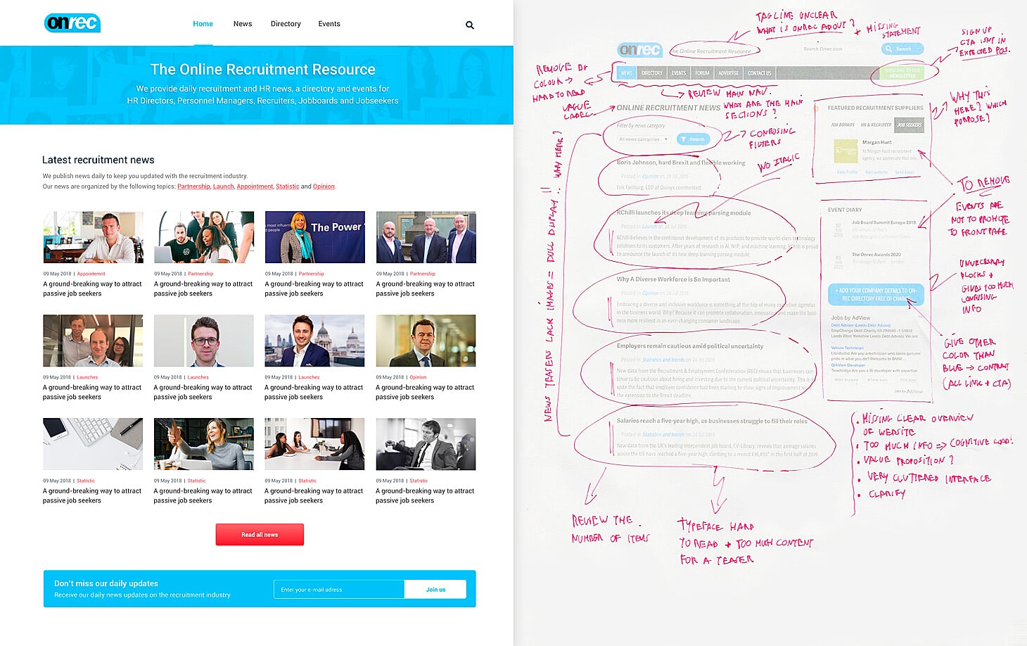
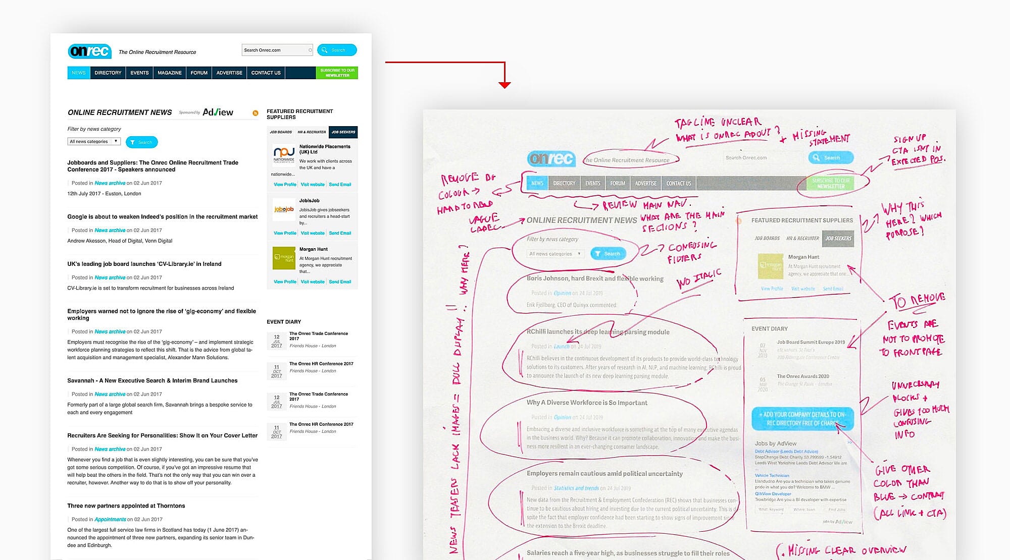
Site audit
Before redesigning a website, I always examine the existing site in order to apprehend its context. In this particular case, a quick review of the site revealed major problems, such as:
- Cluttered web pages;
- Confusing labels on primary navigation;
- Confusing interactions (call-to-actions, links);
- Homepage failing to answer strategic questions: (What is Onrec? Who is it for? Value-proposition? What primary actions?...)
- Unclear site tag line;
- Poor content strategy;
- Dull webpages in general.
Google analytics
By using Google Analytics we collected further meaningful data:
- High bounce rate on pages (e.g 90% on homepage);
- Only 12% of the traffic are returning users;
- Website used at 80% on desktop versus 20% on mobile.
Survey
To wrap up the site audit, we surveyed a group of users to assert our assumptions and gather feedbacks on their experience. From the responses we obtained, they mostly indicated:
- A lack of engagement and clarity across the website;
- Busy web pages;
- A confusing branding;
- Confusing labels on call-to-actions and links;
- An unclear value proposition;
- Lack of clarity on the business mission.
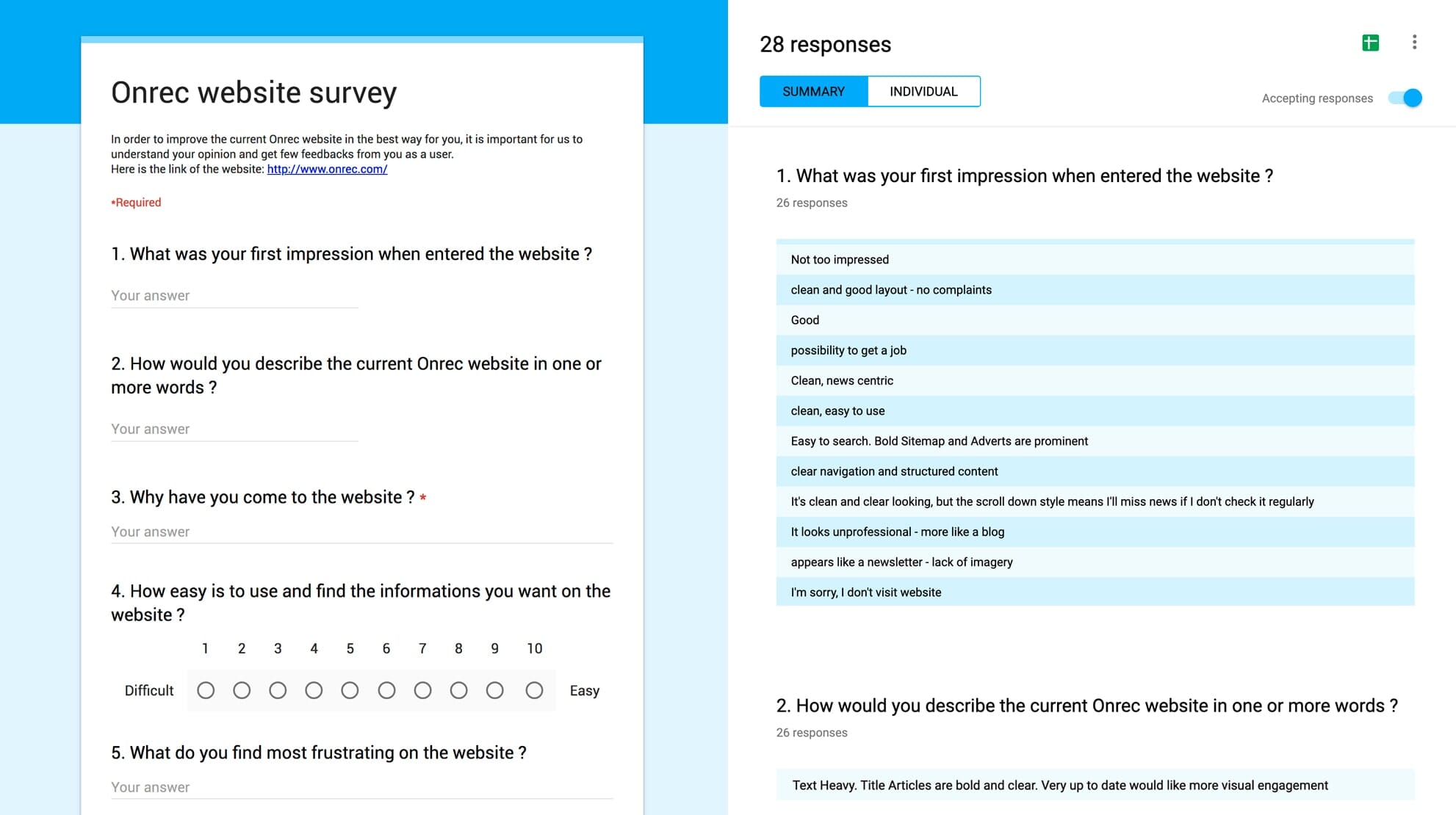
The above findings confirmed that our assumptions were founded and we were, therefore, on the right track.
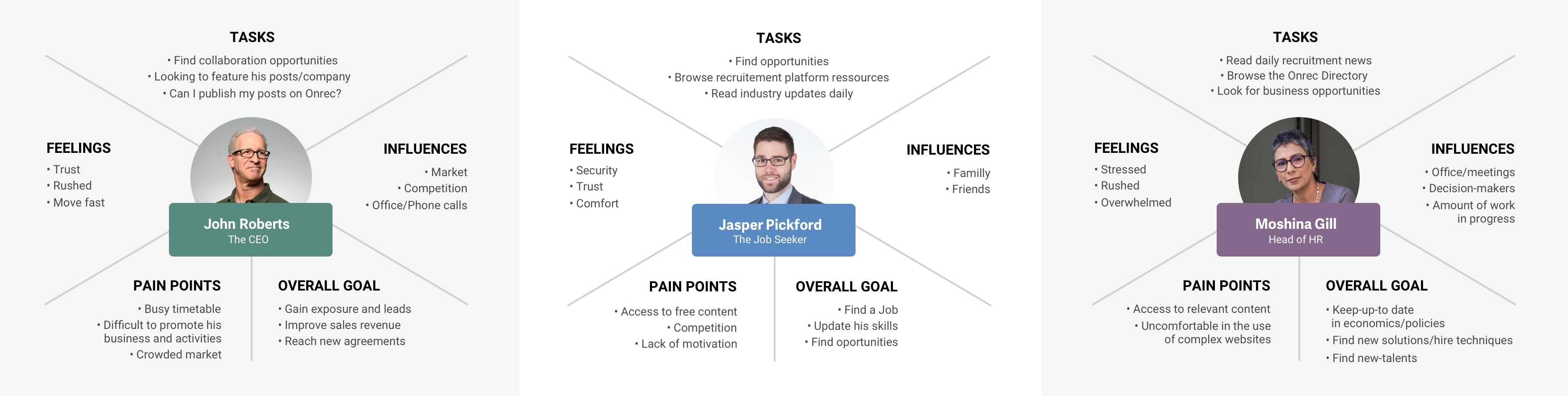
Personas
The questions raised by the survey helped us to understand the profile of the users, their needs and pains. To be concrete, we created three profiles representing the main audience of Onrec.
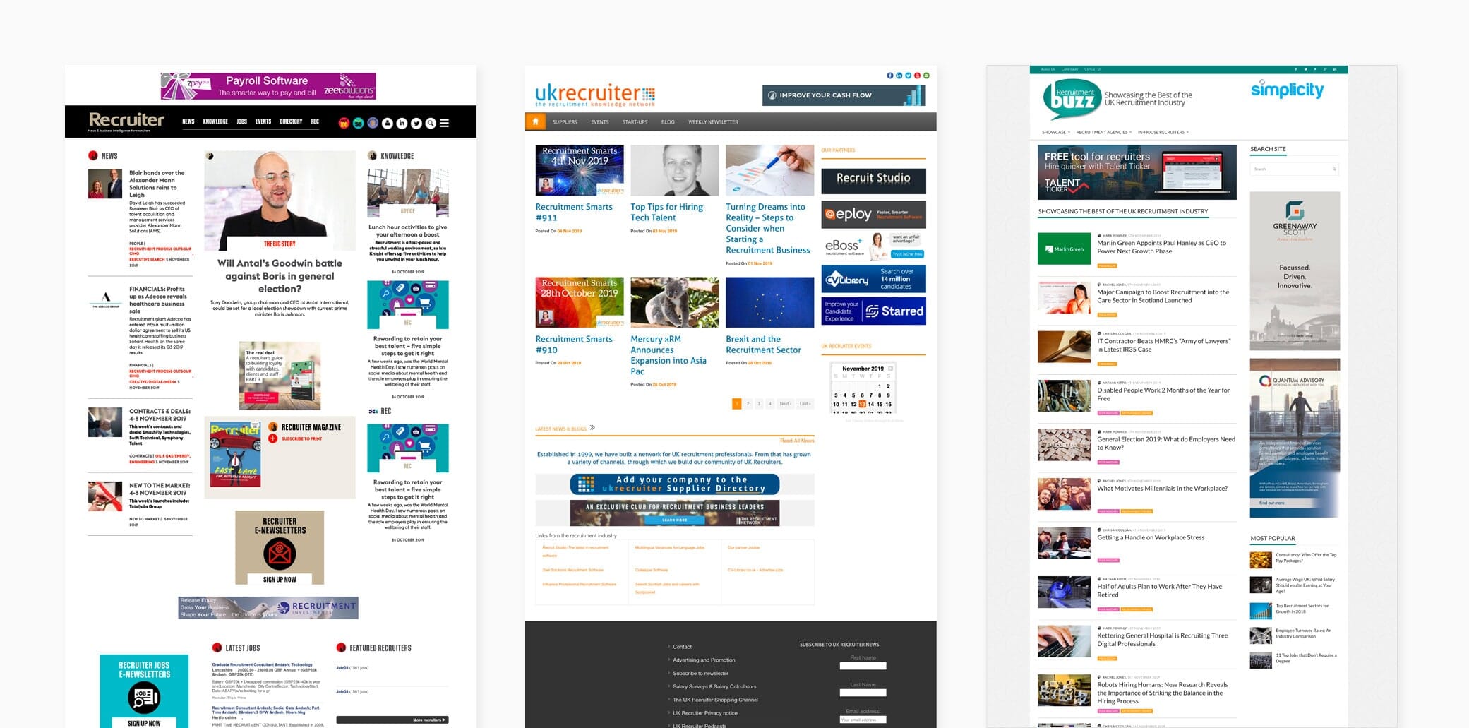
Competition
We concluded the discovery phase by reviewing the websites of three main competitors of Onrec by analyzing and comparing their sitemap and content structure.
2. Information Architecture
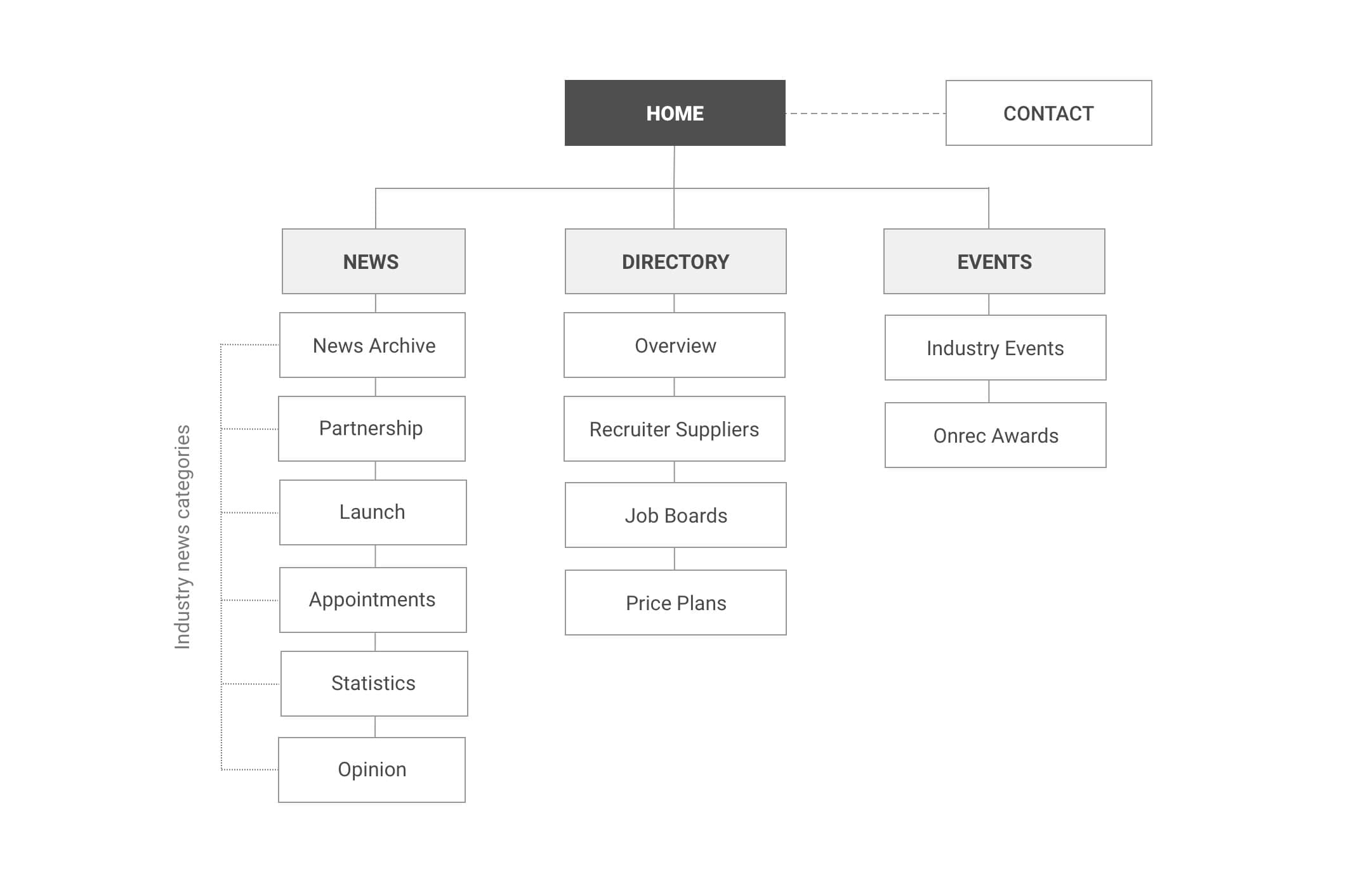
Sitemap
Before sketching the main pages, it was important to mirror the goals and the type of information available on the site on the sitemap: News, Directory and Events.
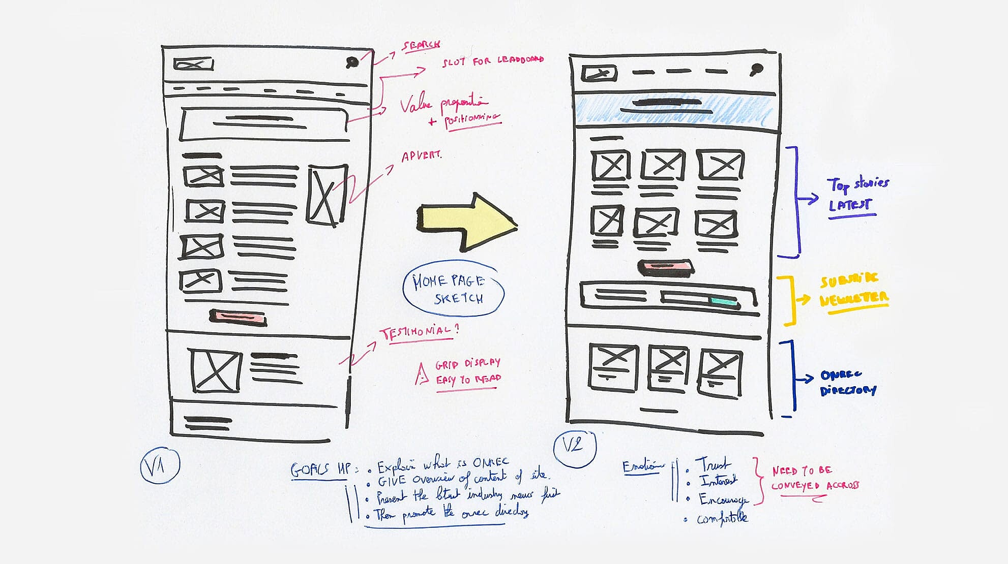
Sketch
Once the sitemap was approved, we sketched the layout of the interfaces to find the best way to layout the information.
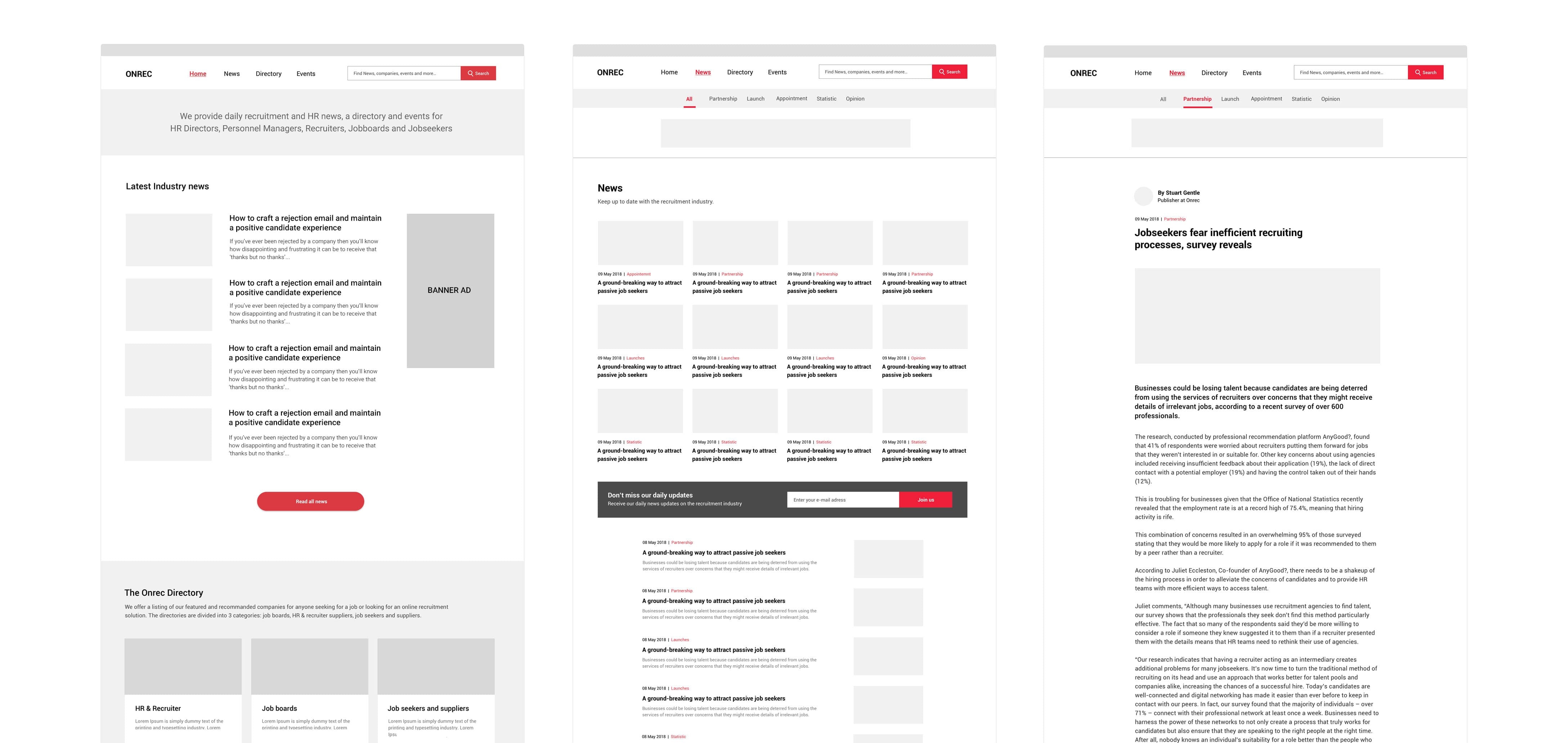
Wireframes
In order to make the ideas more comprehensive for the client and the user, I increased the fidelity of the sketch from pen and paper to low-fidelity mock-ups on computer.
3. Prototyping
I then put together a low-fidelity prototype with Invision from the mock-ups to run usability tests with two users. Due to a limited budget, we couldn’t interview more people.
4. Usability Testing
The test we conducted helped us to detect at an early stage, things that could have frustrated users. For example, the first version of the prototype still revealed some of the issues initially indicated by the users when they interacted with the homepage, i.e:
- Value proposition still unclear;
- Confusing news feed;
- Call-to-actions not in evidence;
- Long pages (needing scrolling)
- Newsletter sign up bar not prominent;
- Missing pictures on news feeds…
Taking into consideration the above feedbacks we iterated the prototype to another version by applying several adjustments.
When we tested the prototype for the second time, we noticed that the new homepage converted more and users were able to understand better Onrec.
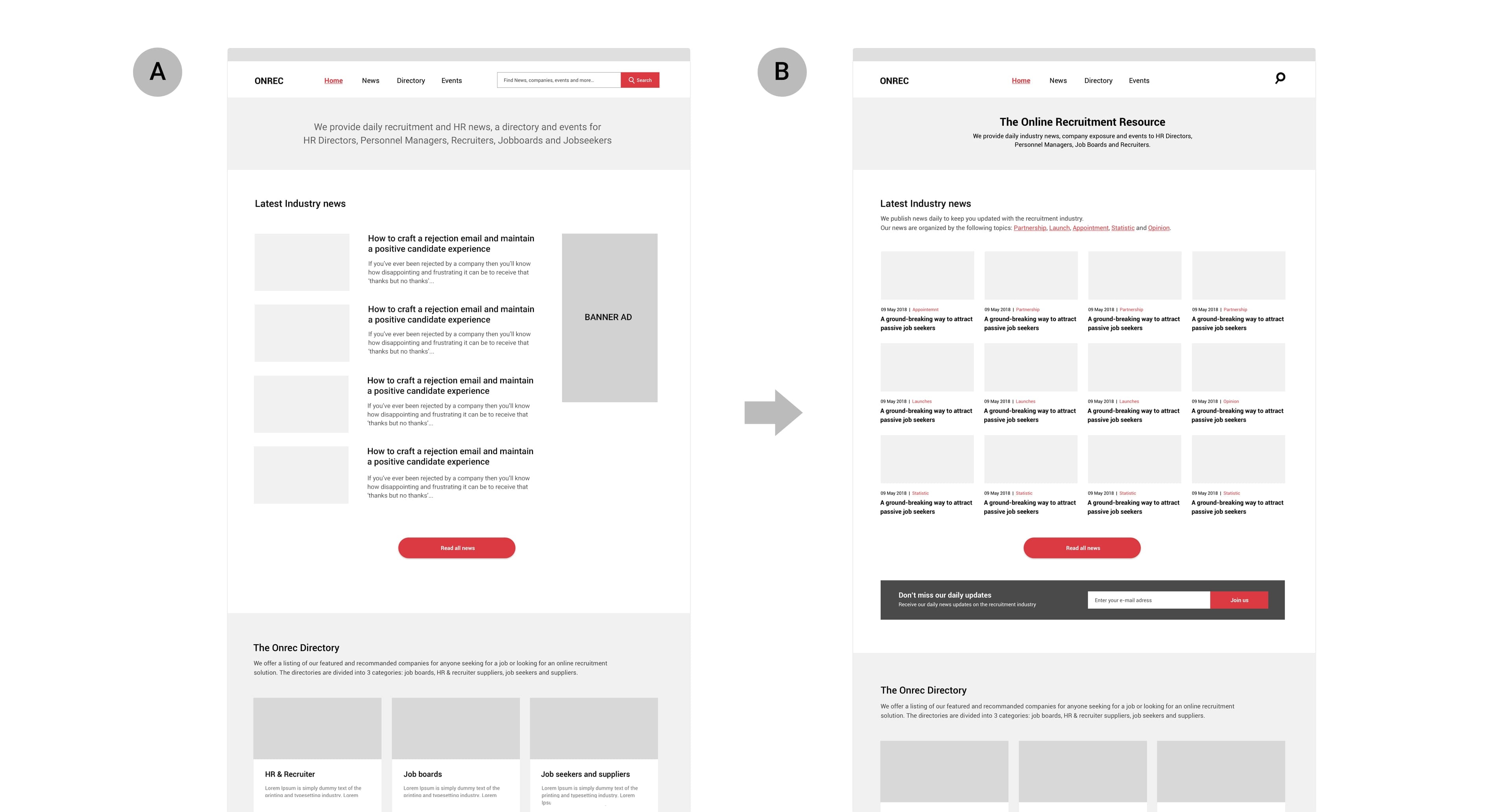
In the end, we decided to retain the version (B) of the homepage as our final reference.
NB: The test in question was only conducted on the homepage, since it was the most important page for the client’s business and the one reflecting the highest bounce rate ie 90%.
5. Visual design
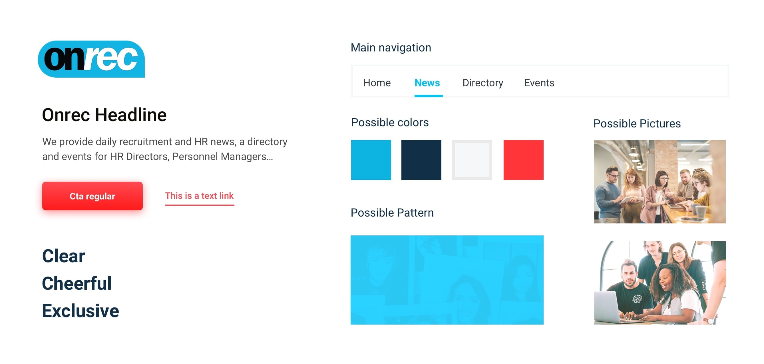
Brand values
Part of the challenge was to define the brand’s values with the client in order to create an appropriate visual language of the website.
I assisted the client in defining the values of the brand, as follow:
- Social
- Friendly
- Relevant
- Dynamic
- Authentic
- Exclusive
I concluded this step by creating a Style Tile presenting the creative direction of the website to the client.
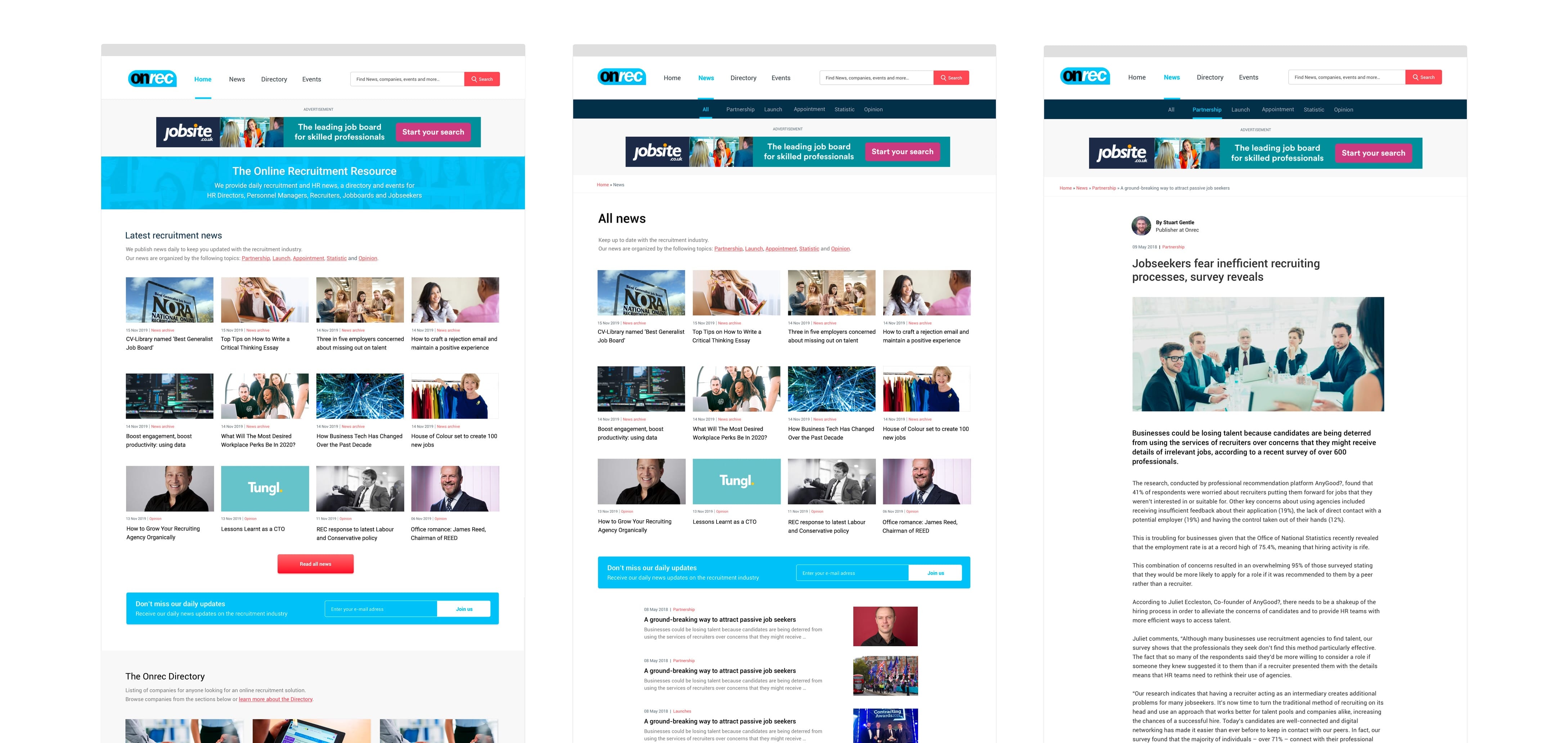
Refined visuals
6. Front-end development
On this project, I was also in charge of all the front-end integration such as: building the pages in HTML5, styling the pages using latest techniques like CSS Grid and Flexbox and assisting the developer with the theme creation on the CMS Drupal.
(In order to make the final website user-friendly and easily to maintain, the developer has implemented the site into the item managing system Drupal 7).
Conclusion
After 8 months of work, this project was one of the most exciting I have been working on. I delivered clear interfaces and prototypes, involving the stakeholders throughout the process. Collaborating with everyone helped me to deliver a solution which provided answer to the initial goals. To that effect, here is a living testimonial from a user:
Loving the new website look and feel Onrec - great job @Onrec
— Paul Thompson (@paulatvoyager) August 14, 2019
A shiny new website and FREE skills testing for all Recruiters, what's not to like? https://t.co/aS5mo9nR7t