Website redesign and brand identity refresh for Les As Frenchies
Mission:
The mission of this project consisted in redesigning the website and adjusting the branding of Les As Frenchies, a video production agency based in Lyon.
The Challenge
The challenge of this project was to find the best ways to enhance the credibility of the company and to communicate more effectively their missions.
We redesigned the website in order to:
- Improve the brand awareness;
- Promote the company expertise and services worldwide;
- Increase engagement;
- Boost the volume of clients.
Outcome
After my consultancy, the company has now a redesigned website aligned with its brand strategy and has consequently gained:
- Awareness;
- Credibility;
- An increase of daily site visitors +43%;
- A site accessible, engaging and easy to use.
- (Reading time: 5min)
Team
In this project I also collaborated with Jerome Tchania (Web Developer) and Ludovic Martinet (The founder of Les As Frenchies, and client).
1. Discovery phase
Goals and target audience
I started the project by defining a strategy with the stakeholder; together we reviewed the challenge of the project, the business goals and figured out the main target audience of the website.
Business goals:
- Improve the brand awareness;
- Promote the company expertise and services worldwide;
- Increase engagement;
- Boost the volume of clients.
Target audience: Professionals and Individuals.
After defining the goals, the next step was to run a quick site audit in order to diagnose the problems:
Site audit
I analyzed the main pages of the website before the redesign where I found several problems such as:
- Wrong communication of the brand;
- Lack of clarity of the company mission;
- Unclear value-proposition.
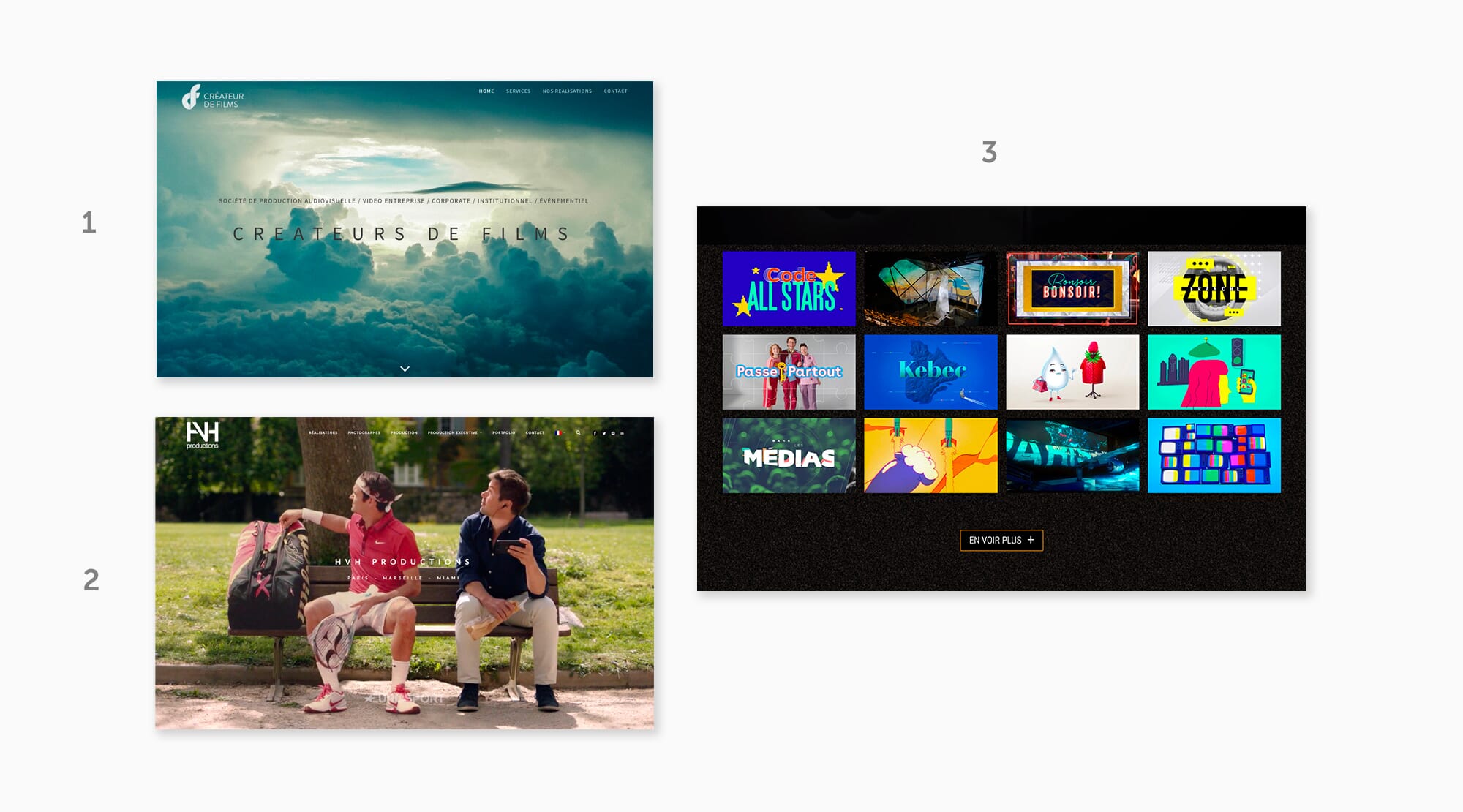
Competition
In parallel, I reviewed the websites of three main competitors, in order to examine how they structure their information, sell their services and present their expertise to their audience.
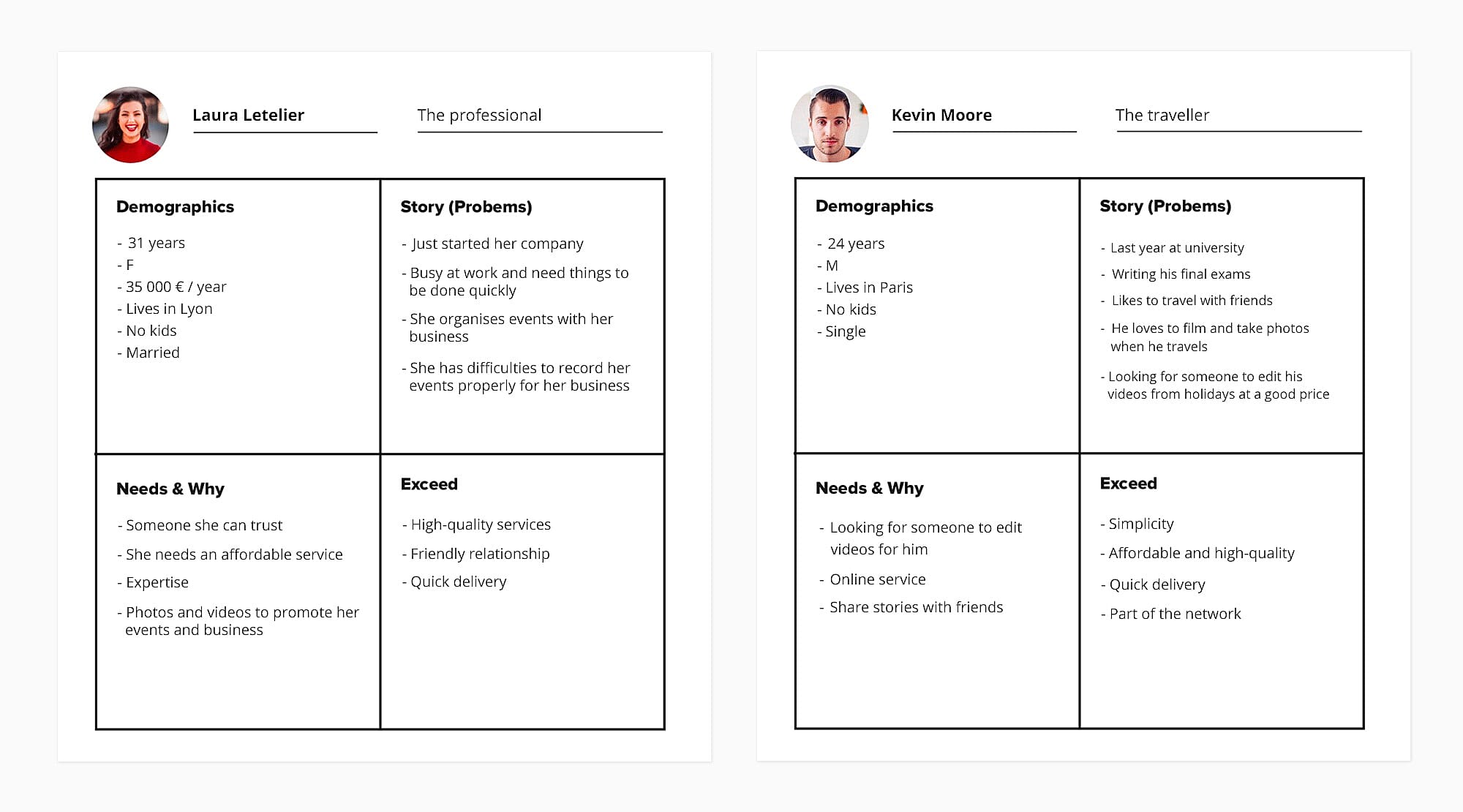
User profiles
We finished our discovery phase by creating two user profiles reflecting the main target audience of the website. To create them, I first collected information from the client about the ideal profile of the user, then I analyzed the Facebook page of the agency to picture better the people interacting with Les As Frenchies.
All these findings helped us to come up with two main personas.
At his point, we were able to understand their needs and, consequently, how to structure better the information on the new site.
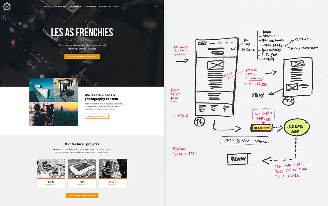
2. Sitemap & Wireframes
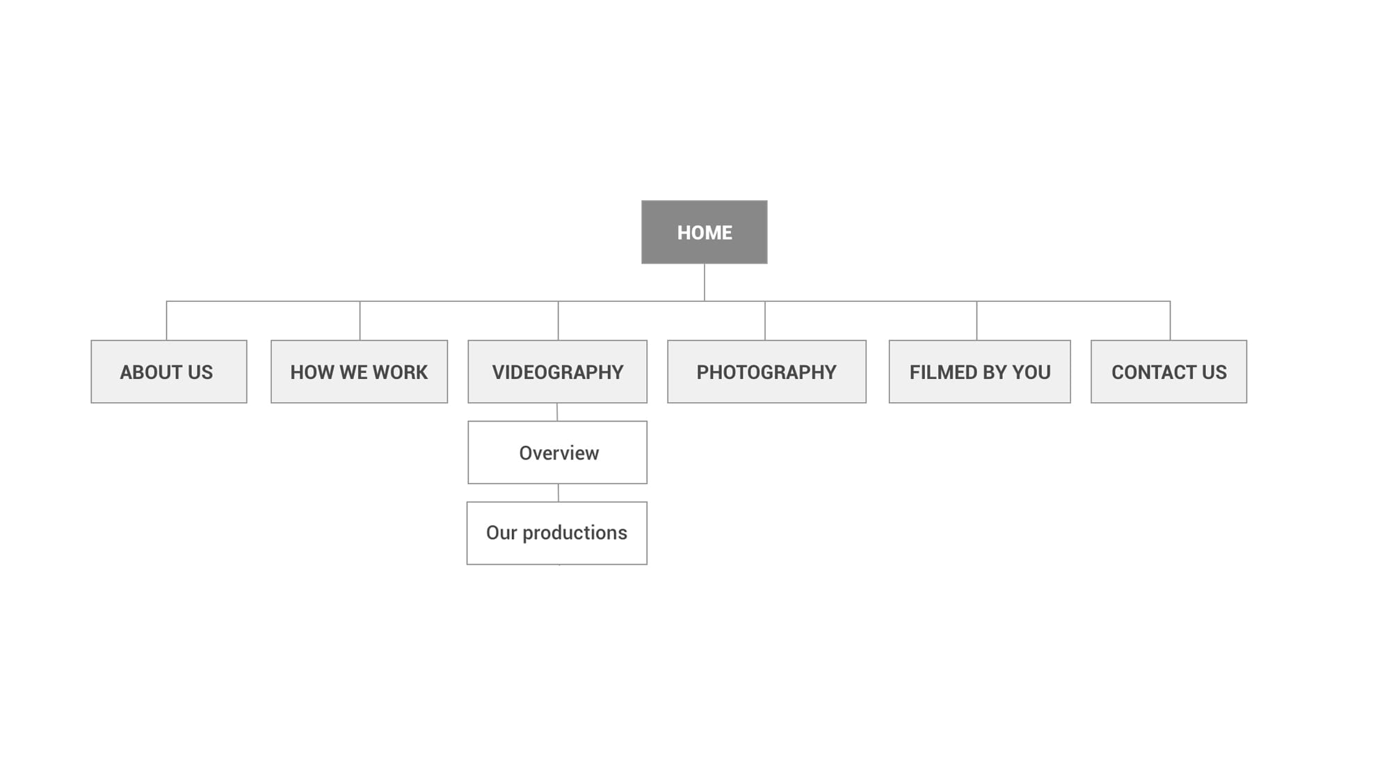
Sitemap
Before sketching the main pages, it was important to reflect clearly the goals and the principal sections of the website on the sitemap.
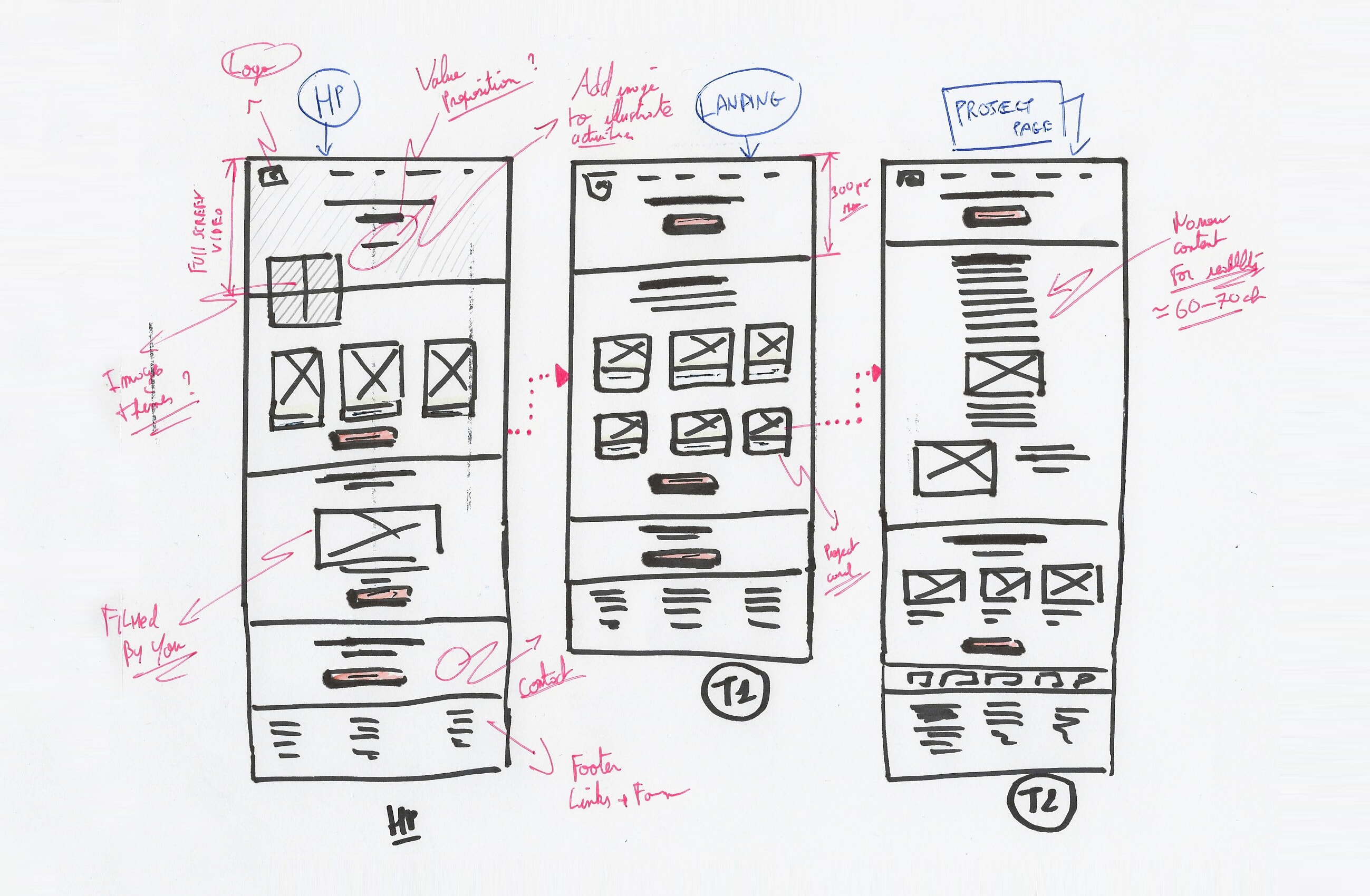
Sketch
Once the sitemap was defined and approved, I was able to start sketching the layout of the pages of the website, keeping the personas in mind. At this point, I explored several ways to present the information to the user.
3. Prototyping
Since this website was simple in terms of architecture, I decided to design, straight in the browser, an interactive prototype in HTML/CSS to test the content structure and iterate ideas at an early stage with three real users.
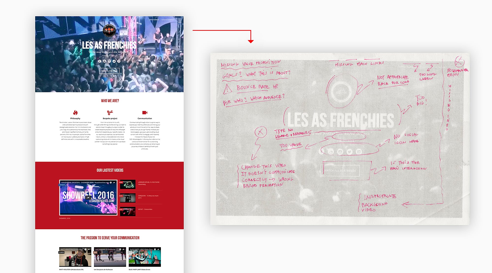
4. Usability Testing
The test I conducted helped me and the team understand that the prototype failed to communicate effectively several key information to the users. Below are the problems I identified during the test.
- Mission statement not clear enough;
- Confusing link labels inside a hamburger menu;
- Still hard to figure out the services provided and the audience;
- Lack of strong call-to-action to lead the user through their tasks;
- Missing relevant copy to guide the user;
- Confusing background video subject…
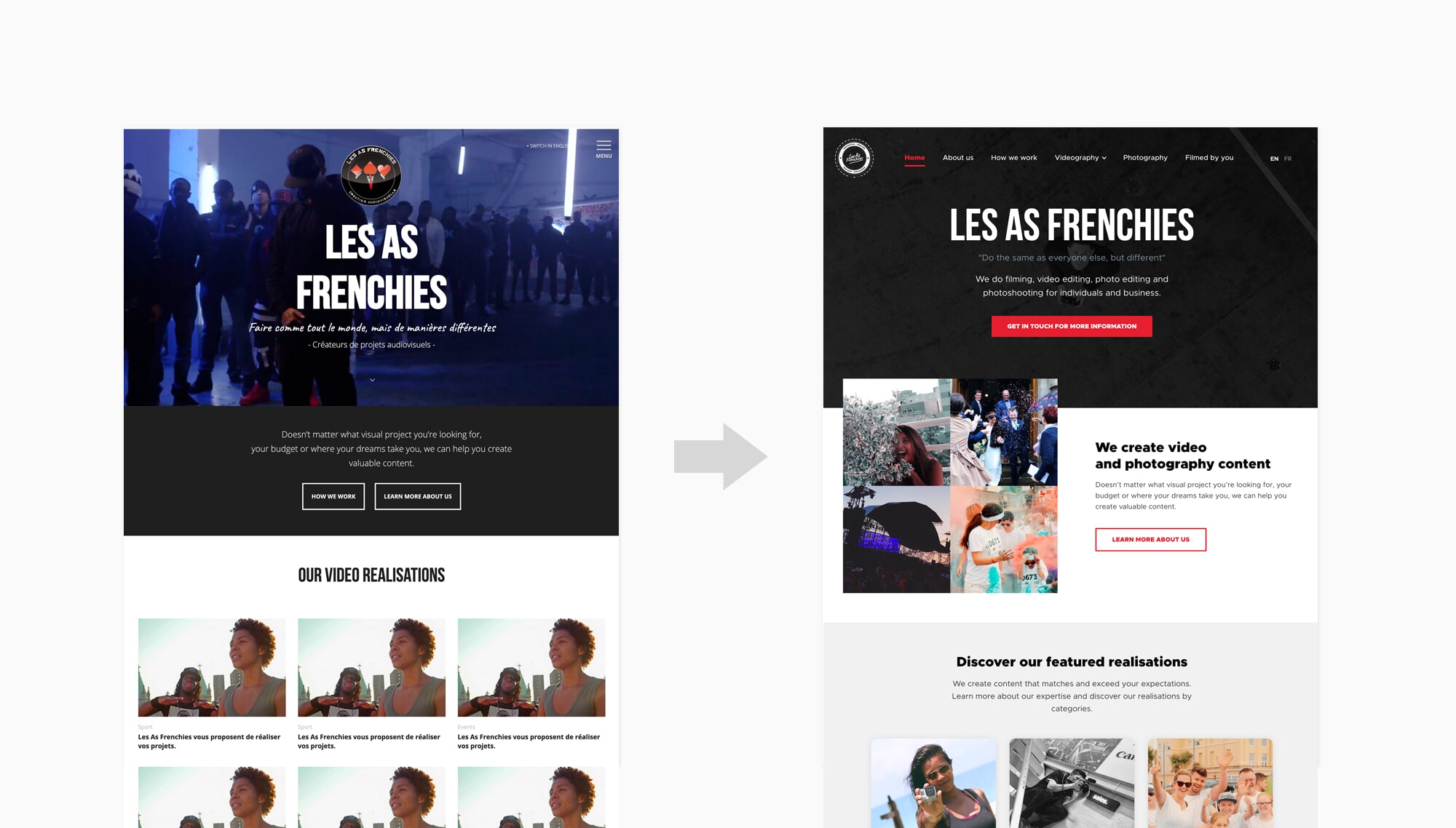
After considering the feedback, we worked on a second version of the prototype that we tested again later. The changes we made, such as, displaying the full menu on the header, change of colour, adding extra copy and a couple of images, improved drastically the usability of the prototype.
In fact, the conversion rate had slightly improved and the pages were much clearer and accessible for the user.
Once the prototype signed-off by the client, we focused on the brand’s communication and refined the User Interfaces of the website.
5. Visual design
Brand values
Part of the strategy was to redefine the brand values, in order to create a visual language aligned with Les As Frenchies (See table below). I assisted the client in defining the appropriate attributes of the brand:
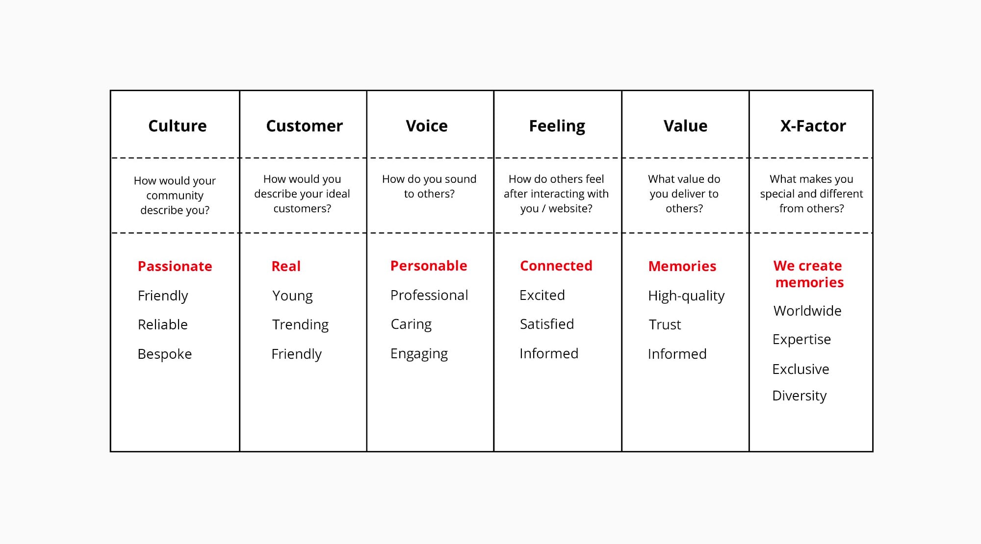
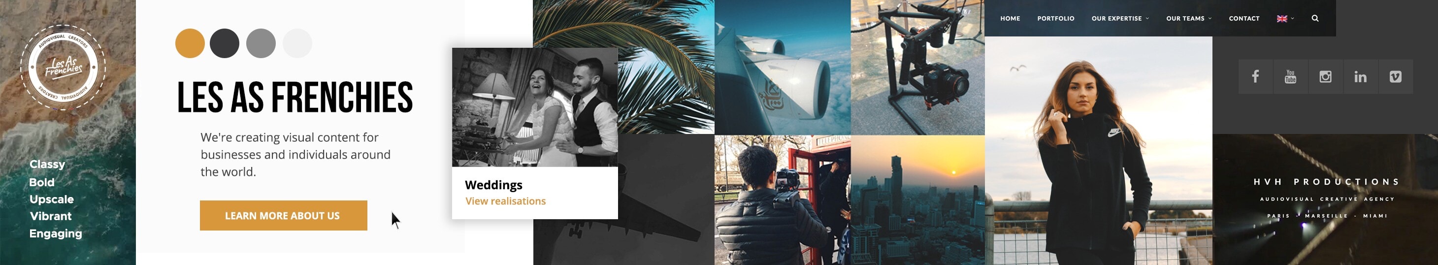
From the brainstorming session, I created a Stylescape based on five main attributes to setup the visual atmosphere of the design: Classy, Bold, Upscale, Vibrant and Engaging
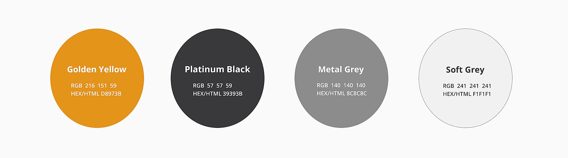
Colours
Having a Stylescape helped me to define an appropriate color palette highlighting the personality of the brand. I used a vibrant golden color to style links and clickable call-to-action and darker colors for sections to suggest the prestige quality of service aspect claimed by the brand.
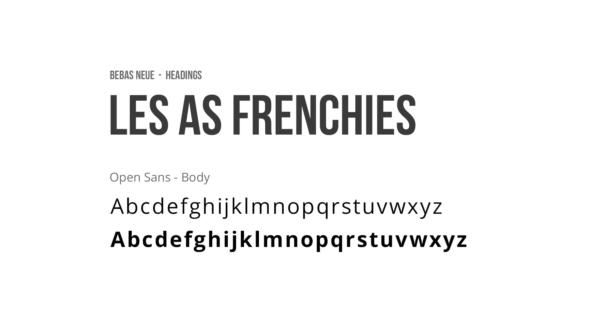
Typography
Choosing the appropriate typefaces was another important step. As the goal of the new design was mainly to communicate more information to the audience, it was important to choose readable and legible typefaces.
I, therefore, chose Open-sans, an easy to read typeface because of its open shapes and generous x-height.
For the main headlines, I chose the display font Bebas-Neue to emphasize contrast and convey the boldness attribute of the brand.
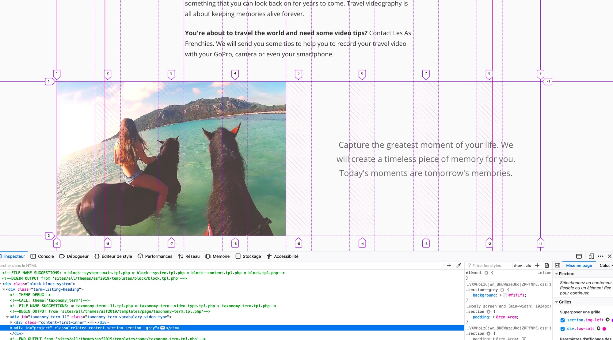
Refined visuals
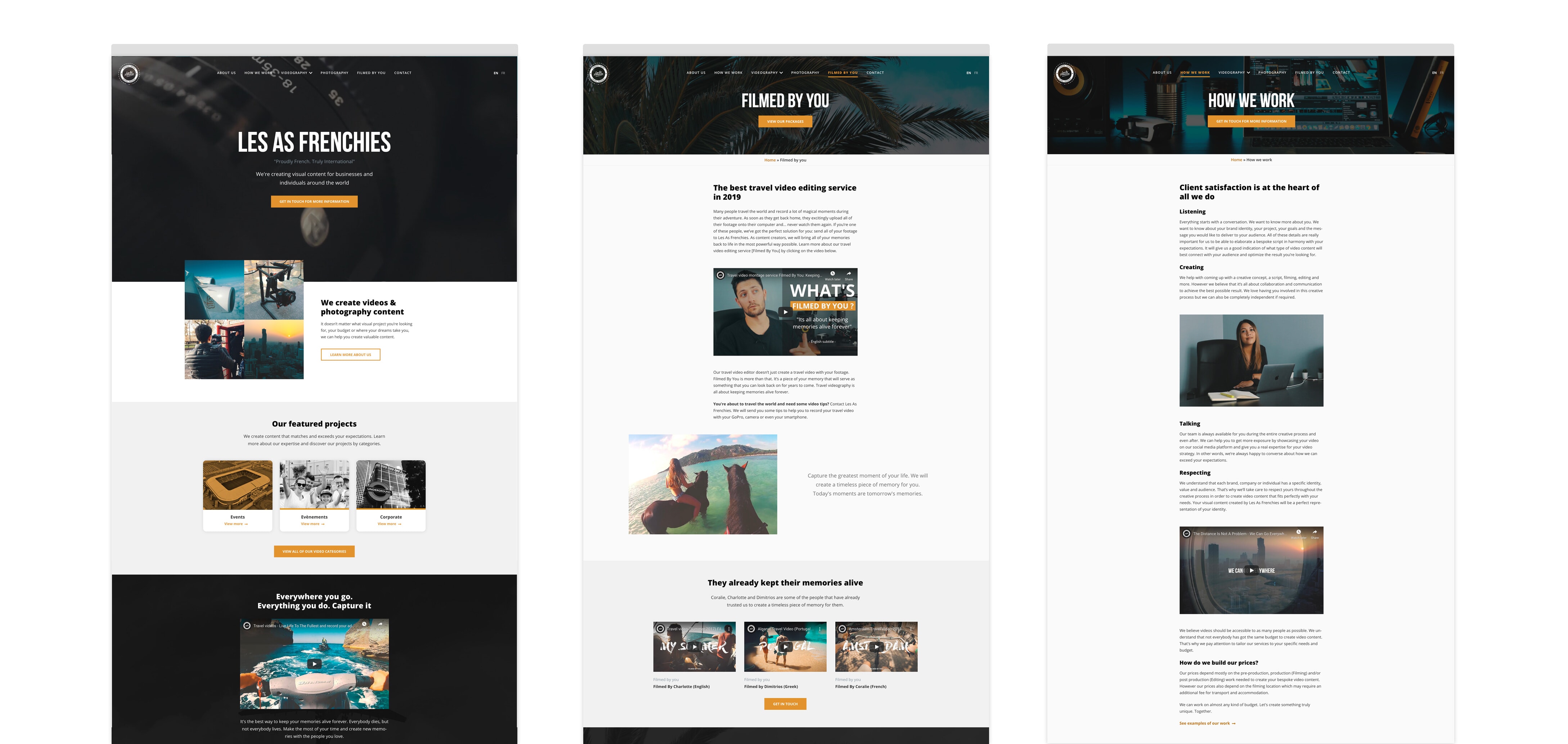
6. Front-end development
On this project, I was also in charge of all the front-end integration such as: building the pages in HTML5, styling the pages using latest techniques like CSS Grid, Flexbox and assisting the developer with the theme creation on the CMS Drupal.
(In order to make the final website user-friendly and easy to maintain, the developer has implemented the site into the content managing system Drupal 7).
Conclusion
After six months of team work, I delivered a website suitable to communicate the mission of the company, its services and portfolio. This project has been an enriching and pleasant experience for me, as I collaborated remotely with the stakeholder from inception to delivery.