5 rules to boost UX with a clear visual hierarchy
Quick summary 5 ways that you can use to create great visual hierarchies in your interfaces with typography.
Recently, I’ve decided to help one of my friends to redesign his website. However, before diving into the creative part of the website design, I spent a week reviewing a couple of websites to find inspiration about how I could use typography.
While reviewing these websites, I was surprised by how difficult it was to process the content without feeling overwhelmed by the amount of information on the pages.
These sites had one problem in common: The pages were very busy and hard to read because of a lack of visual hierarchy.
When an interface lacks a clear visual hierarchy, it is likely to provoke a high cognitive load on users because it might be difficult for them to understand where to look for the information that will help them survive and thrive when scanning the pages.
Since a bad user experience impacts the business behind the system, app or website, it’s our responsibility to consider every detail, such as the quality of the visual hierarchy, to design the best solution for the business and its customers.
According to studies by the Norman Nielsen Group, users don’t necessarily read the content on a page; instead, they scan it until they find what they need.
On average, users will read only 20% of the text. That’s why having a clear visual hierarchy to guide users through the content is essential.
To clarify, visual hierarchy refers to the organization of design elements by priority on a page used to draw users’ attention toward the parts of the interface we want them to see.

You can use several ways, like shapes, colours, sizes or typography, to enhance the visual hierarchy on an interface.
In this article, I will introduce five tips I love to use to create better visual hierarchy in my designs with typography.
Once you put these tips into practice, you will improve the usability of your interfaces and elevate the quality of your designs.
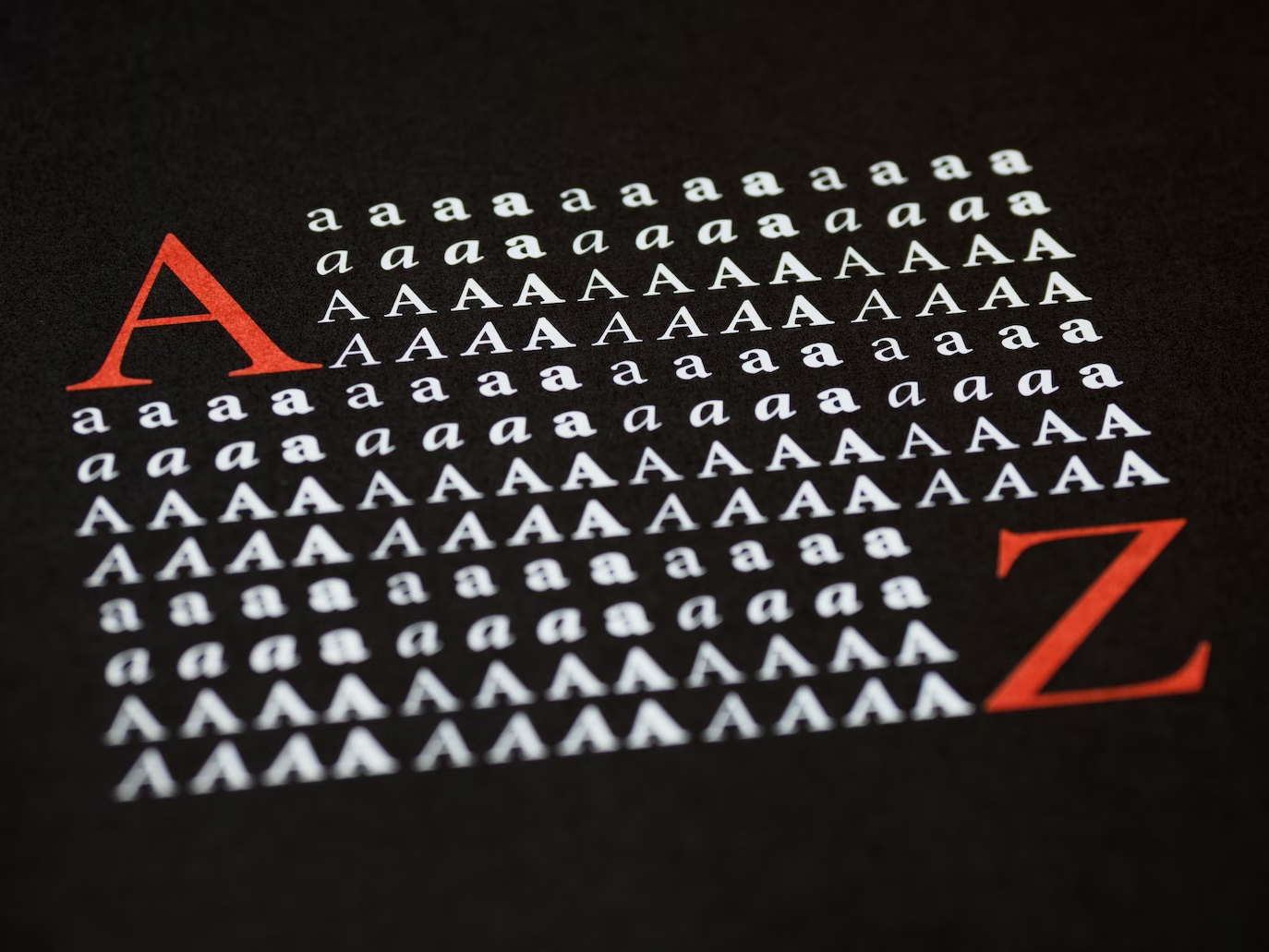
1. Size/Scale
Use a type scale to assign consistent sizes to your typographic elements.
When using a scale, you will create a clear visual hierarchy since users will first notice prominent elements before seeing smaller ones.
Whenever you work on an interface design, set different font sizes for your typographic elements, such as headings, paragraphs, or quotes, to create contrast and enable users to scan the content better.

Rule of thumb: Use bigger sizes to emphasize essential elements and smaller sizes for less important ones to establish a clear visual hierarchy.
2. Font variations
Use font variations to enhance the visual hierarchy on your interfaces.
Most typefaces you can find on Google Fonts or Adobe Fonts include variations of styles that you can use to create contrast and enhance the visual hierarchy in your interface designs.
Common styles include light, regular, bold, and black. One way to create contrast between your typographic elements is to use a bold font style for your headings to make them stand out and use a regular or light font style for your body paragraphs.
For example, the typeface ‘Source Serif Pro’ offers a variety of styles including ExtraLight, Light, Regular, SemiBold, Bold, and Black.”
Rule of thumb: Pick typefaces with several font variations on your designs. This allows you to create contrast effectively and enhance the visual hierarchy of your design.
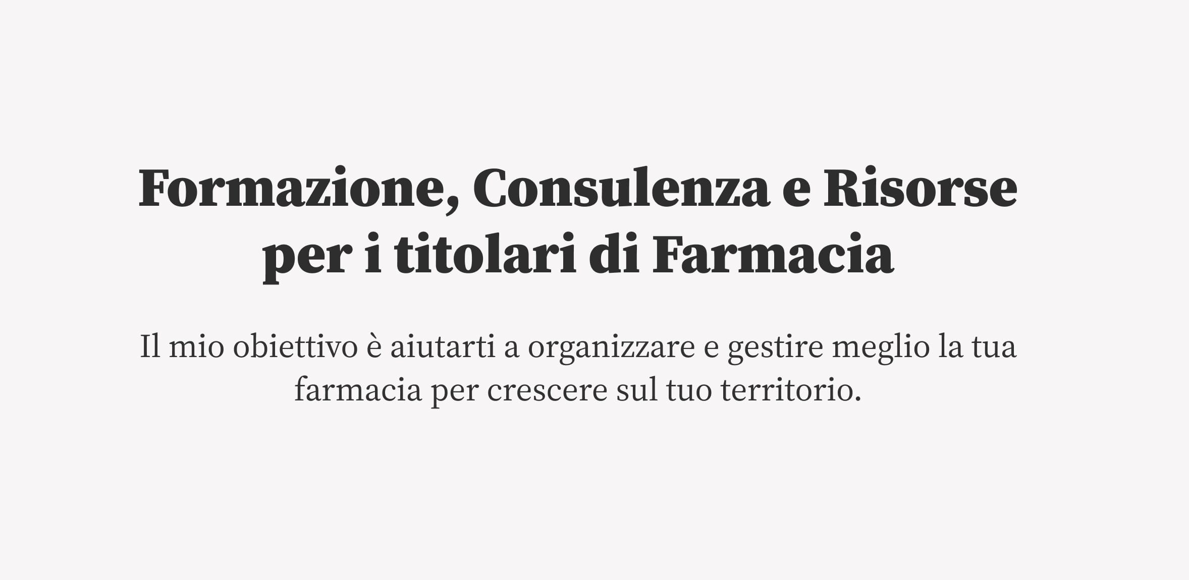
3. Color & contrast
Another great way to draw users’ attention and establish the proper visual hierarchy is to assign colours to the typographic elements you want to emphasize on the screen or page.
However, to avoid turning your design into chaos with too many colours, apply them thoughtfully and align them with your brand personality.
Experiment with appropriate colours by playing with hue, saturation, and brightness levels on your text elements to create contrast and add texture to your interfaces.
For instance, you can use dark tones for your headings and light ones for your paragraphs to establish a good visual hierarchy.

Rule of thumb: Ensure that you use colours wisely to create sufficient contrast between the elements and background in your interface.
4. Spacing
Most interfaces are busy and challenging to scan because they lack whitespace between typographic elements.
Whitespace is a critical aspect of your design, allowing users to flow around the content and focus on elements without feeling overwhelmed.
Adjusting the spacing between your typographic elements and the line height of your text will allow you to create visual contrast and improve the readability of the content.
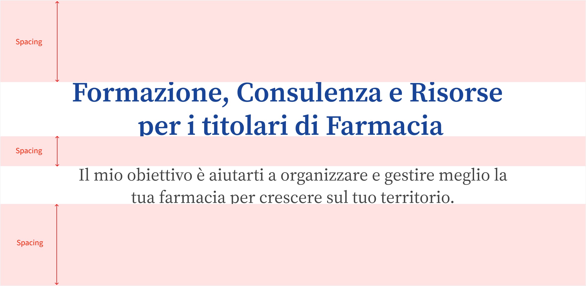
Rule of thumb: The whitespace between elements helps users to focus better on those elements and scan the interface more effectively. It is a critical aspect of the readability of your design.
5. Font-pairing
Mixing typefaces on an interface is a great way to evoke emotions, enhance the visual hierarchy, and help users process the content effectively.
Creating contrast and enhancing the visual hierarchy on your interfaces is essential. So, to achieve excellent contrast on your interface, ensure that you pair contrasting fonts or typefaces together.
For example, mix bolder fonts with lighter ones to create excellent contrast and visually appealing interfaces.
One way to properly combine fonts is to ensure that the typefaces share similar characteristics like the X-Height to create a consistent look.

Rule of thumb: Mix typefaces on your interface to enhance the visual hierarchy, add personality to your design, and help users process the content on your design more effectively.
Takeaway
This article presented 5 ways that you can use to create great visual hierarchies in your interfaces with typography.
Remember, a great visual hierarchy is critical because it will help users understand the importance of each design element on your interface, process the content better and find what they need quickly.
That’s a wrap!
I hope you enjoyed this article and thanks for reading!
Jerome
If you want to learn more about this topic, read my book “DON’T START WITH VISUALS”.