UX deep dive: my strategy for redesigning Amalia’s site and elevating her brand (Part 2)
Quick summary This article is part 2 of the deep-dive case study explaining how I clarified Amalia's brand, streamlined the content and art-directed the new website to create distinctive interfaces.
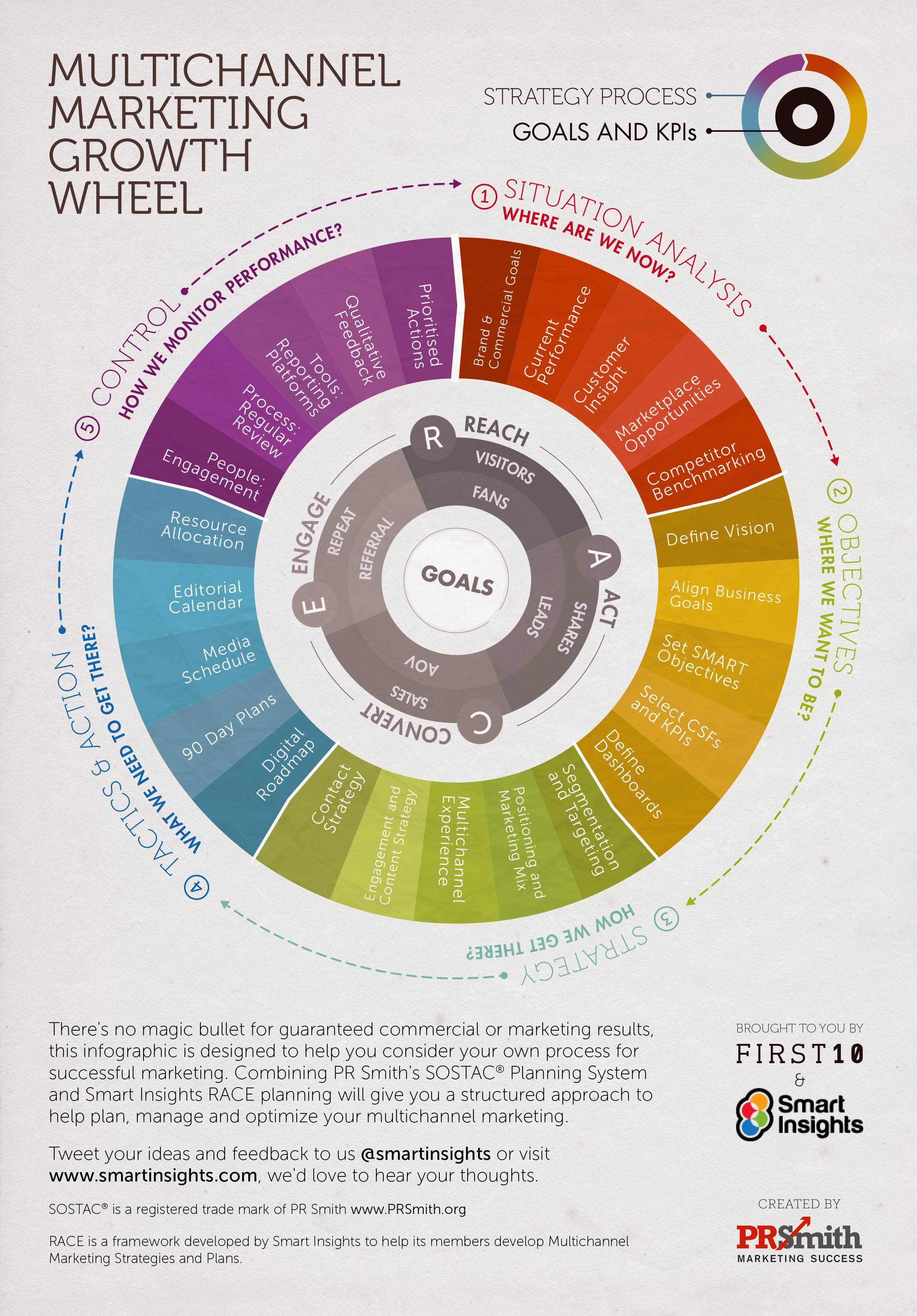
In Part 1 of the deep dive, I explained how I started the project from the right angle, using principles from Paul Smith’s SOSTAC® framework and my recommended approach.
In this article, I will now teach you how I designed Amalia’s new website, including how I clarified her brand, structured the content, and defined the new visual identity.
Let’s continue!
Step 3: Crafting the user experience from the brand
As I explained earlier, Amalia’s old website frustrated users with confusing messages. The site didn’t communicate clearly what her business does (its products and services), what the brand stands for (its purpose), and how her services would improve people’s lives (the benefits).
Consequently, dull interfaces and unclear messages made her brand cheap and untrustworthy.
As we saw in the previous sections, Amalia’s audience is busy. So, to catch their attention and encourage them to act, the new site needed to have clear brand messages and a design that was appealing and easy to use.
To help me rewrite better brand messages and prepare a visual identity that would accurately convey Amalia’s personality, I had to define the core components of Amalia’s brand identity below:
- The brand’s story
- Personality
- Tone of voice
In summary, defining the brand identity helped me communicate Amalia’s offering and distinctive personality effectively so that the new website would elevate her brand experience.
Let’s see each of them in detail:
1. Brand Story
Every successful brand has a story that resonates with its audience to encourage them to take action.
People look for brands that help them answer their burning questions and help them meet their primitive needs (to survive and thrive).
In other words, people never really buy a product or service but the story and the benefits attached to it. For this reason, we should always be clear about how the brand — with its products and services — improves the user’s life.
Most websites fail to engage with their audience because their core message is self-centred and doesn’t explicitly communicate the brand’s promise and value proposition.
For example, I often see phrases like this on corporate websites:
- We are the leading company in the X industry
- We have X years of experience, and our products are revolutionary
- We are proud of our team of skilled engineers
Usually, when I spot these types of sentences on a site, it indicates that the company prioritizes itself rather than addressing its customer’s needs.
When I checked Amalia’s original site, I noticed that she spoke more about herself instead of explaining how she helped customers achieve their dreams with her services.
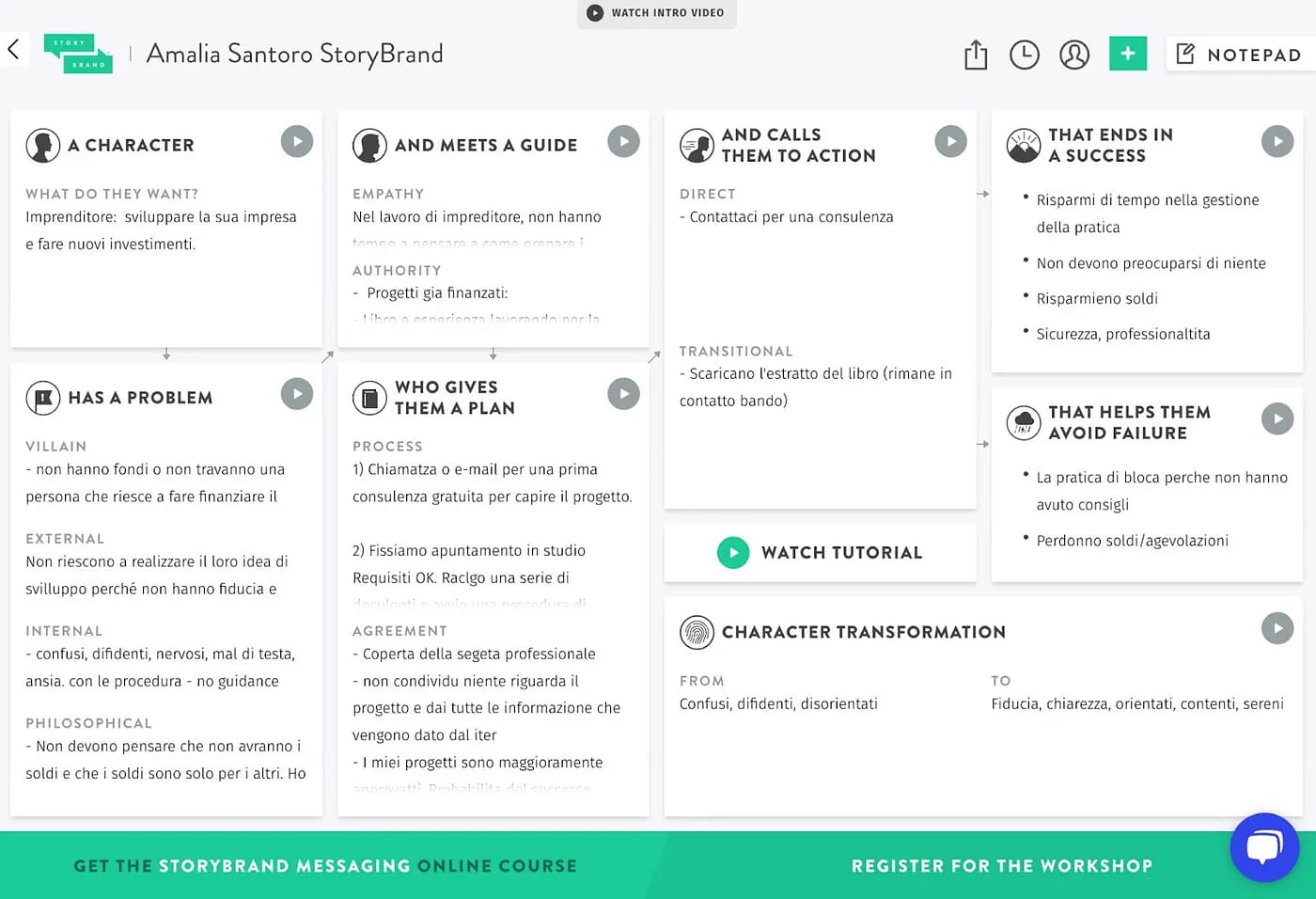
So, to improve Amalia’s brand messages, I used the Donald Miller StoryBrand (SB7) Framework. This allowed me to prepare key brand messages and engaging stories about her services, which I would later use to design effective pages.
► Quick tip: When you work on a brand with an unclear value proposition, use the StoryBrand (SB7) Framework to clarify the brand before designing anything. This will help you set an excellent foundation for creating your website and other marketing materials.
At the end of the exercise, I understood Amalia’s services and how she should communicate better with her audience.
Amalia was speechless when she realized how clear her brand had become and how she should speak to her customers to sell her services.
2. Personality
Every brand has a personality. This voice is expressed visually through images, illustrations, graphic elements, layouts, typefaces, colours, and micro-interactions.
All these elements compose the brand’s visual identity.
Since Amalia is dynamic, reliable and knowledgeable in her field, it was important to reflect these attributes on her website to convey her personality successfully. When I asked her for a list of words she wanted her new site to evoke, she mentioned the following: vibrant, friendly, refined and premium.
► Quick tip: To prevent creating dull experiences, the brand’s personality should be defined with keywords so you can make intentional design decisions.
To find the appropriate keywords, I usually start by asking the following questions:
- How would you like your ideal customer to describe your brand? (e.g. words like Vibrant, Energic, Trustworthy, joyful…)
- How do you want the user to feel when interacting with the website? (e.g. words like Happy, Excited, Empowered, Confident…)
These questions confirmed that vibrant, friendly, refined, and premium were the attributes that would best describe Amalia’s personality. In short, these keywords were my foundation for establishing the new creative direction.
At the end of this case study, I will explain how I used these keywords to create the website’s visual identity, including the wireframes.
3. Tone-of-voice
As I mentioned previously, tone of voice is an essential element of brand identity. Since the content is a conversation between Amalia and her customers, I wanted to make sure that its tone of voice was in line with Amalia’s personality to be effective on the new website.
In addition, knowing the tone of voice gives the designer an idea about the typefaces he could use to communicate the right feelings. In short, the tone of voice allows you to know how the content should sound and look to match the brand’s personality.
To understand Amalia’s tone of voice, I just asked this question:
- How would you like to sound to your customers? (e.g. words like Cheerful, Friendly, Informative…)
Amalia answered that she wanted her tone of voice to be simple, cheerful and authoritative. At this point, I had materials to write effective texts and to define the creative direction for the new website.
Amalia became really confident and couldn’t wait to see visuals for her site. But, I had to pause and explain to her that we needed to create a content draft first and prioritize the main section of her website before thinking of visuals.
Takeaway n°3
Starting from the brand is very important to shape a good user experience. Remember, when someone interacts with a website, they also interact with the brand. That’s why clarifying the brand’s value proposition, personality and tone of voice is the foundation for creating a successful website and better interactions with customers.
Step 4: How I Improved Amalia’s Content Structure
Now that I had clarity on the business goals, user needs and brand, looking seriously at the content was my next exercise in order to have a good understanding of the system and the texts.
Since the former site was overwhelming, I needed to streamline the content to build my visuals under solid foundations. Content is my baseline for creating very effective visuals.
When I reviewed Amalia’s WordPress site, the content didn’t address most critical user questions. In other words, the content failed because it was self-centred on Amalia instead of helping users solve their problems.
My methodology for improving the quality of the content was the following:
1. Creating the sitemap
To help me better structure the content and create a good content hierarchy, I followed the users’ primary tasks defined during the research phase as a blueprint.
To demonstrate the content organization, I created a menu structure presenting the site’s main sections, including the content priorities. I kept the menu simple so users could quickly access the content they needed.
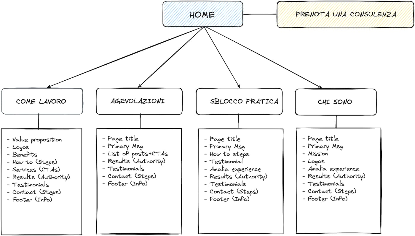
2. Content priorities
In the diagram above, I’ve listed the content ideas under each page to give an overview of the relationships between different pieces of content.
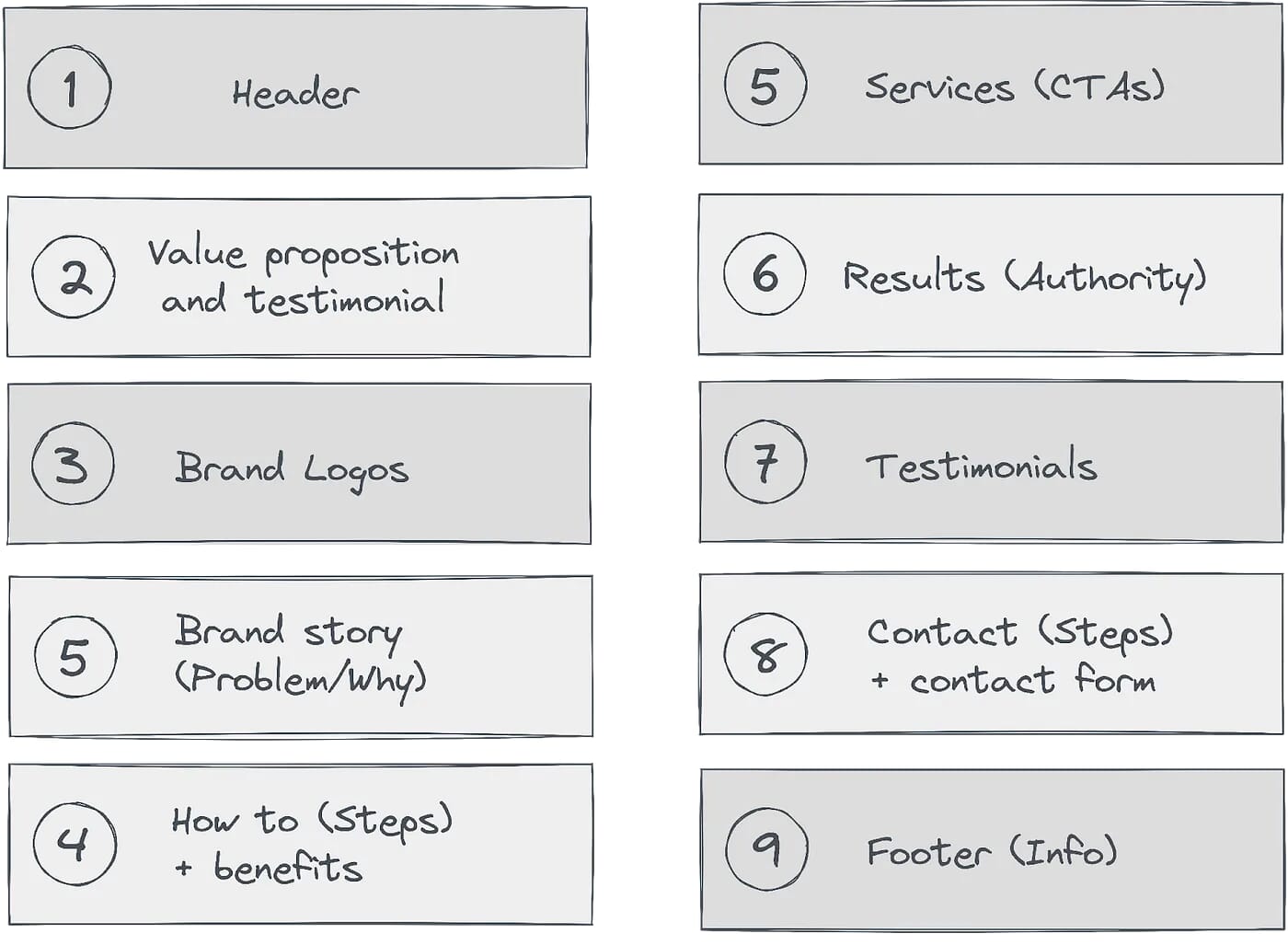
Before rewriting the text of each page, I reorganized the content by defining content priorities. This method allowed me to establish a clear content hierarchy on desktop and mobile.
This approach consisted of grouping the content into chunks and arranging them in order of importance. This is an example of how I organized content priorities on the homepage:
3. Assign user’s questions for each page
To identify those questions, I always ask myself the following fundamental questions:
- What do users want to know from us?
- What information users need to know on this page?
- What do we want them to do on the page?
To find more ideas about the questions customers could ask when visiting a specific page, I asked Chat GPT to provide me with a list of the top ten user questions. This way, I could find any important user questions we might have forgotten with Amalia during our research phase.
When I work on the content, I also consider the primary call-to-action button to add to each page that will drive the business goal, such as “subscribe” or “book a consultation”.
4. Writing the content draft
Once I completed assigning questions to pages, I wrote the content draft of each page with Francesca and Amalia on Google Docs.
I like to use Google Docs because it forces me to concentrate on writing and setting up a good content hierarchy without being distracted by visuals. Having the pages on Google Docs also makes it easier to convert the documents into HTML and CSS prototypes when I implement my designs.
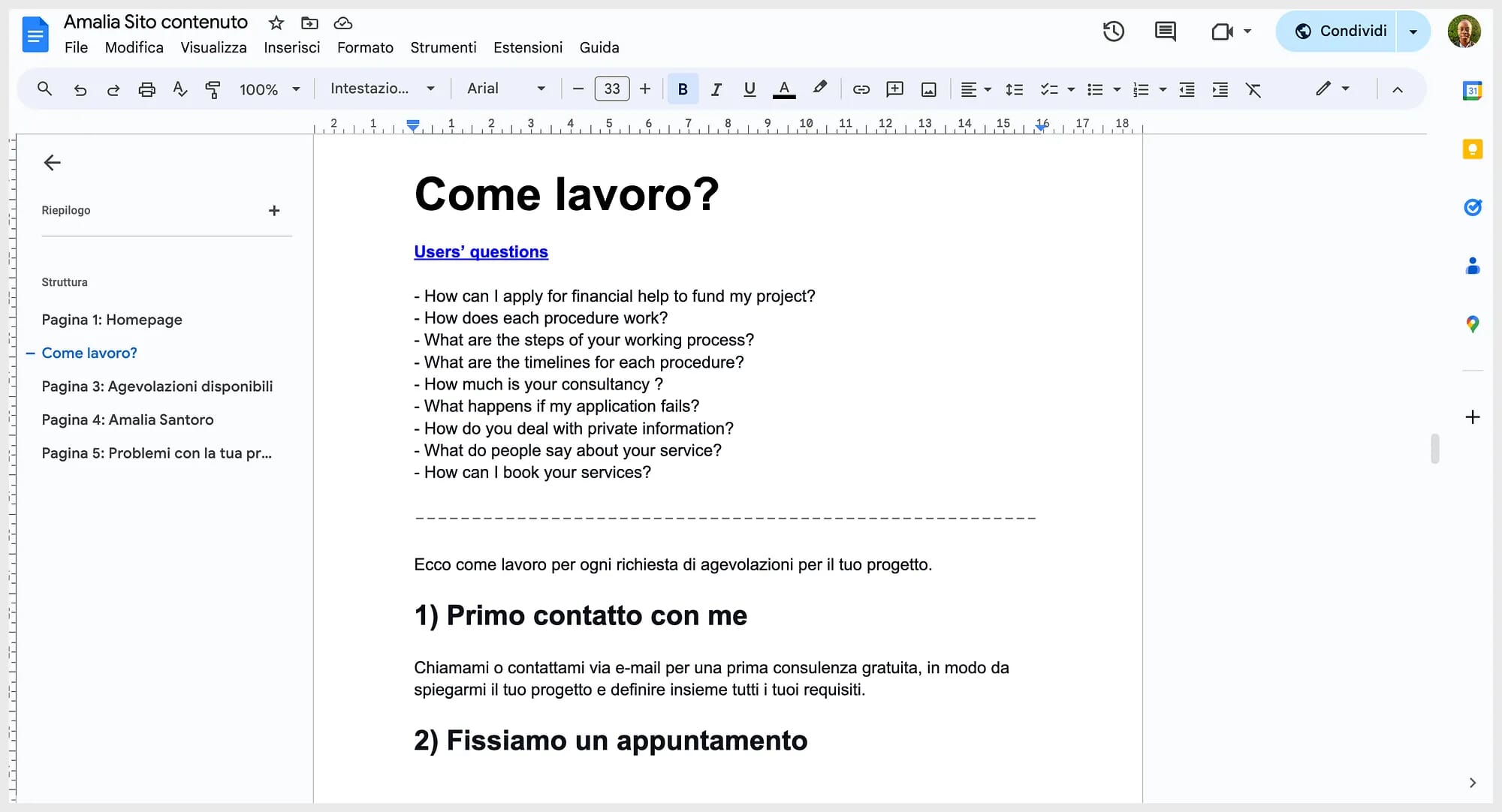
To sum up my methodology, I first wrote the content draft from the users’ questions and the brand exercise.
Then, I used storytelling and the AIDA model to make the content compelling, actionable and clear. My main goal was to write the content in the most accessible way, avoiding any technical jargon.
To finish, I asked Francesca and Amalia to review and refine the content, staying consistent with the tone of voice and brand messages. Their fresh eyes ensured that the content remained accurate and high-quality.
Takeaway n°4
Thinking about the site structure and writing the content draft makes designing visuals easier. By doing this, you will know exactly why each page exists and how you should design it to bring maximum value to users. Remember, if you don’t prioritize and think about content early, you will likely design pages that confuse users. So make sure to always consider this step in your projects.
Step 5: Designing layouts
After a lot of effort on the content, it was finally time to work on the new website’s visual identity.
My objective was to develop a creative direction that would help Amalia’s business stand out from its competitors and create an experience that would leave people with a positive impression.
This final phase involved building the page layouts, picking appropriate typefaces, creating a colour palette, and choosing images to define the new website’s design atmosphere.
Here is the process I followed to art-direct my designs.
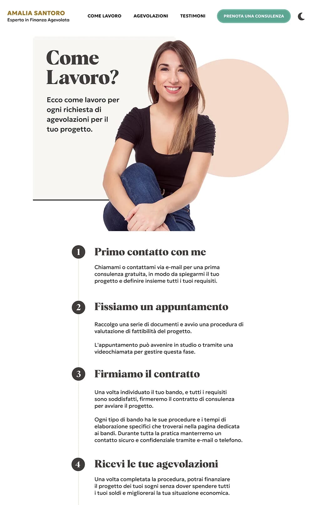
1. Creation of low-fidelity wireframes
For every single page, I began by sketching the interface with pen and paper to get a rough idea of the layout structure.
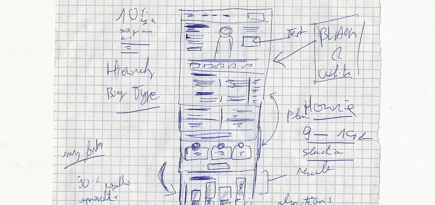
Once I was pleased with my draft, I moved to Sketch (the software) to create a better version of the wireframe in black and white.
By arranging the running text and images without initially worrying about visuals, I could quickly experiment with various layout ideas and gather specific feedback from Amalia about the storytelling.
To create compelling layouts, I used a compound grid that I made by overlapping a four-column with a five-column grid. This grid was the foundation for laying out every page.
My approach to page layout includes choosing the most suitable grid to tell the story effectively and encourage visitors to take action. My aim is to always make the content clear and accessible on every screen size.
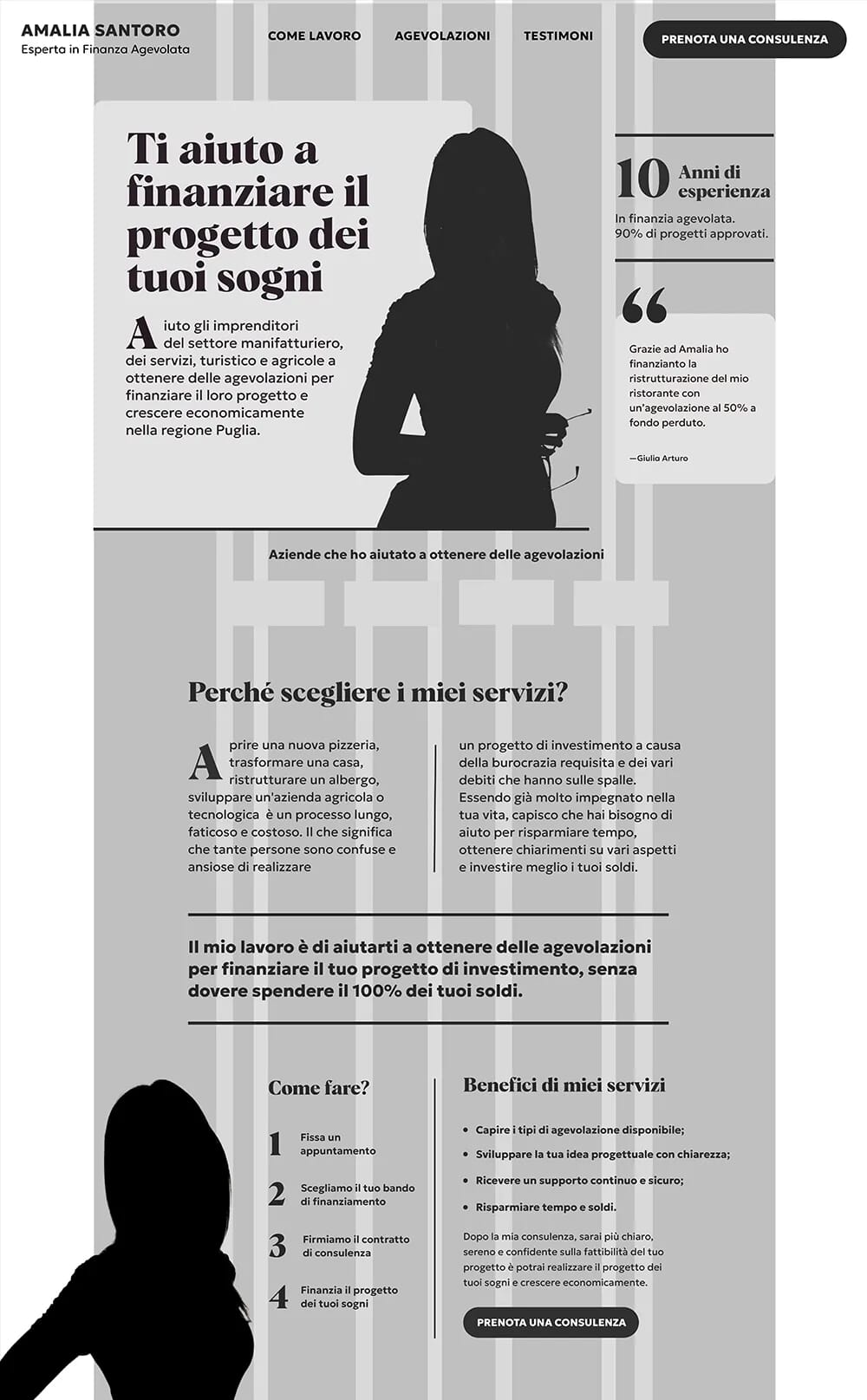
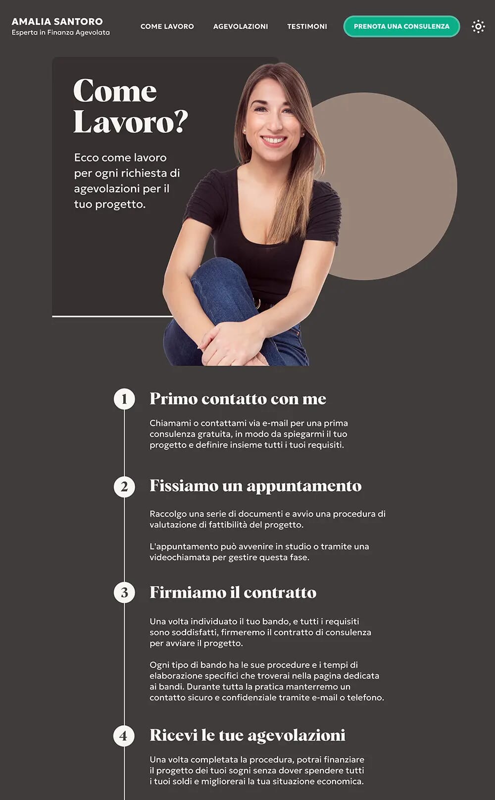
2. Layouts: improved fidelity
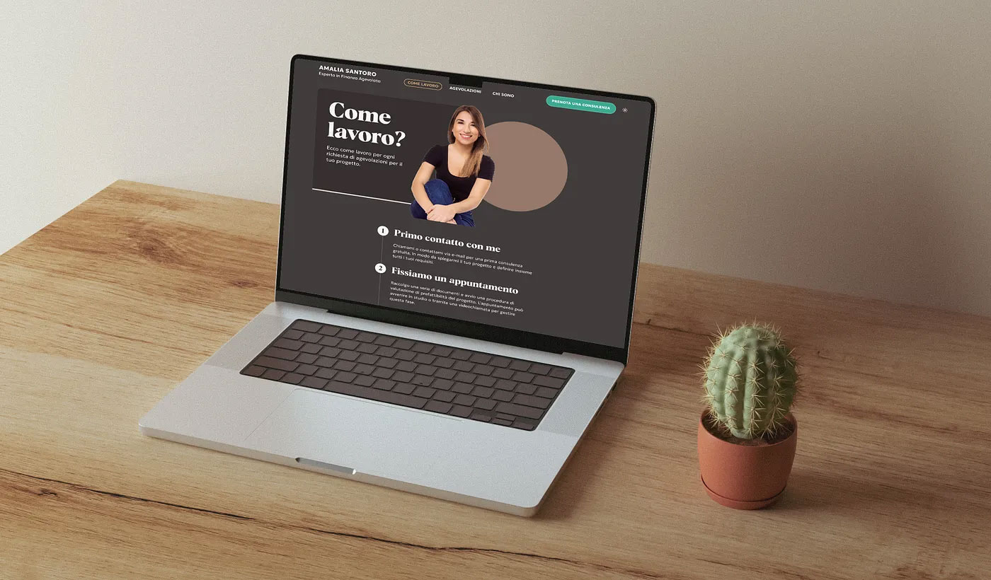
After producing the wireframes in black and white, I improved the fidelity of my designs by adding colours, selecting typefaces, and using images that support the following attributes: vibrant, friendly, refined, and premium.
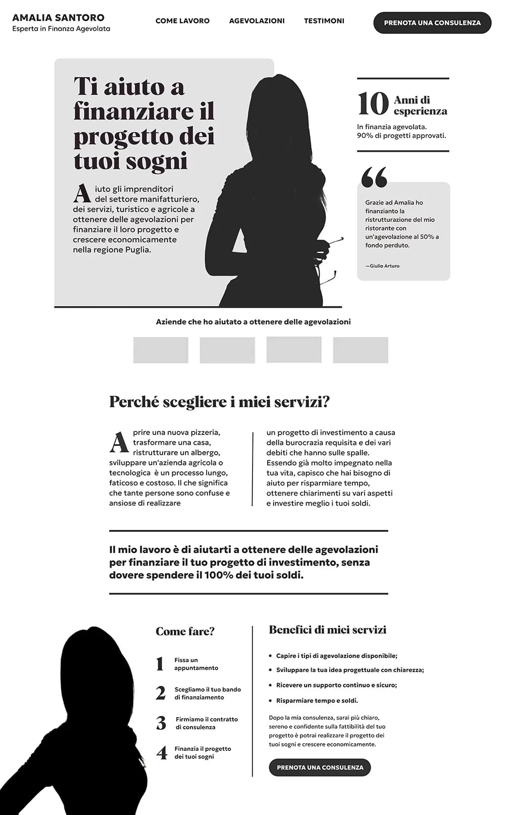
Below is an example of sections of the homepage on a mobile screen:
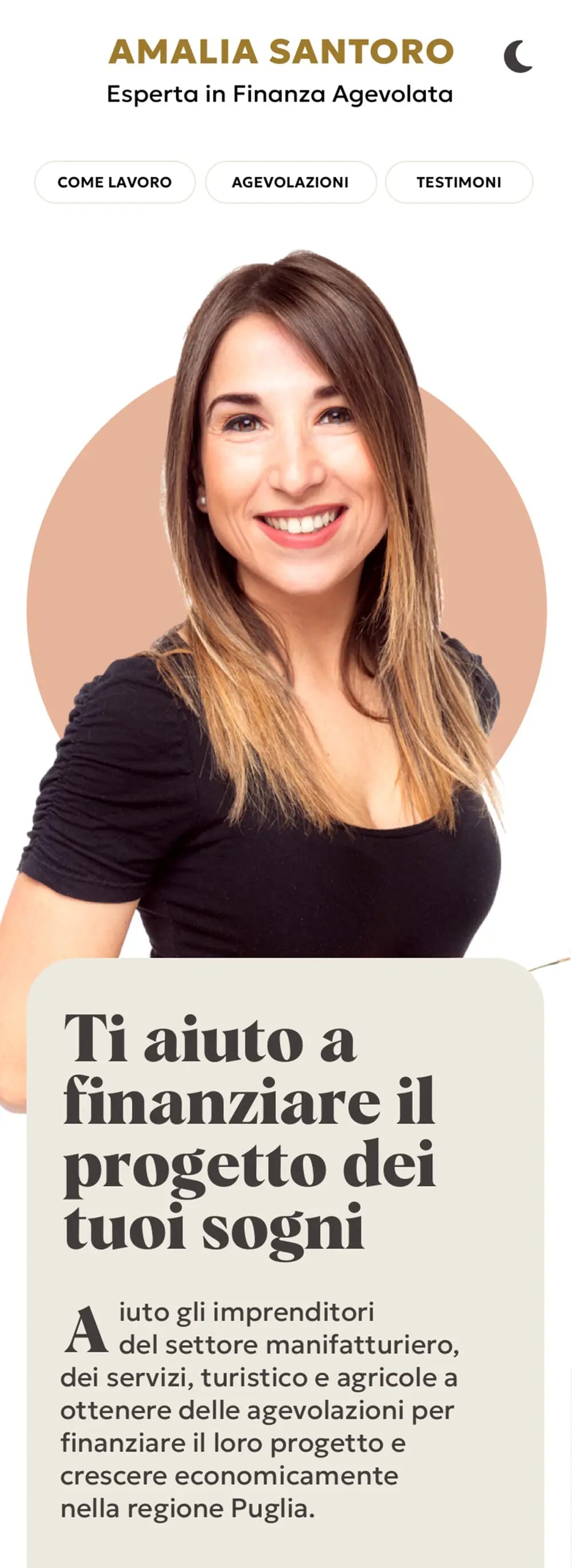
3. Colour palette
Since Amalia’s old website already had great colour combinations, I just refreshed them to make the new palette.
The new palette included two base colours and an accent colour for interactive elements such as call-to-action buttons and links. I also created extra shades and tints for each hue to have more flexibility when styling components on the interface.
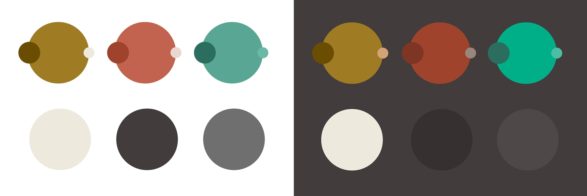
In addition, I created a small set of neutral colours for backgrounds, borders, and text. I extracted different shades from the pictures used in my designs to create these colours.
Since dark modes are popular these days, I made a dark theme version to offer users an alternative browsing experience. To create colours that would work well against a dark background, I adjusted the contrast, saturation, and brightness of the light theme colours.
In the end, Amalia and I were very happy about the result. This approach to colour allowed me to create a colour palette that sets Amalia’s business apart from her competitors.
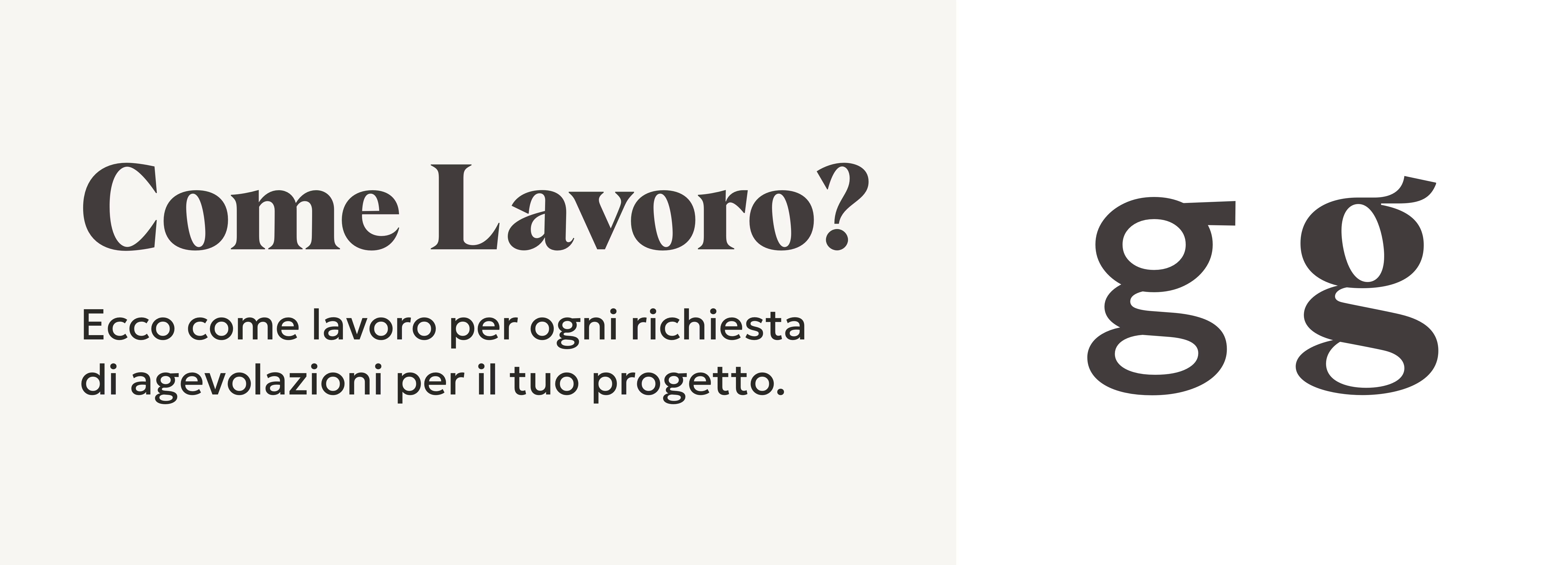
4. Typography
Selecting strikingly different typefaces for headlines and running text was fundamental to giving Amalia’s brand its unique voice, evoking emotions, and effectively communicating the message.
My first step was to find a display typeface with a strong personality that I could use on headings. Starting from headings is my favourite technique because titles are perfect for adding visual interest and captivating someone’s attention on an interface.
When searching for fonts, I found a fabulous serif typeface called “Albra” on MyFonts. This typeface was an excellent choice because it gave Amalia’s brand a luxurious and charming feel.
On the other hand, I chose the sans-serif typeface called “Geologica” to style the running text. This typeface was ideal for typesetting the content since it’s highly legible and readable. The good aspect of this typeface is that it comes with various font styles, including light, regular, semi-bold and bold.
“Geologica” is pretty neutral and pairs well with “Albra.” The combination looks appealing to the eyes but doesn’t distract the reader.
Working on typography goes beyond picking and combining typefaces. I also consider scaling typographic elements, such as running text, headlines, numerals, and pull-out quotes, to create a stunning visual hierarchy that helps users process the content.
In these designs, I used the Perfect Fourth 1.333 type scale from Utopia to size typographic elements consistently on mobile and desktop devices.
So far, the typefaces I picked for the website work remarkably. Whenever I show someone the website, they first mention how nice the font pairing looks. That’s always good to hear!
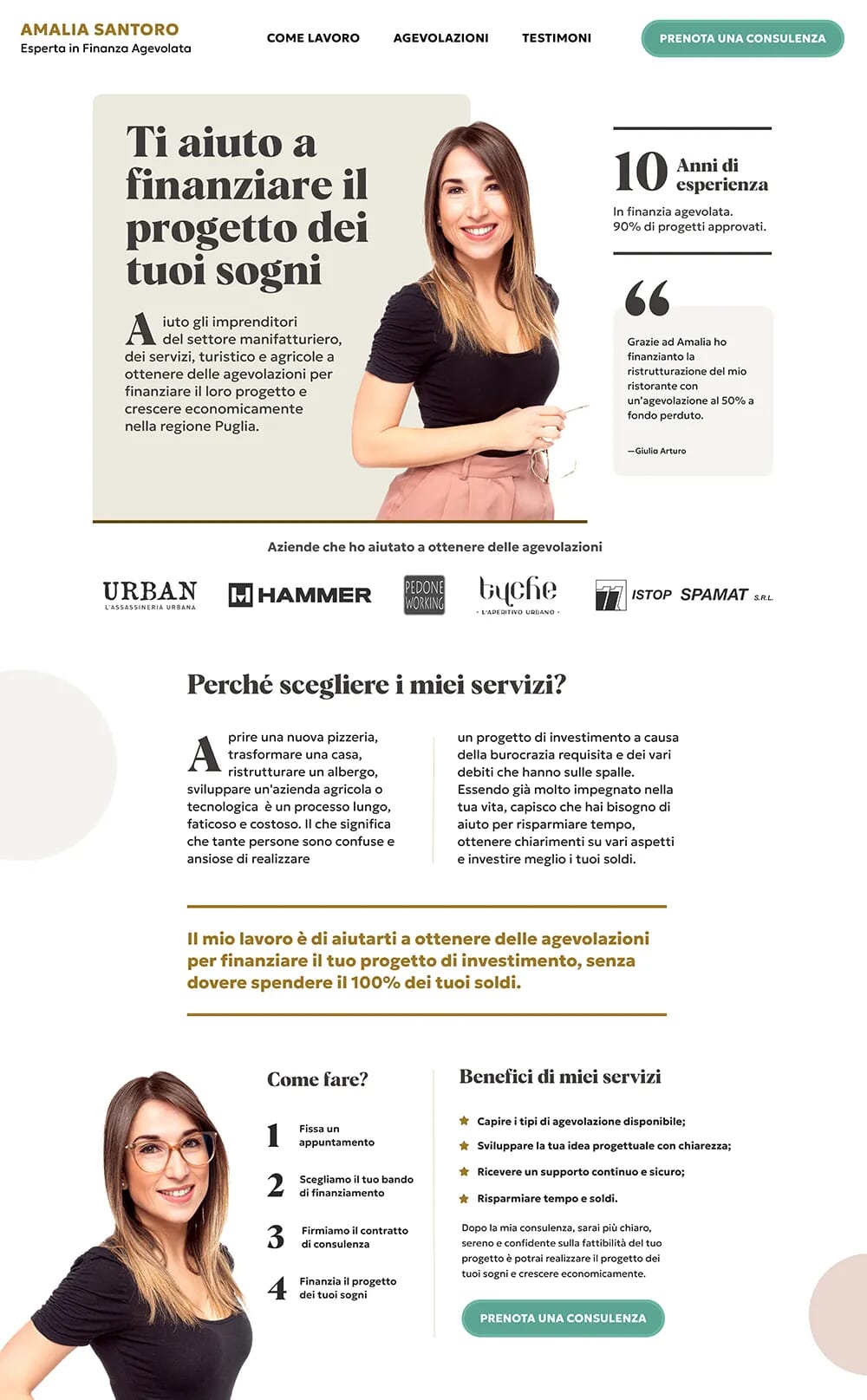
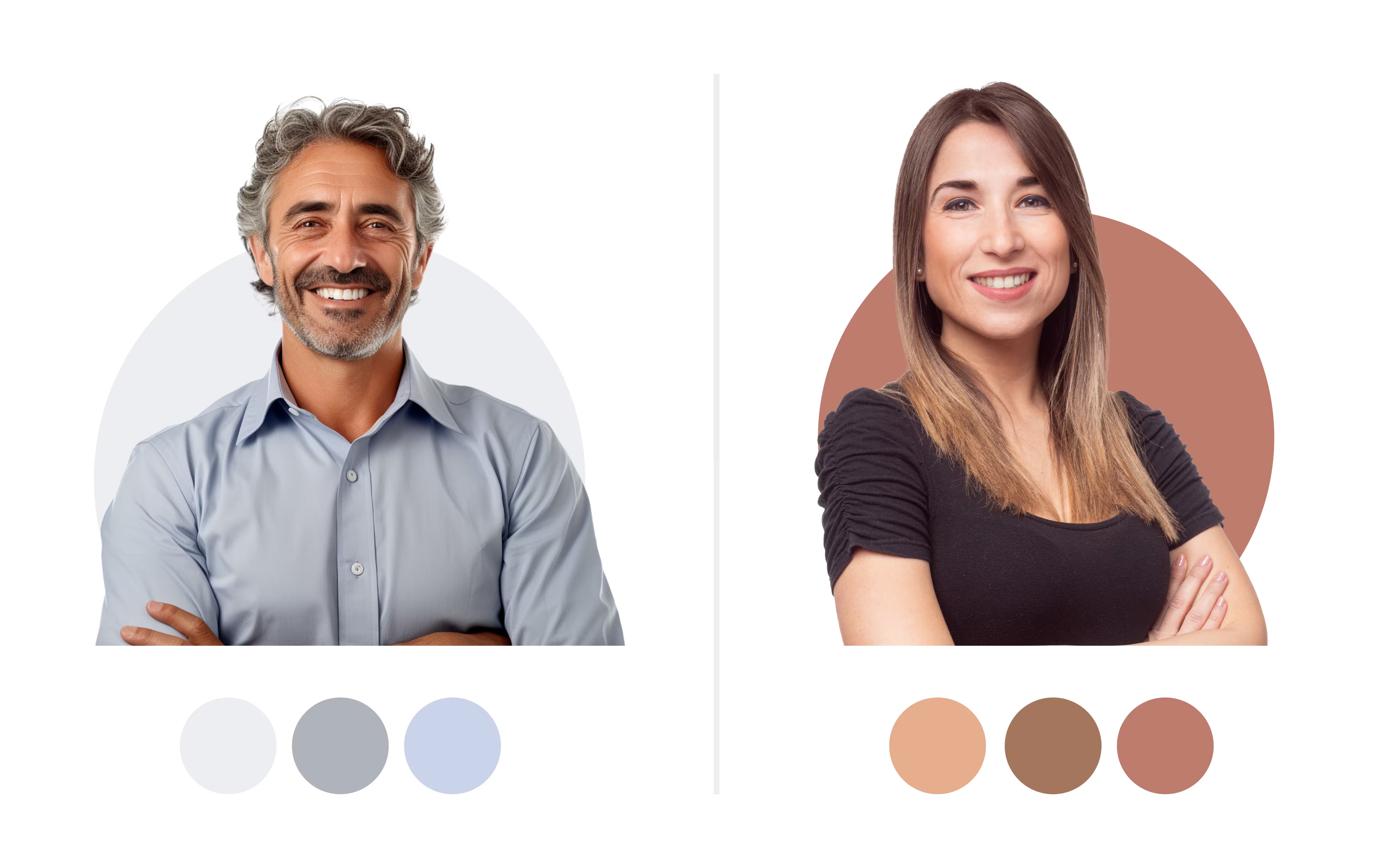
5. Images
When appropriate, images are powerful tools for telling better stories, influencing, and conveying trust. Since the old website had many low-quality images that made Amalia’s brand seem unprofessional and unreliable, I had to improve this area on the new site.
This is how I made better use of images to fix this problem.
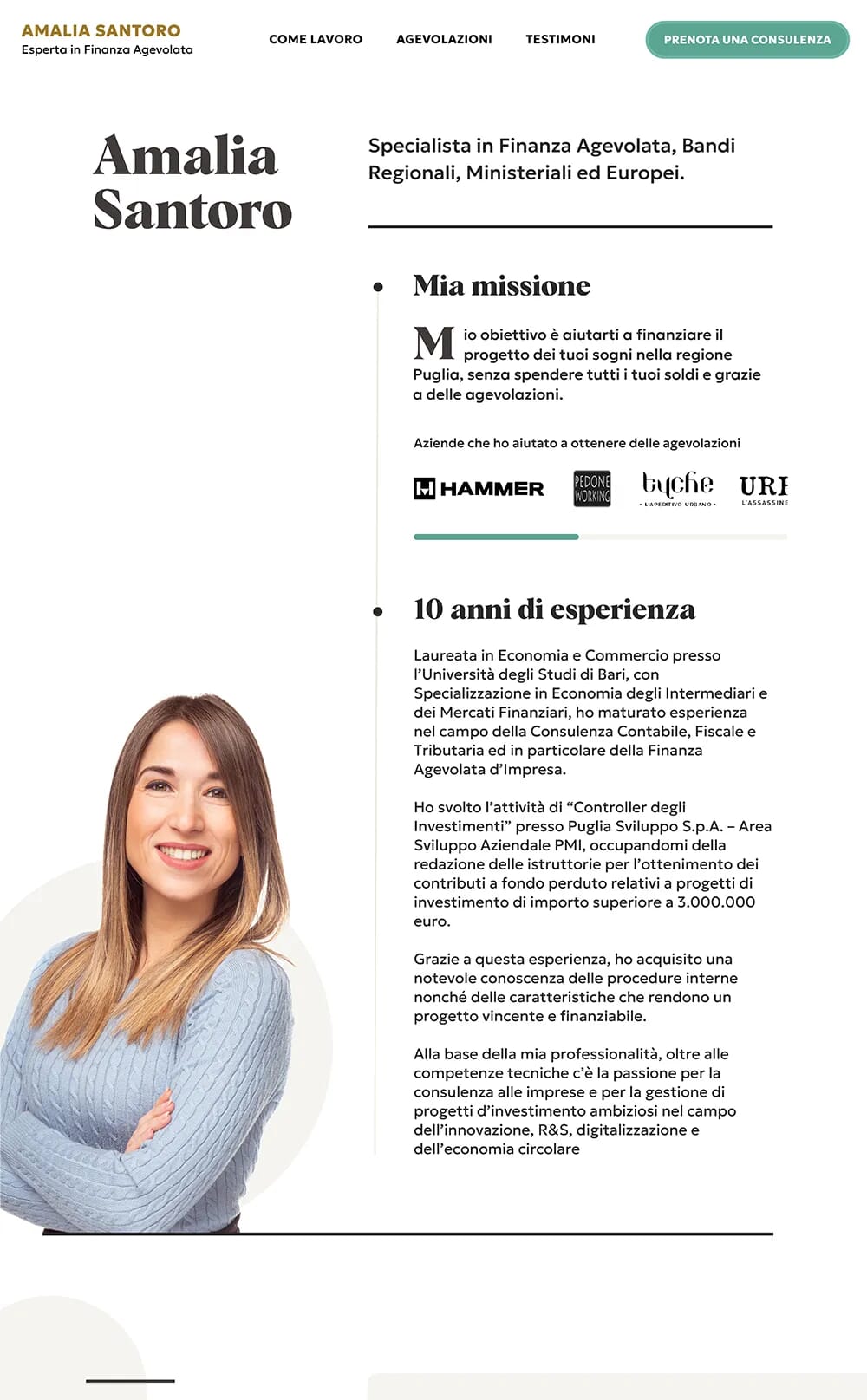
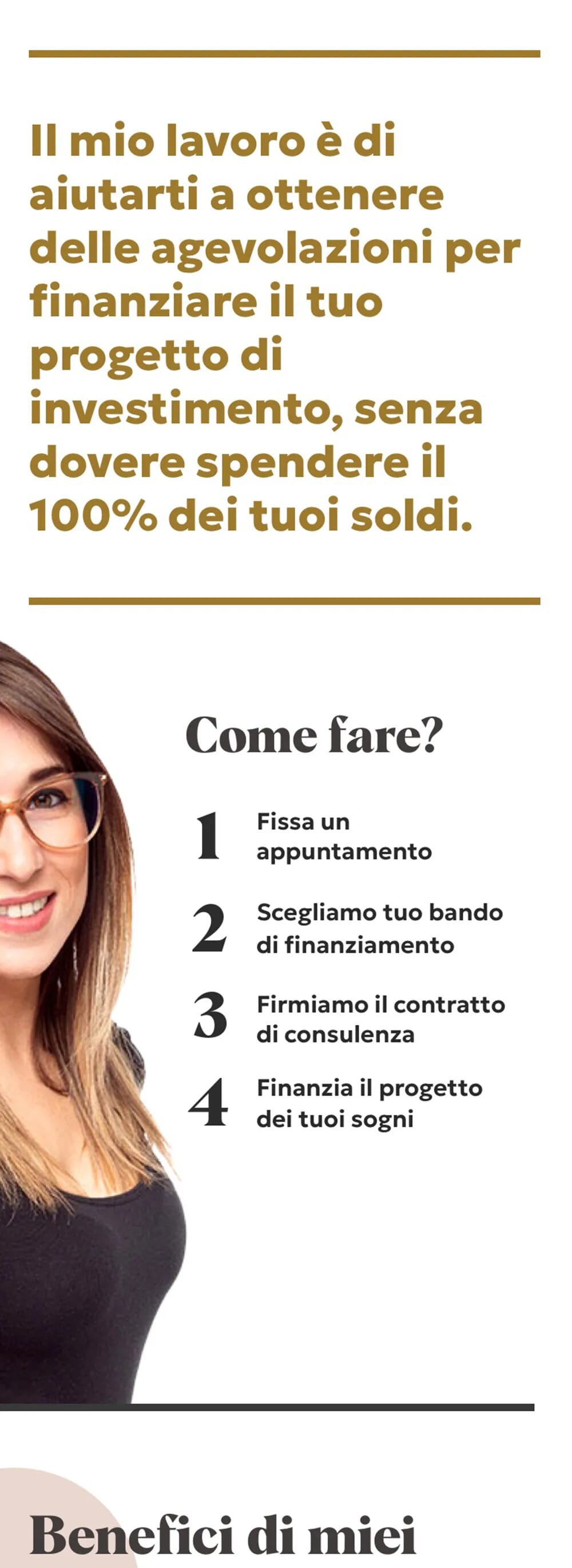
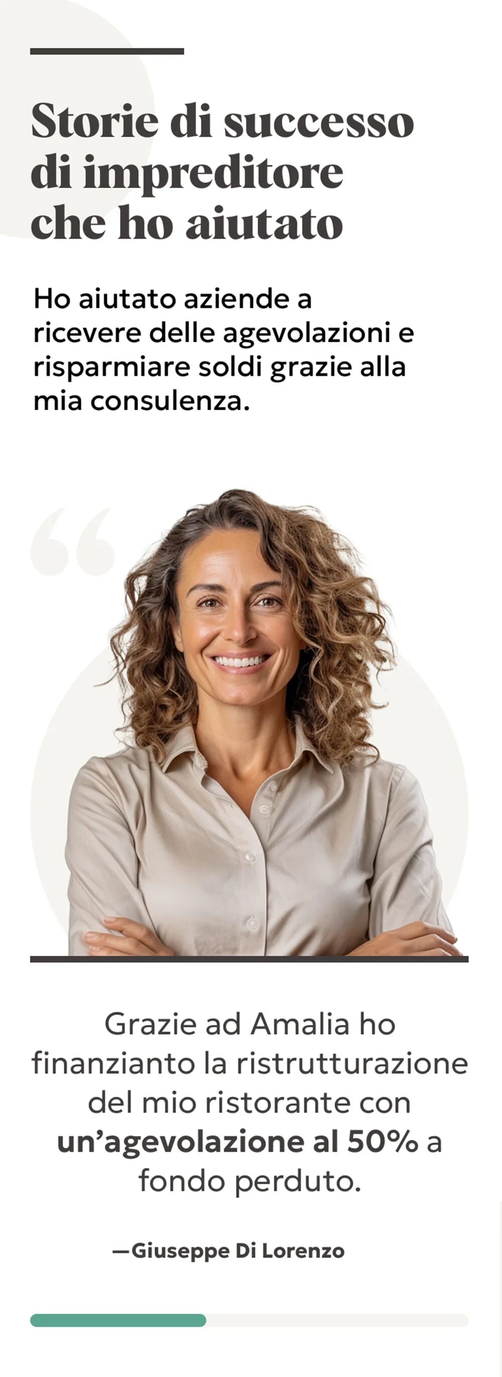
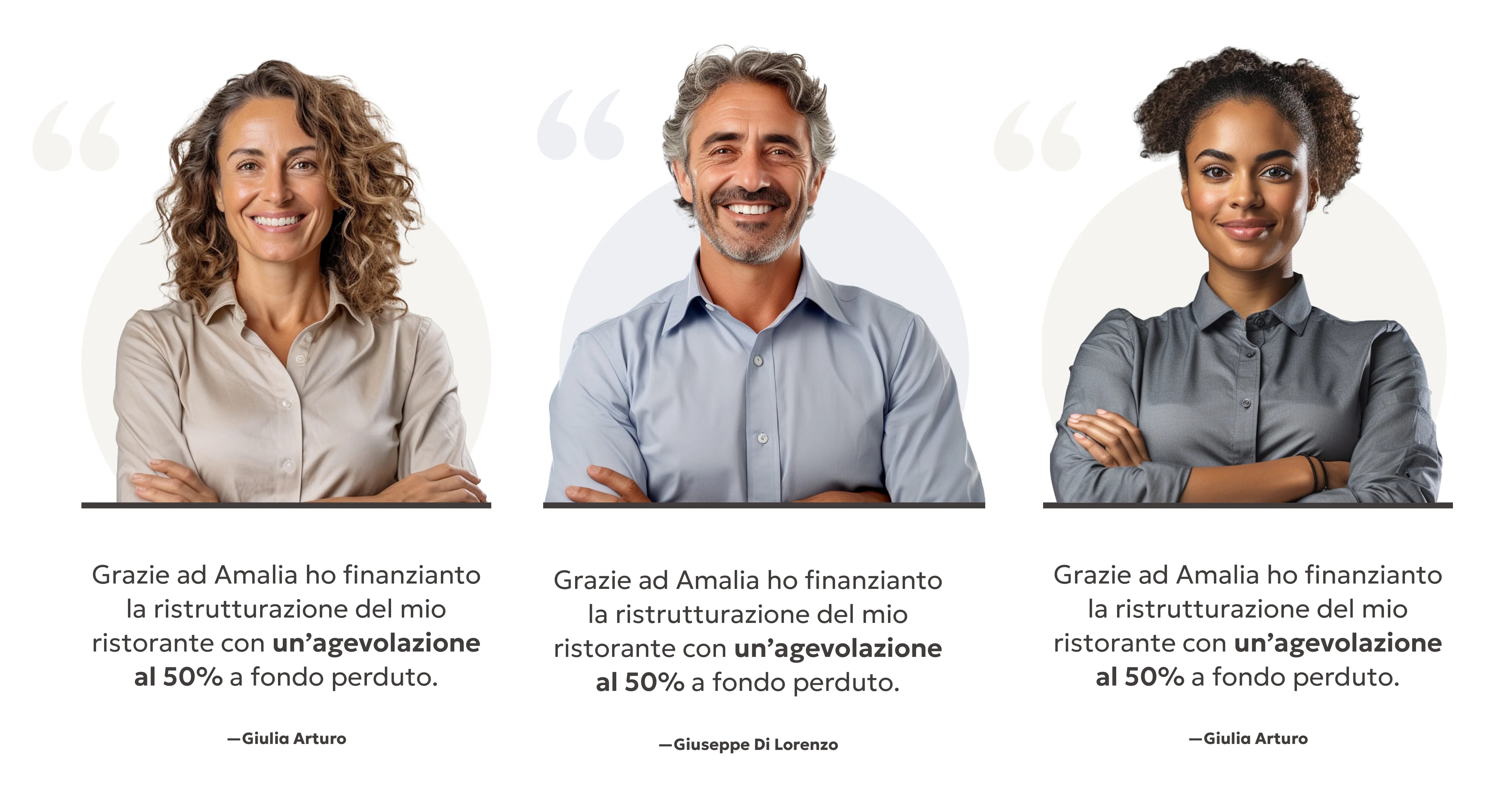
I used multiple high-quality portraits of Amalia with different expressions to add variety and create an emotional connection with users on pages.
Using different images of Amalia communicates that she is approachable, trustworthy, and empathetic. This method allowed me to let people feel reassured and excited about doing business with Amalia.
In addition, using Amalia as the brand character was an effective way to guide users through the website, tell the brand’s story, convey its message, and consistently and appealingly engage with the audience.

a) AI images with Midjourney
I also used Midjourney (AI) to generate realistic human faces. Since humans are attracted to faces, using realistic profiles strengthened the emotional connection and increased the level of engagement in my designs.
b) Animated SVG
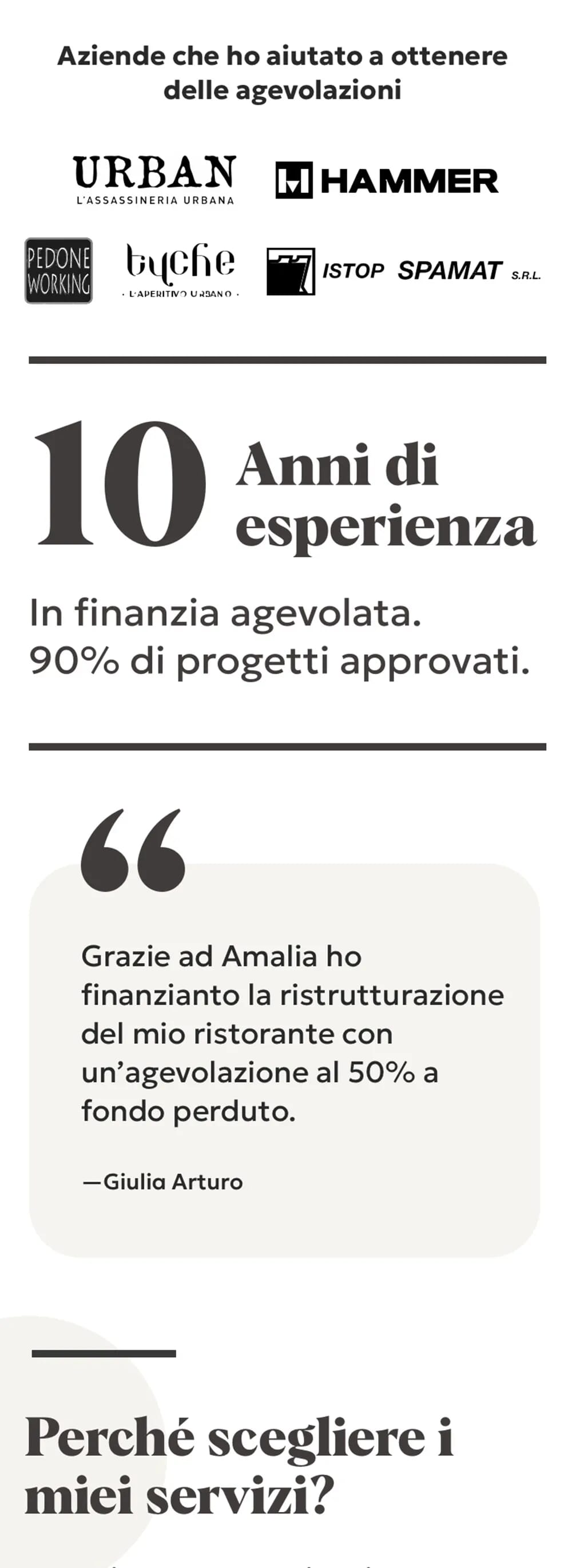
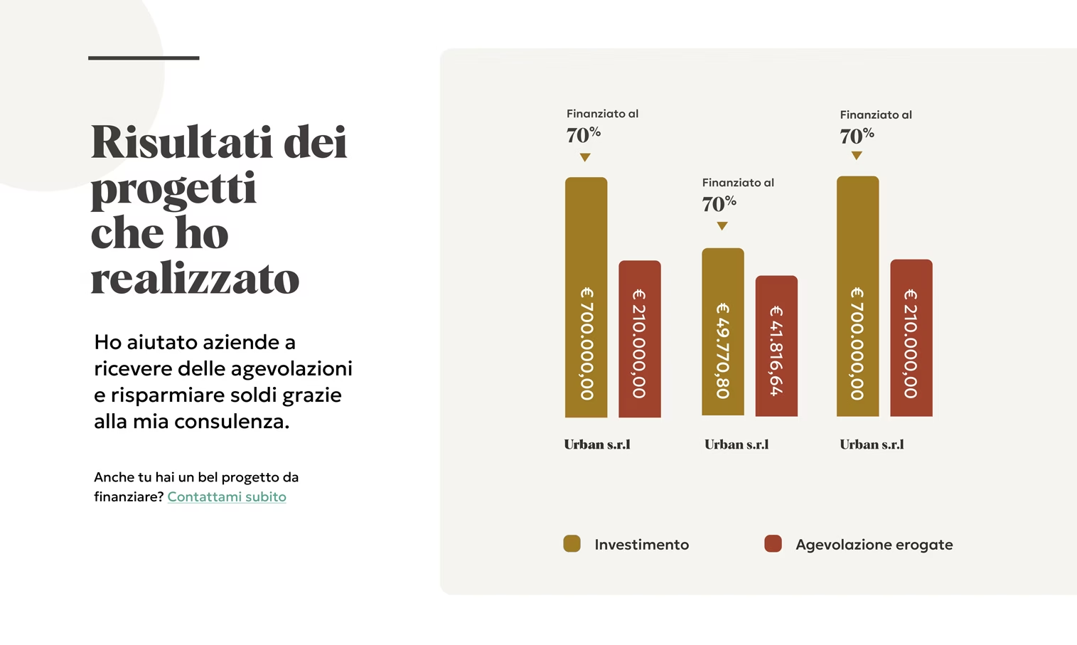
On her former website, Amalia presented her work results with too much content that was difficult to read.
Since this information was critical to convey authority to customers on the new site, I turned the data into a diagram to present the content in a clear and engaging way.
When I implemented the site in HTML and CSS, I animated this illustration with SVGator to add a nice touch of art direction to the website.
6. Design details
Small details make a big difference in a design. I used a blend of graphic and typographic design elements to enhance the brand’s personality, improve usability, and refine the interface.
Print magazines were a great source of inspiration for exploring how I could add depth to different areas of the site.
In addition, I created a small set of neutral colours for backgrounds, borders, and text. I extracted different shades from the pictures used in my designs to create these colours.
Here is a snapshot of the design details I used in my designs:
- Circles shapes
- A mix of thin and thick borders to structure the content
- Custom scrollbars
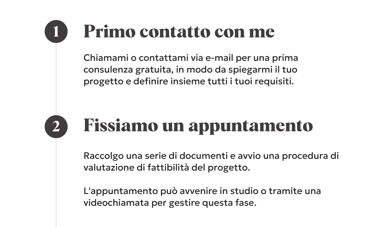
- Numerals to improve comprehension
- Stars icons for list-style bullet points
- Drop Caps
Remember, a well-crafted design is all about the smallest details. Always add design elements that improve the user experience. Don’t add elements that would distract the user or clutter the interface.
Takeaway n°5
Art-directing and refining your designs is essential to creating a distinctive website. This approach enhances the user’s experience and helps create lasting impressions that stick in people’s minds. On Amalia’s website, the mix of fonts, colours, and picture styles evokes an emotional response from people and communicates that the brand is friendly, vibrant, reliable, and premium.
Conclusion: the outcome
A few weeks after I released the site to live, I was very pleased with the outcome. It is one of the best websites I have ever made.
Amalia is super excited about her new website because it finally communicates her personality and clearly tells the story of her products and services. The website elevates her brand and attracts more customers to her business.
Customer feedback is also very positive. Right after launching her new site, Amalia has gained two new important clients for her business. That was a key indicator of success!
These Key Performance Indicators (KPIs) were useful to evaluate the impact of the strategies and actions I implemented throughout the project. Monitoring performance relates to the “Control” phase of the SOSTAC® framework.
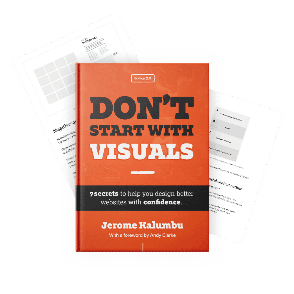
My goal with this series was to demonstrate my strategy for designing a distinctive, engaging, and successful website. To read more about my design approach, read my book “Don’t Start With Visuals”.
I hope this case study has inspired you to think about strategies you could use to successfully solve creative challenges!
Thanks for reading.
Jerome Kalumbu
If you are interested, here are the resources that helped me during this project. I am sure they will help you improve the quality of your work, too:
Articles:
- SOSTAC® marketing planning model guide and the RACE Growth System
- Don’t Start With Visuals
- The AIDA model
- Inspired Design Decisions: Pressing Matters
- How to combine typefaces successfully to add personality to your digital interfaces
- 7 tips to create a successful content outline for your web interfaces
- Inspired Design Decisions With Giovanni Pintori: Publicity Becomes An Art Form
Books:
- Building a StoryBrand by Donald Miller
- Marketing Made Simple by Donald Miller
- This Is Marketing by Seth Godin
If you want to learn more about this topic, read my book “DON’T START WITH VISUALS”.