7 rules for great web interface design
Quick summary This article outlines 7 rules essential for designing interfaces that are user-centred and help the business achieve its business goals.
When you work on a website or on the design of web pages, remember that their success is not determined by the beauty of their visual style. In fact, in his article “10 Principles Of Good Website Design”, Vitaly Friedman stated:
Usability and the utility, not the visual design, determine the success or failure of a web-site.
The problem
Sadly, many designers concentrate their efforts on designing trendy user interfaces without considering the audience and goals. As a result, they create interfaces that are complex, sometimes unrealistic and inappropriate.
This article attempts to address this problem by describing 7 rules for designers and anyone interested in user interface design to create web pages that are functional and visually attractive.
Let’s get started!
Rule #1: Define the goals of the page
On a website, each page should accomplish a goal, solve a problem and serve the user. To start your design on the right track, ask yourself the following questions:
- Why am I designing this page? This question will enable you to understand the problem the design should solve in the first place.
- What are the goals of the page? Defining the goals of the page will give you a better understanding of its purpose. For example, the business goal of a page can be to:
- Sell a product or service;
- Encourage users to sign-up;
- Promote some benefits to the users.
But, a page can also have multiple goals. Pay attention to this important aspect.
Rule #2: Know your audience
To design an appropriate interface, you must know what is your target audience and keep that in mind throughout the design process; this will aid you to make relevant design decisions.
In fact, to visualize your ideal users, I recommend you to create empathy maps since they are a snapshot of the users focused on what they want to achieve. In general, you can create them from the data you collected during the research phase of your project.
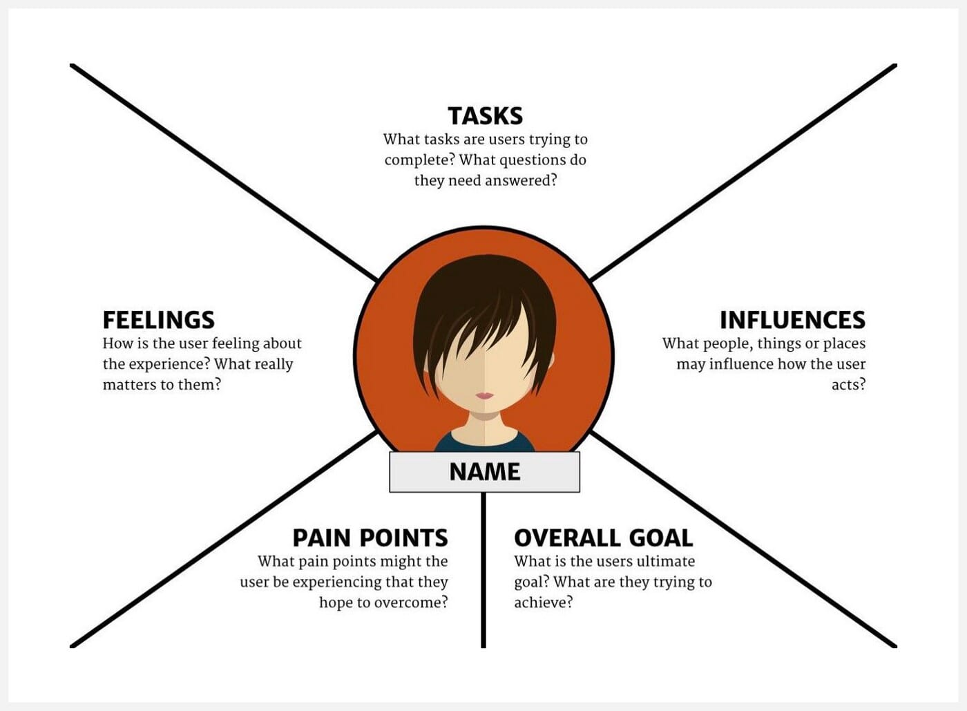
When it comes to designing a specific interface, put the user at the centre of your work by answering the following questions:
- Who is the target audience?
- What matters for the user on this page?
- Why should the user visit this page?
- What tasks does the user want to accomplish?
- What questions will the user have in mind when visiting the page?
- How should I address these with my design?
At this juncture, we understand the importance of both the goals and the audience in designing a successful web interface. Jon-Mikel Bailey puts it more clearly in his article “Better UX Is A Compelling New Feature”:
A good user experience is one where the user’s needs are met and the business goals are achieved.
Rule #3: Choose your calls-to-actions
To guide the users toward their tasks and encourage them to act, you should always think about the actions you want them to accomplish.
When you ask yourself the following question, you will have an idea about the call-to-actions to consider on your interface:
- What do I really want the user to do on the page?
Generally, I tend to use two types of call-to-action when I design a page. For example, the primary call-to-action is usually the more prominent and used to highlight the most important goal. It can be something like “Sign up”, “Register”, “Buy” or “Get in touch”.
However, the secondary call-to-action is less important and used to emphasize a less prominent action. Finally, to avoid confusing the user, each type of call-to-action should have a distinctive visual style.
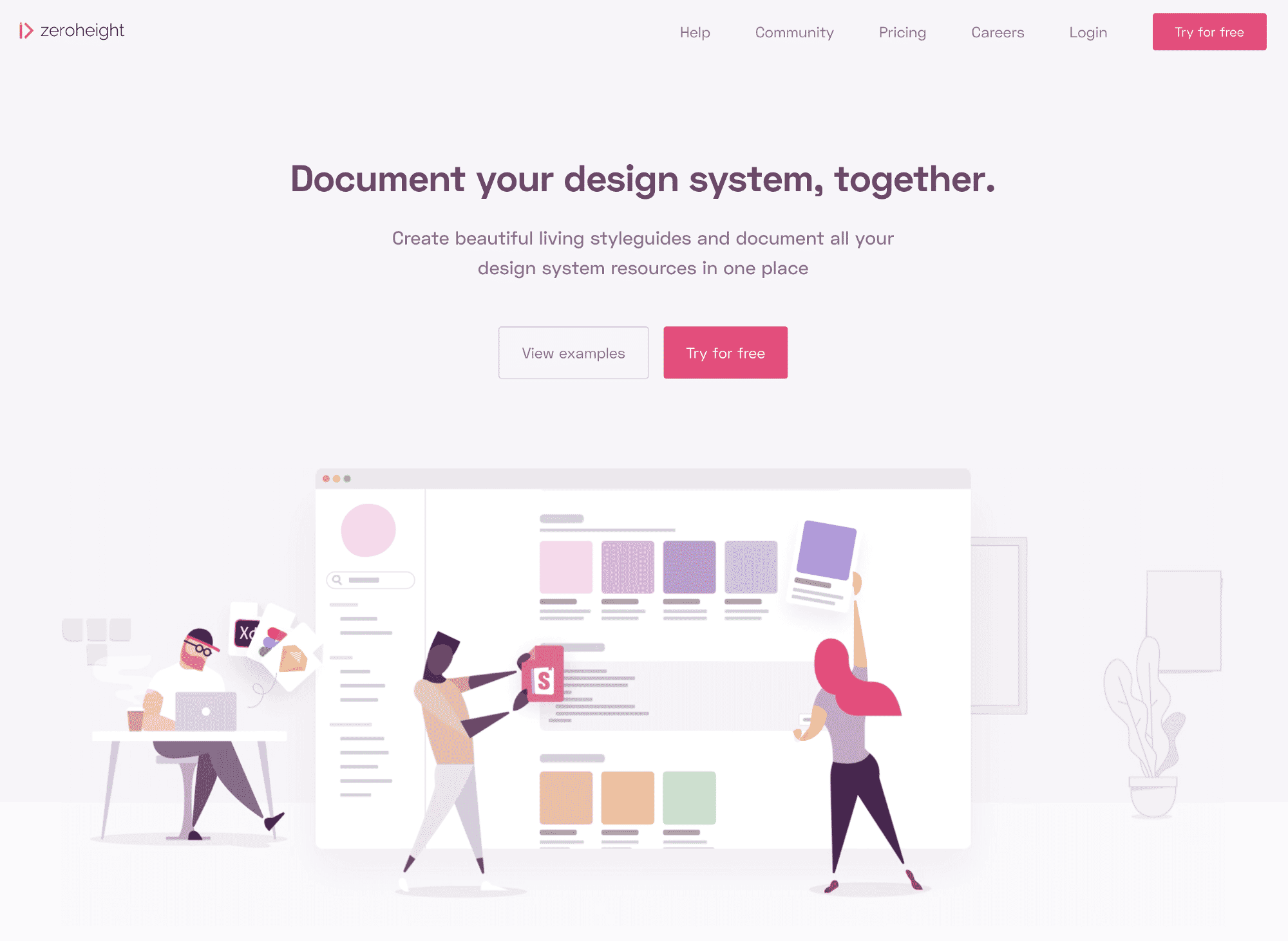
For example, on the Zeroheight website, the main goal of the business is to encourage the user to sign-up so they can get a free trial to use their tool. This action is shown to the user with the primary call-to-action “Try for free”. But, If the user is not yet ready to complete this action, he has the possibility to click on the secondary call-to-action “View examples” to learn more about the service. As you can see, both call-to-actions have a distinct visual style.
Rule #4: Content first
From the beginning, work with the real content in order to understand the story and how to structure your page. If you don’t have the content provided to you, do your best to write it in order to have at least the initial draft in place. Always get the content established first, and then build the design around it.
Below is a list of tips to help you write compelling content:
- Who are you talking to?: Consider your audience to write content based on user needs.
- Avoid distractions: Consider writing in a low-fidelity environment like a text editor to avoid being distracted by any visuals or text formatting;
- Be human: Use the second person (You) when referring to the user to make your content approachable and engaging.
- Answer the user’s questions: When visiting a website, the user has specific questions in mind. Your copy should give answers to these questions.
- Don’t be verbose: Be concise and clear as much as possible.
- Make your content scannable: Break down your content with headings, subheadings, paragraphs, pull-out quotes and lists. Remember: users don’t read pages but scan them instead.
- Write in plain language: Avoid the use of acronyms, jargon and complex words that will require the user to think.
- Avoid walls of words: Make sure to break down your copy into small chunks to make it easier to process and read. Large blocks of text are difficult to process.
- Voice and Tone: Consider the kind of emotions you want to evoke with your message. For example Friendly? Informal? Formal? I will explain more this point in rule #6 below;
- Avoid Lorem Ipsum: Using Lorem Ipsum text will encourage you to focus on a meaningless design that is likely to be distorted later, once the real content is in place.
That said, content should always come first. As Jeffrey Zeldman once said:
Content precedes design. Design in the absence of content is not design, it’s decoration.
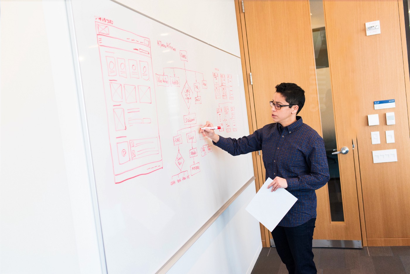
Rule #5: Wireframe your interface
To determine how the content should be organized on the page, start by drafting different approaches of the layout on paper based on the goals. This task will keep you focused on the page layout, content structure and interactions without being distracted by any colour, fonts or graphic elements. Whenever possible, collaborate with the client, stakeholder or any member of your team to share the ideas.

In his article “My five commandments for wireframing” Paul Boag confirms the benefits of starting a design from hand-drawn sketches:
To keep a light weight, spontaneous approach, wireframes should be initially produced with pen and paper.
When wireframing, consider how the information should be displayed starting from mobile to desktop screens in order to think about the whole experience and prioritize the necessary information.
Once you are happy with your sketches, feel free to refine them on the wireframing tool of your choice.
Finally, test early and often your wireframes with a few people outside the project and iterate until you have a great solution to the problem you are trying to solve.
In the last two guidelines, I will advise you on how to approach the visual design of your interface in order to make it visually attractive and memorable.
Rule #6: Art direct your design
If you want to develop trust and make people connect with your interface, you should consider applying art-direction to your design to create a distinctive personality. In his book “Art Direction for the Web” Andy Clarke said that art-direction:
“Uses design techniques to intentionally evoke an emotional response from someone when they read an article, use a product, or visit a website.”
To art-direct your design, start by asking yourself the following questions:
- How do I want the user to feel when interacting with the site?
- What do I want them to say?
In addition, write a shortlist of words that convey the impressions you want users to have when seeing your site. These attributes will define the personality of your design and guide you on which typefaces, photography, colours and layout are appropriate to use.
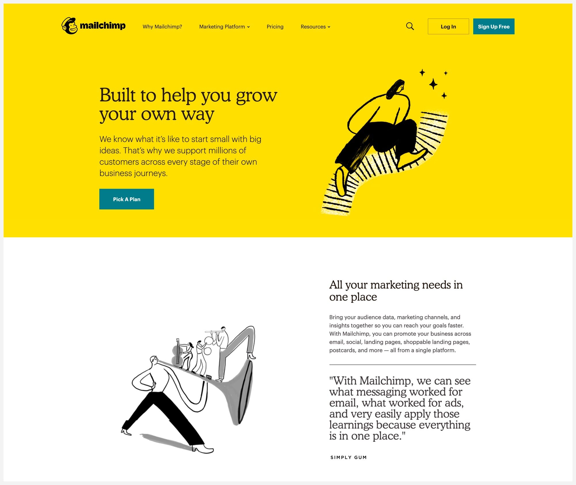
Finally, the copywriting of your page (e.g: body copy, labels and error messages) should be created around these attributes to reflect the correct voice and tone. For example, Mailchimp and Smashing Magazine websites have a visual language and copy which conveys their personalities efficiently.
To learn more about how I art-design my designs, consult my article “How art direction will help you create masterful web interfaces”.
Rule #7: Make it beautiful
Once you determine the design direction of the site, your next step is to make the pages visually attractive and enhance their functionality. A successful visual design will put the user in a positive frame of mind about the whole experience of the website; this will make them believe the website is trustworthy and easy to use.
Below are critical design principles to consider if you want to create an interface that is easy to use and pleasant to see on screen.
- Balance: Achieving visual balance will make your interface feel right and comfortable for the user to stay engaged with. Symmetry, Asymmetry and Radial balance are three ways to balance elements on a design.
- Alignment: Alignment helps to create order, arrange your elements as well as create visual connections. For instance, the use of Grids can help you ensure great alignment and improve the readability of your interface design.
- Contrast: Contrast helps to create variety and visual interest in your design when successfully applied. For it to be effective, one element such as shape, colour, size, weight or texture must look different from another.
- Consistency: UI Elements that have the same function and purpose should be styled in the same way. This will make your interface easy to use.
- Negative space or (White space): Negative space brings focus to the content, improves readability and builds visual hierarchy. Also, it can help the user process easily the content on the page.
- Colours: Use a small number of colours in your palette to avoid a “rainbow effect”. The colours you choose should reflect the personality of your site’s brand.
- Typefaces: Make sure to choose readable and legible typefaces for your design. To learn more about how to choose appropriate typefaces for your project, read my article “Great interfaces are made of good typography”.
To go further on this subject, I suggest you read the book “Designing Visual Interfaces” by Kevin Mullet and Darell Sano. Also, understanding the Gestalt principles will help you design interfaces that work visually.
Conclusion
As we have seen in this article, a successful user interface design requires you to think further than the visual aspect. I hope that the guidelines I stretched under this article will assist you in the creation of meaningful and easy to use web interfaces.
Jerome Kalumbu
Recommended Articles
- 10 Principles Of Good Website Design by Vitaly Friedman
- How To Use Spaces In Web Design With Gestalt Principles by Ayesha Ambreen
- 30 Powerful Call to Action Examples That Are Successful by Paul Boag
- Why designers should never use fake text by Jerry Cao
Recommended Books
- The law of simplicity by John Maeda
- Designing Visual Interfaces by Kevin Mullet and Darrell Sano
- Think First by Joe Natoli
- Art Direction for the web by Andy Clarke
- User Experience Revolution by Paul Boag
- Don’t make me think by Steve Krug
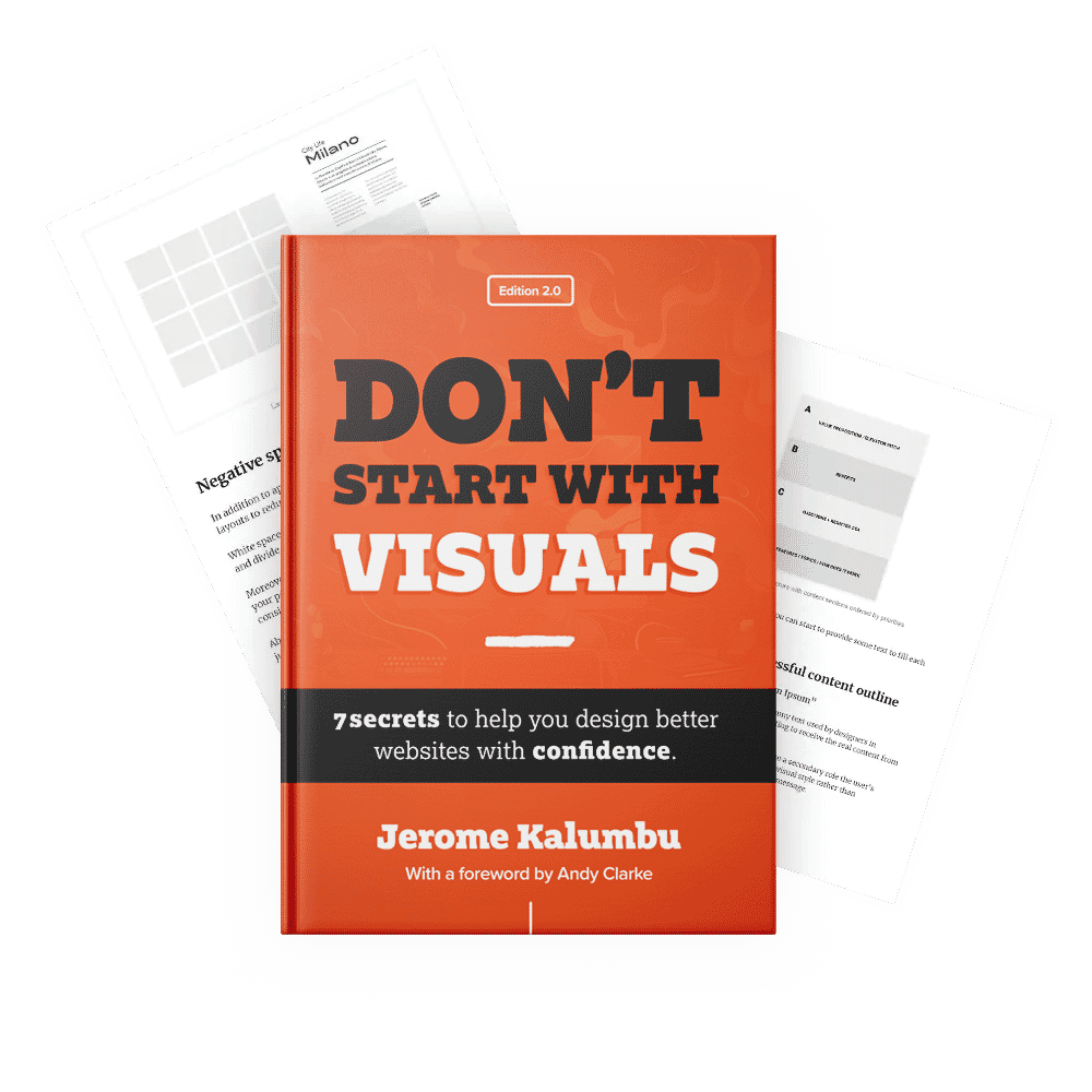
If you want to learn more about this topic, read my book “DON’T START WITH VISUALS”.