How I Revamped Comunicare in Farmacia to Clarify Its Message and Drive Sales
Quick summary This case study shows how I improved engagement and brand positioning by clarifying the message, applying strong art direction, and structuring content around real user needs and business goals.
The Problem: A Website That Didn't Sell
Three years ago, Alfonso Di Stasio, the owner of Comunicare in Farmacia, asked me to redesign his website to better promote his services to pharmacist-owners.
The site lacked clarity, making it difficult for visitors to understand:
- What they were buying
- How Alfonso's expertise could help them
- Why they should choose him over competitors
Beyond that, the reading experience was frustrating, and the design failed to differentiate the brand in a crowded market.
The Turning Point: A Site That Cost Clients & Revenue
A year later, Alfonso reached out again—frustrated that his website was actively costing him clients and money.
This time, we approached the redesign with a clear focus on business outcomes, defining four goals:
- Clearly communicate Alfonso's offerings
- Grow the newsletter subscriber base to build authority
- Increase consultancy inquiries
- Strengthen brand awareness
I applied insights from Amalia's redesign and my mentorship with Andy Clarke, combining UX principles, storytelling, and creative direction to design a site that builds emotional connection, expresses a clear personality, and supports business growth.
The Process: 5 Rules for a Website That Works
Rule #1: Say It Fast, Say It Right
Users spend only a few seconds deciding whether to stay on a website. If the value proposition is unclear, they leave—and the business loses opportunities.
When I audited Alfonso's original site, the content was:
- Too vague — users didn't know what was being sold
- Too minimal — key questions were unanswered
- Too generic — it lacked emotion and distinction
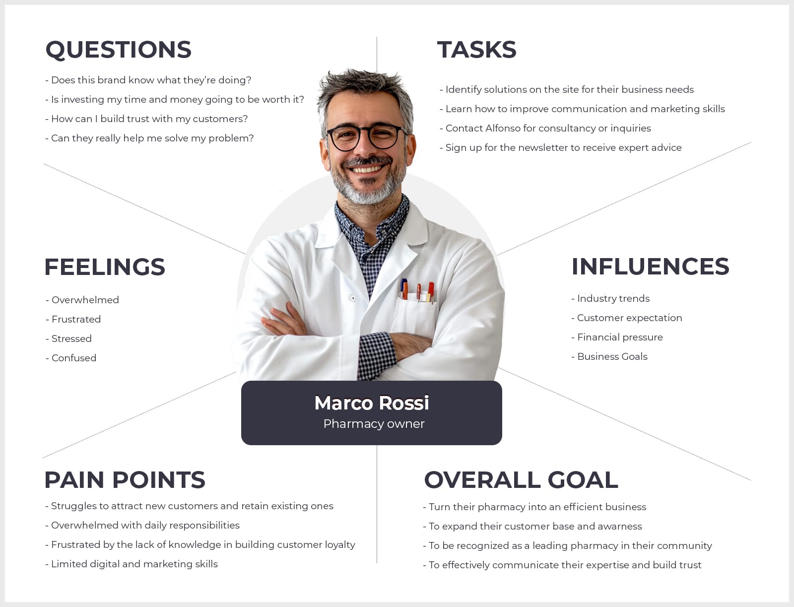
To fix this, I rebuilt the content around users' real questions and objections, ensuring that:
- Key information was delivered quickly
- Concerns were addressed upfront
- Trust was built through clarity
- Users were guided toward action
- Perceived risk was reduced
I combined Alfonso's business insights with AI-supported research to surface objections, pain points, and motivations for each key page. Following Paul Boag's content principles helped reshape the site from the user's perspective, not the brand's ego.
A clear message builds trust. Storytelling makes it memorable.
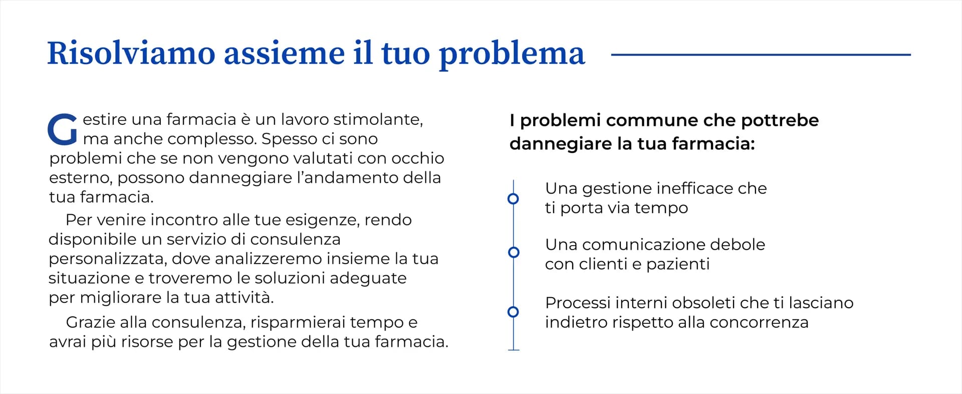
Rule #2: Stop Talking About Yourself
Alfonso's original site focused heavily on his achievements, rather than how he could help pharmacists solve their problems.
This is a common mistake: brands position themselves as the hero instead of positioning the customer as the hero and the brand as the guide.
I rewrote the homepage and service pages using clear storytelling principles, ensuring each page answered the questions users actually care about:
- Why should I care?
- Do you understand my problem?
- What happens if I say yes?
- What's in it for me?
- How does it work?
- What's stopping me?
- Can I trust you?
- What's the next step?
The result was content focused on transformation, not self-promotion—supported by benefits, proof, and clear calls to action.
When storytelling is done right, it doesn't just engage—it persuades.
Rule #3: If They Can't Scan It, They Won't Stay
The original site suffered from:
- Dense paragraphs
- Weak hierarchy
- Poor typography
To improve readability, I focused on:
- Clear content hierarchy with structured headings
- Bullet points and lists to break up text
- Optimised typography for long-form reading
- Strong spacing and white space to reduce cognitive load
The goal was simple: make the content effortless to scan and comfortable to read on any device.
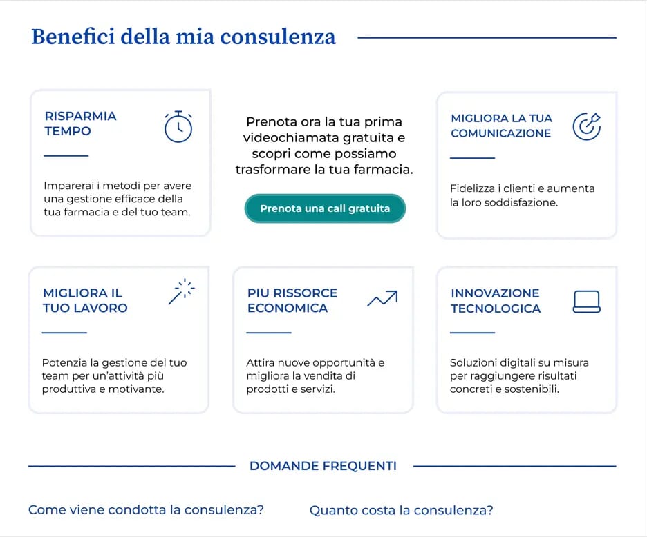
Rule #4: If You Don't Ask, They Won't Click
The old site failed to guide users toward action. CTAs were unclear and inconsistent.
I introduced a clear CTA strategy with two roles:
Transitional CTAs
To guide users gently—exploring services, learning more, and building confidence without pressure.
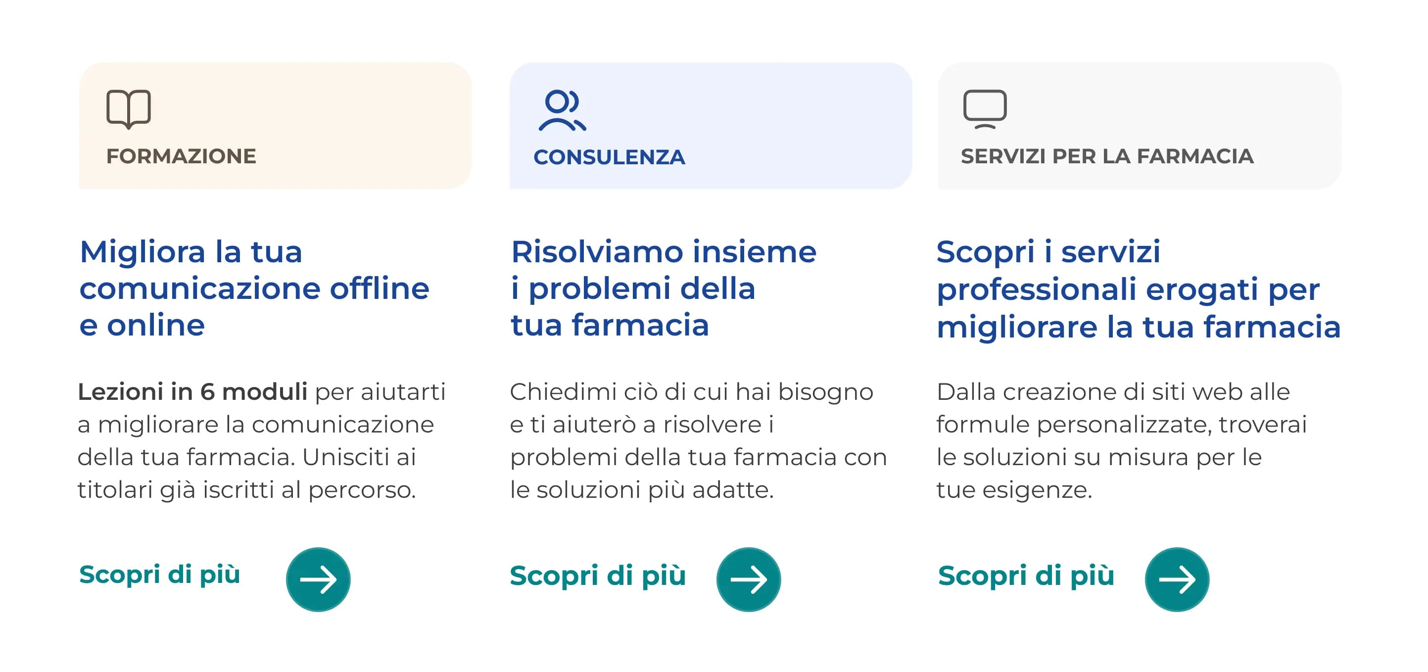
Direct CTAs
Placed after benefits, proof, and reassurance to drive commitment and reduce hesitation.
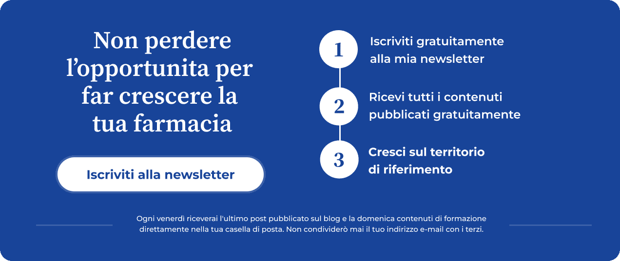
Every page ends with a clear next step, removing uncertainty and friction from the decision-making process.
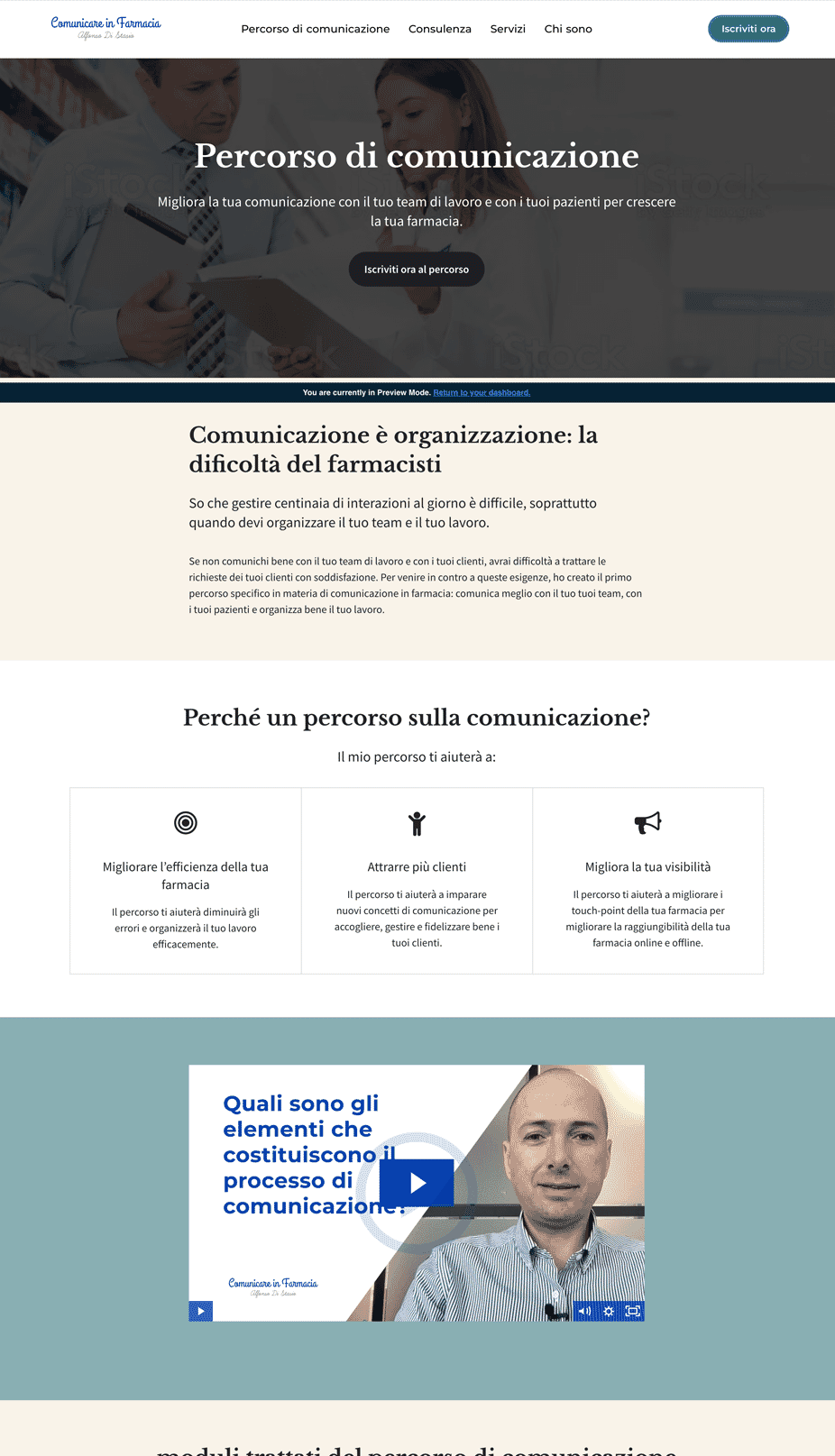
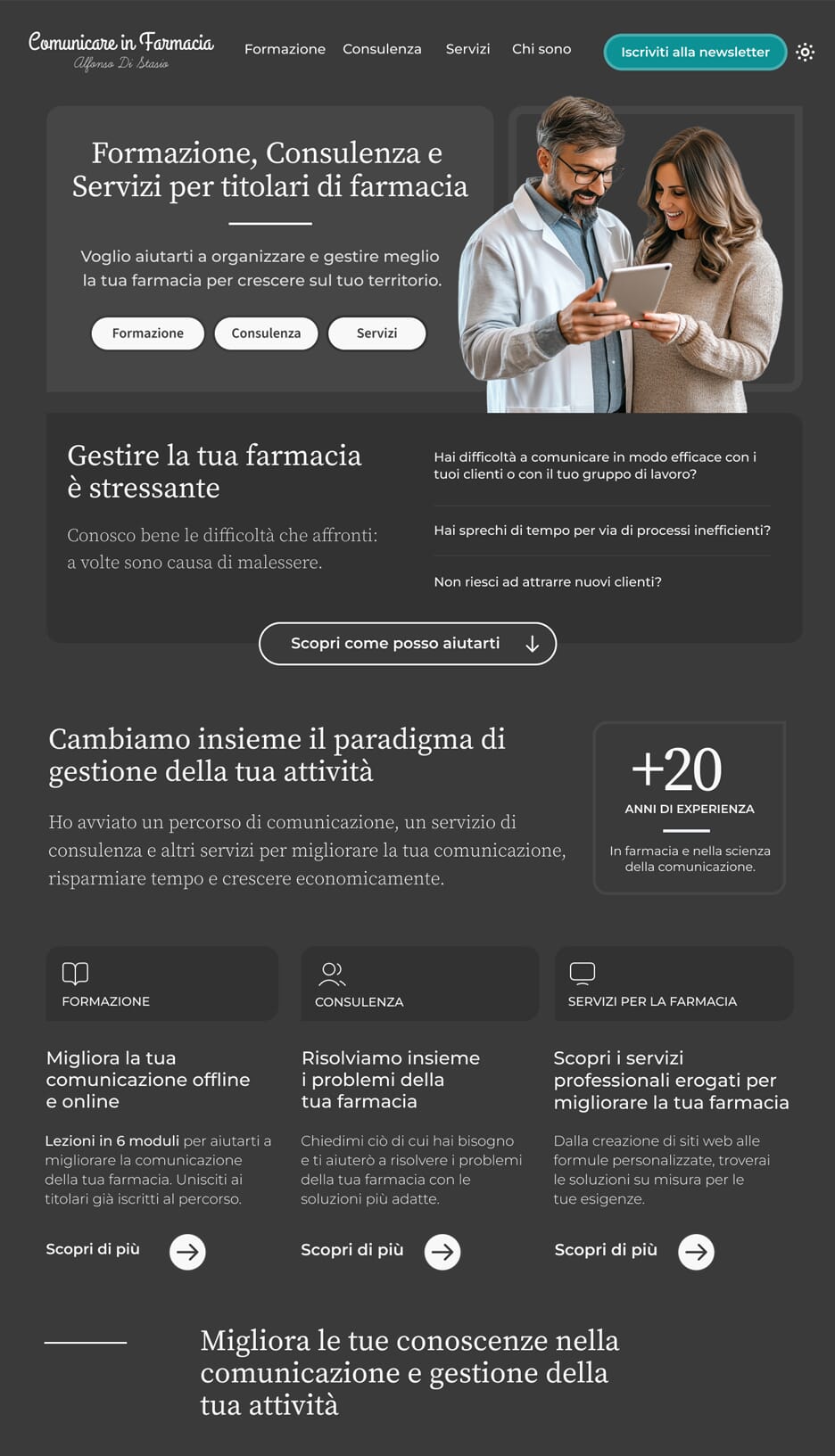
Rule #5: Take Risks. Design to Stand Out.
The original site showed signs of good art direction, but it didn't fully express the brand's personality.
I pushed further by using:
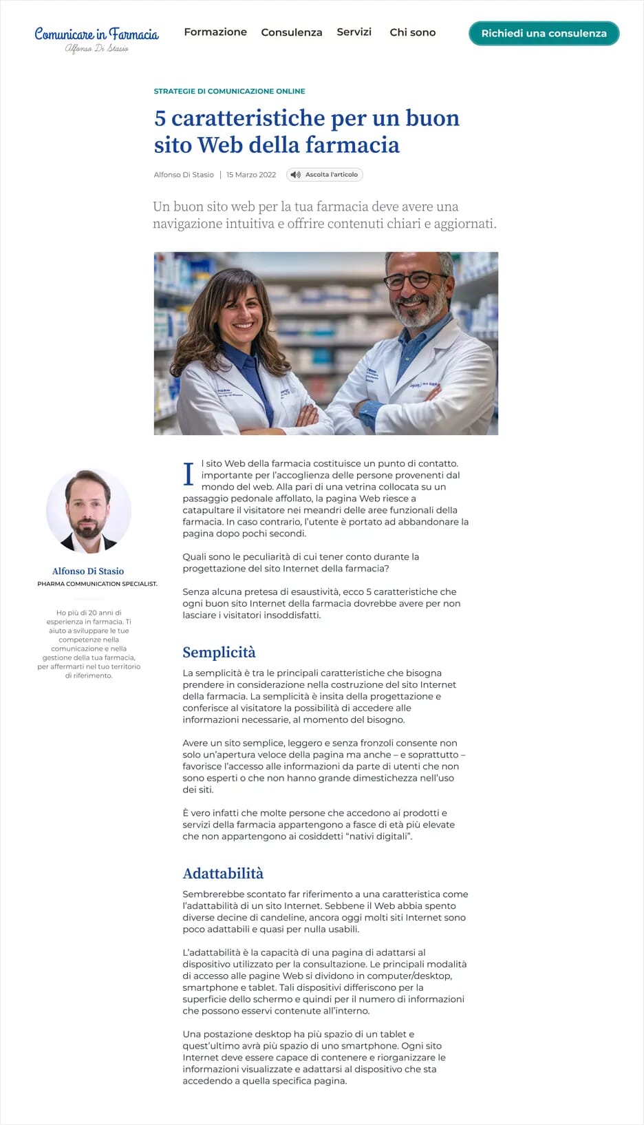
Typography
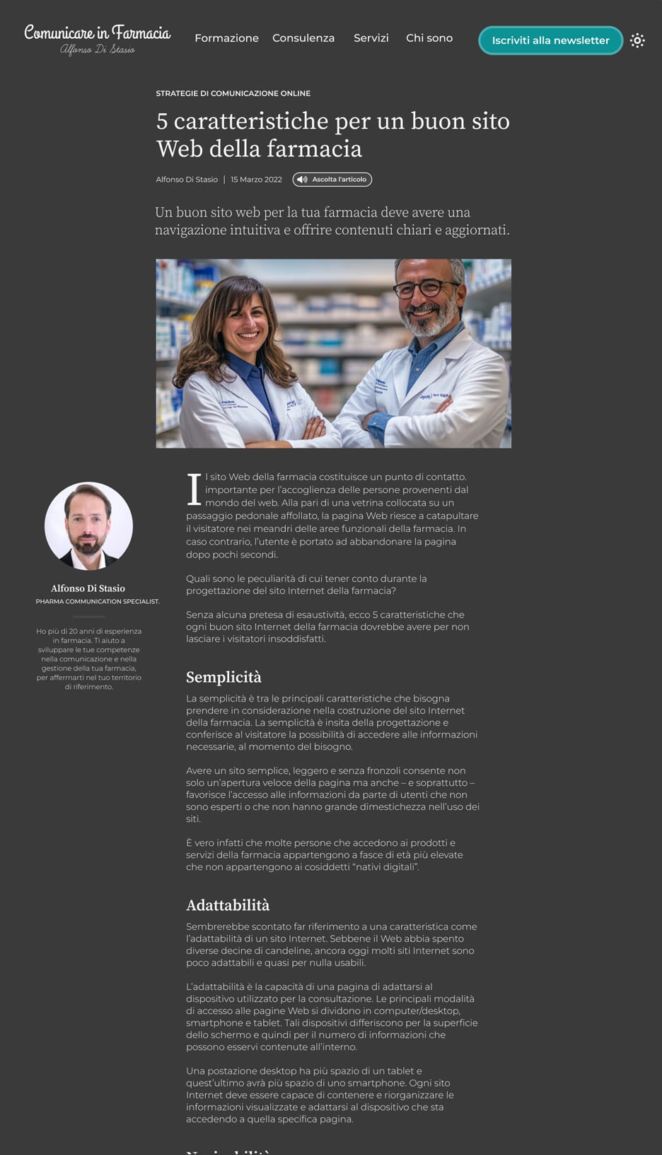
Pairing Source Serif 4 with Montserrat and applying careful typesetting to create a calm, book-like reading experience.
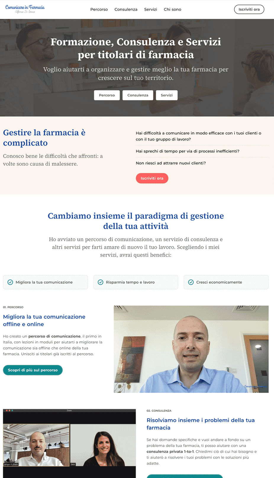
Dynamic layouts
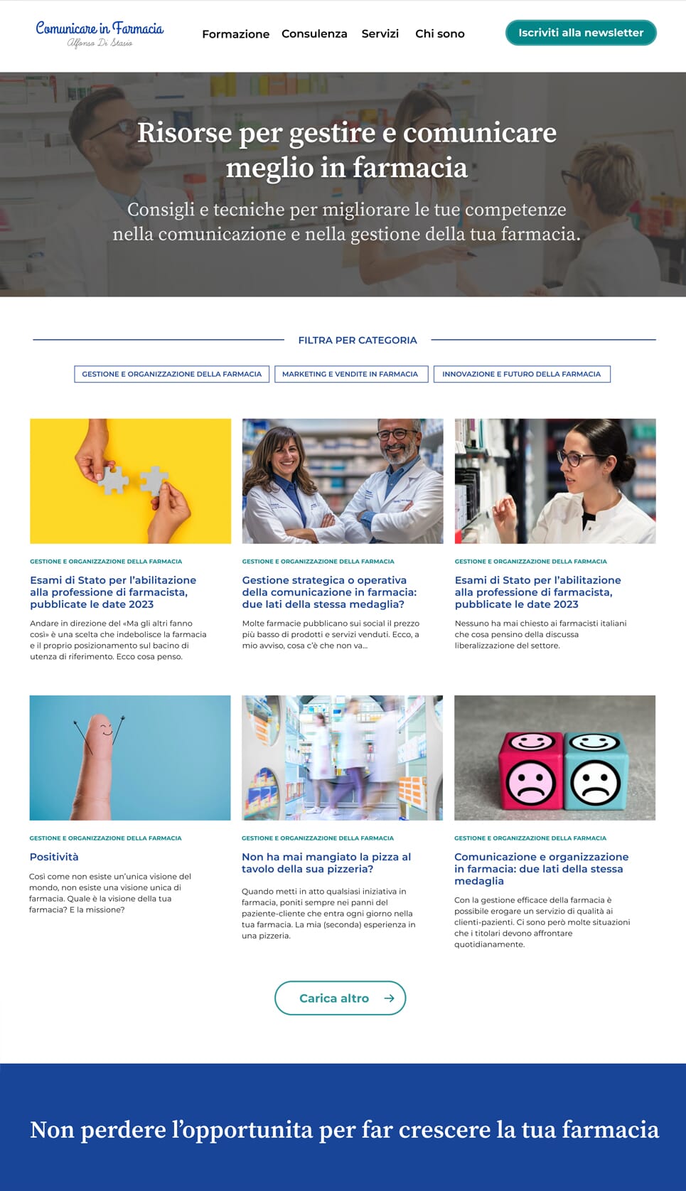
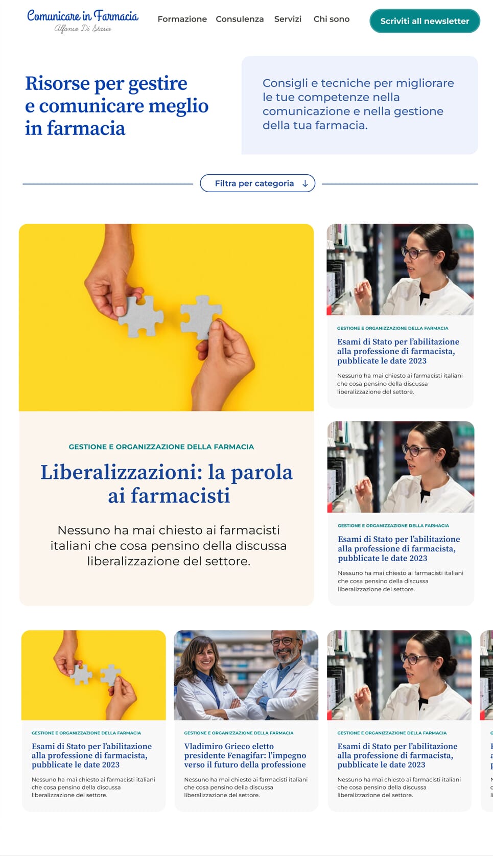
One of the major changes compared to the former design is that I used compound and modular grids to create a variety of distinctive and energetic layouts for each content type.
Below is an example of how I improved the original layout of the blog landing page, which was based on a 12-column grid, into a stand-out layout using a modular grid to create the blog section.
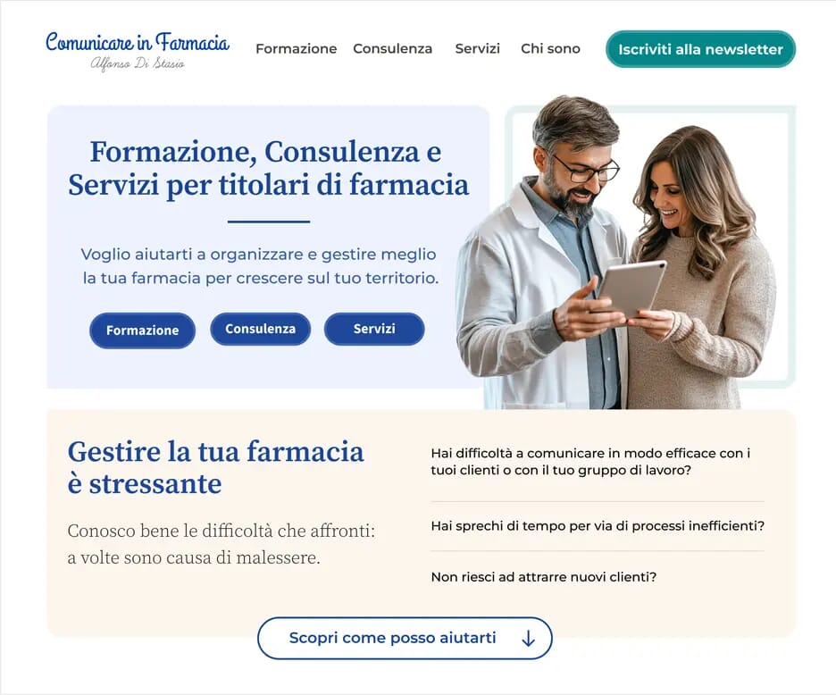
Imagery and graphics
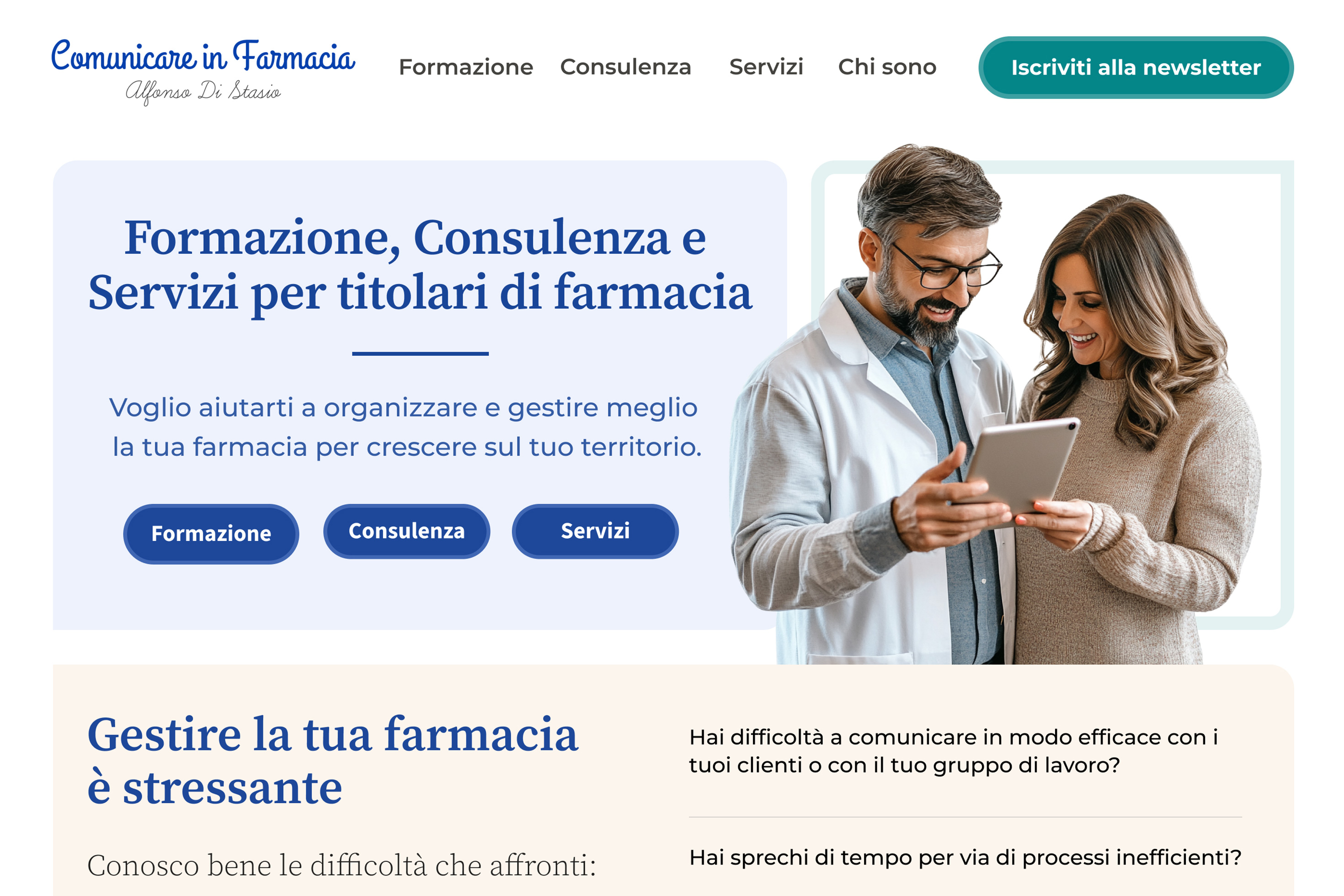
To create an approachable atmosphere on the homepage, I featured an image of a pharmacist-owner helping a customer while using a digital device.
Across the website, I also used icons and symbols to reinforce the site's personality and enhance content readability. This approach allowed me to tell the brand's story better and forge emotional connections with users.
Colour system
I enhanced the original colour palette by keeping the core colours while introducing additional tints and shades for greater design flexibility. The combination includes light colours for backgrounds and borders, with accent colours to highlight primary calls to action.
I used darker colours on the background and text to create contrast where needed. To improve UX and accessibility, I also created an alternative dark theme, giving users another option for viewing the website.
The Impact
The redesigned website is no longer just an online presence—it's a business tool.
- ✔ A clear message that answers users' questions
- ✔ Storytelling that builds trust and emotional connection
- ✔ Art direction that expresses a strong, recognisable identity
- ✔ An interface designed to support engagement and conversion
Key Lessons
A high-performing website isn't built on visuals alone. It's built on clarity, storytelling, and thoughtful design decisions.
If your website isn't delivering results, ask yourself:
- Is the message immediately clear?
- Does the story speak to real user problems?
- Does the design feel intentional and distinctive?
When these elements align, your website stops being a cost—and starts becoming an asset.
If you want to learn more about this topic, read my book “DON’T START WITH VISUALS”.